How to Choose Quilting Fabric (A Quilter's Fabric Pull Walkthrough)

Save it for later. We'll email you a link, no password.

Find it again on your phone or computer, with your finished steps ticked.

You tapped Save

Save this project for later

We'll email you a link, no password.

How to Choose Quilting Fabric (A Quilter's Fabric Pull Walkthrough)

  • Your saved projects in one list
  • Your ticked steps on any device

Check your inbox for an email from us. Not there? Look in your spam folder.

  • 7 steps
  • 12:05 video
  • Difficulty: Medium
  • About 45 minutes
  • Materials about $40 to $80
  • Quilting

Based on a video by Quilt Addicts Anonymous (Stephanie Soebbing)

Opens their YouTube channel

Steps written out by Crafting Step by Step · Published · Updated

The finished result: How to Choose Quilting Fabric (A Quilter's Fabric Pull Walkthrough)
Also in:Crafts

The reason some quilts feel like they were planned and others feel like a clearance-bin accident comes down to fabric selection. It is not a sewing problem. It is not even a color problem, exactly. It is a process problem.

Stephanie Soebbing ran Quilt Addicts Anonymous as a quilt shop for years, and the curated kits she put together built her reputation for having an eye. The good news: that eye is a repeatable process, not a gift. Start with a focal print you love. Layer coordinating prints from the same designer. Anchor the whole pull with solids and low-volume basics. Then lay everything out in color order and edit until the balance feels right.

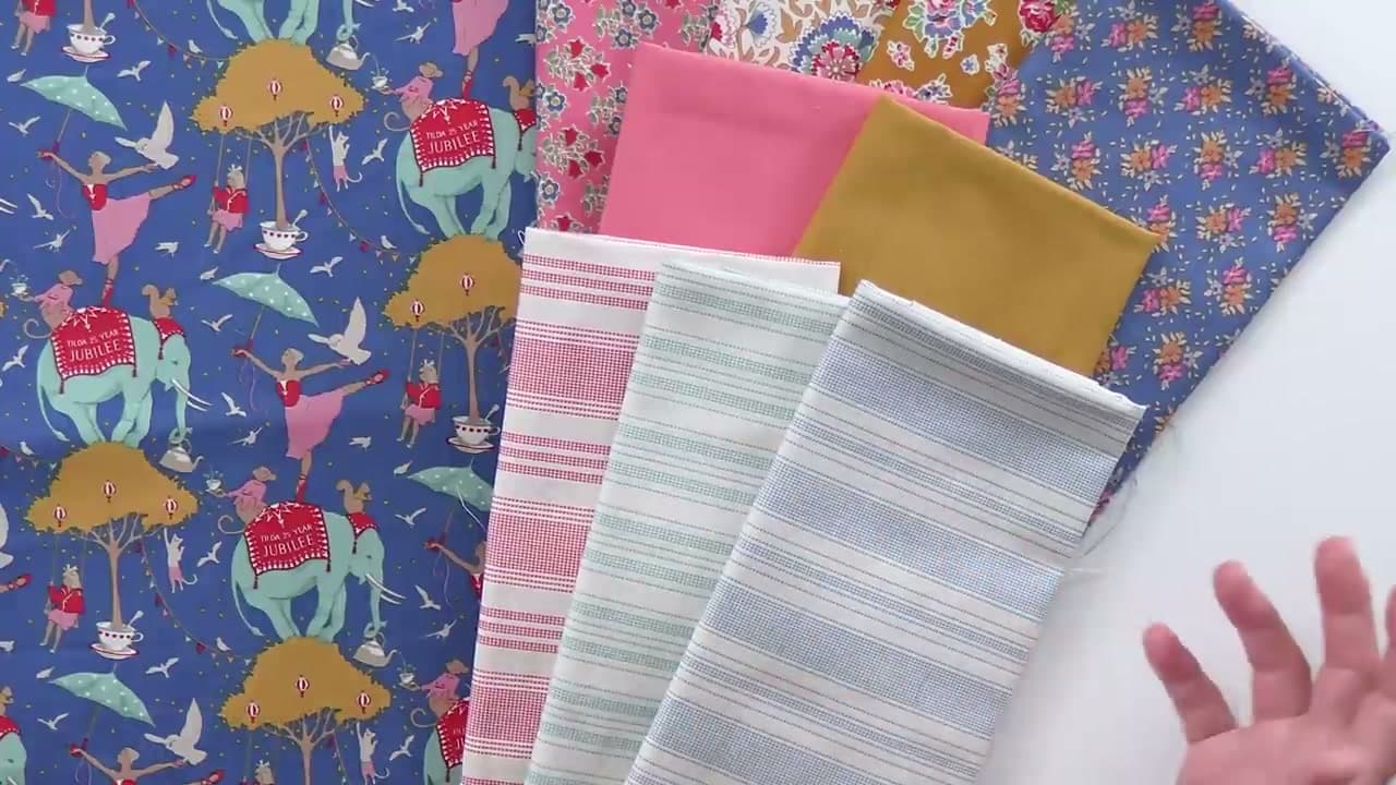
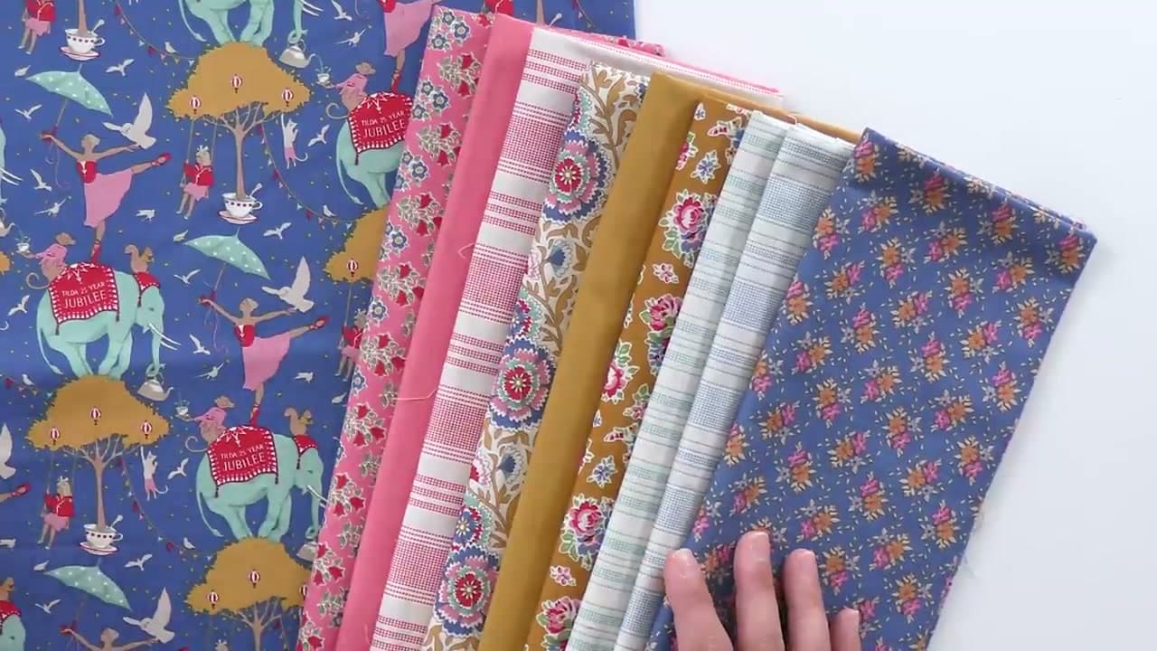
This tutorial walks through her process on a real fabric pull - a Tilda Circus Life elephant print in Jubilee blue that she finally bought after walking past it in three different shops. She mixes in prints from other Tilda collections, picks salmon and mustard solids, adds basics in stripes and tiny florals, and then audits the pull in color order to spot the gaps. By the end, every fabric in the stack is supporting that elephant.

This is the foundation skill for every quilt you will ever make. Pair it with our guides on cutting quilt fabric straight, half-square triangle blocks, and binding to build a complete beginner skill set. Already comfortable with these? Move on to machine quilting basics next.

What you'll need

Free, for this project

Get this checklist by email

  • All 7 tools and materials, with tick boxes
  • A link to print all 7 steps on paper, to keep by you while you craft

No password. The whole tutorial stays free on this page.

Quick answer

Learn how to choose quilting fabric like a kit curator: pick a focal print, layer coordinating prints, anchor with solids, and audit for color balance. A medium project: about 45 minutes. Materials cost about $40 to $80. You need 7 things, including One focal print fabric, Coordinating quilting cotton prints and Color wheel reference. The 7 steps start with start with One Focal Fabric You Cannot Stop Thinking About and pull Coordinating Prints from the Same Collection.

Step-by-step guide

7 steps, about 12 minutes. Tap a picture to jump to that step. Your progress saves automatically.

Tick each step off as you go.

  1. Step 1: Start with One Focal Fabric You Cannot Stop Thinking About

    Watch this step · 1:20
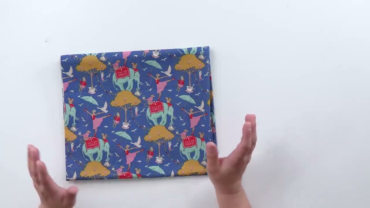
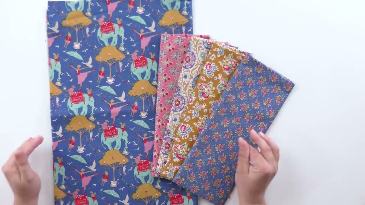
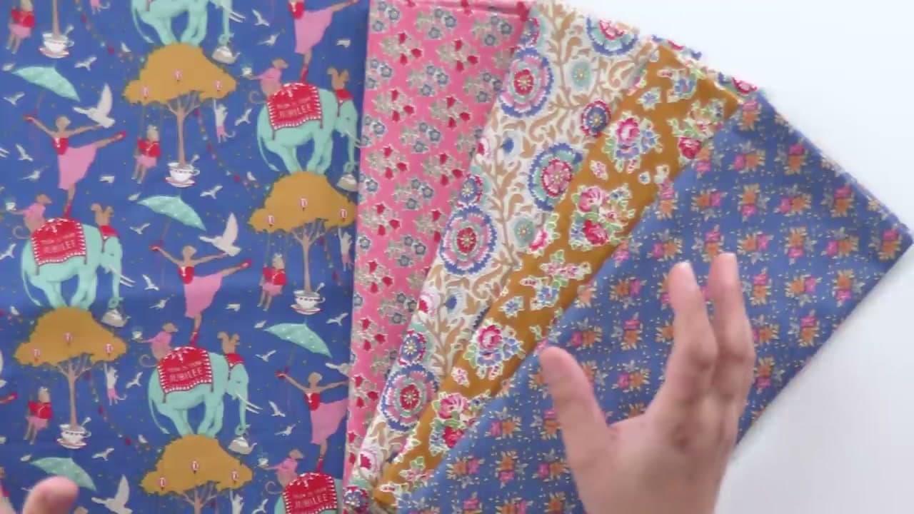
    The first decision is the most important one. Stephanie picks her focal print first - the Tilda Circus Life elephant in Jubilee blue. She walked past it in three different quilt shops before she finally bought a yard. When a print keeps calling you back, that is the print to build a quilt around.

    The focal fabric sets the color story, the mood, and the fussy-cutting opportunities for the entire quilt. Buy a full yard at minimum so you have room to fussy cut without panic. A half yard works if you are doing a small project or know exactly which motif you want to feature, but a full yard leaves you space to change your mind.

    Tip:

    If a fabric keeps showing up in your shop visits or your Instagram saves, that is the signal. The print you cannot stop thinking about is the right focal. Trust that instinct over a more sensible-looking option.
    Back to all steps

  2. Step 2: Pull Coordinating Prints from the Same Collection

    Watch this step · 2:30

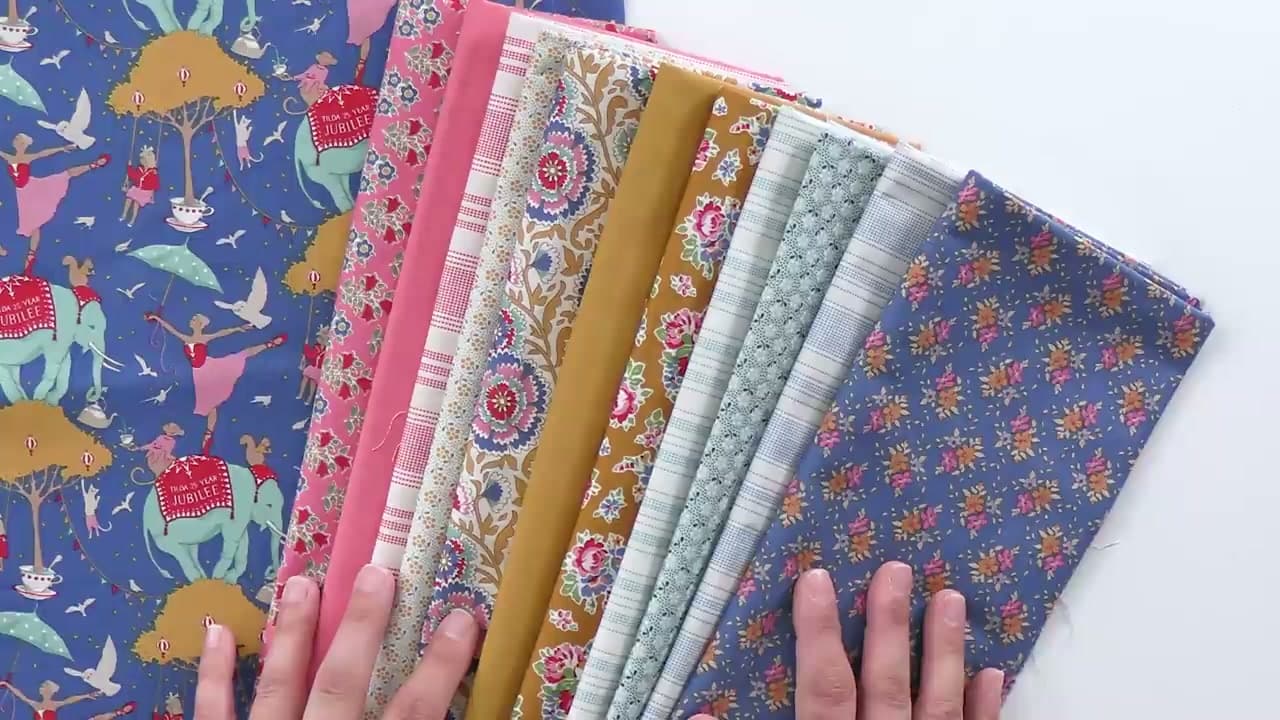
    Rather than buy a matching fat quarter bundle - too kitted - Stephanie pulls half-yard cuts of other prints from the same Tilda collection. She picks one of each design, never two of the same print in different colors, so the pull looks curated instead of factory-assembled.

    Half yards are the right amount of fabric when you do not know exactly what you are making yet. Enough to fussy cut around an interesting motif if you want, enough to just cross-cut into strips if the design calls for that. Decision deferred. Same designer keeps everything in the same visual language: thread weights, scale relationships, dye tones all feel related.

    Tip:

    Rotary screen printers usually offer the same design in three or four colorways per collection. Pick only one. Repeating the print in different colors makes a quilt look like a sample card, not a finished piece.

    Back to all steps

  3. Step 3: Anchor the Palette with Tilda Solids

    Watch this step · 5:00

    Solids give the eye a place to rest. After the prints, Stephanie adds two Tilda solids - a salmon pink and a mustard - in third-yard cuts. The salmon is not an exact match to the pink in the elephant print (the print pink reads more coral), but it is close enough not to clash, and the small mismatch actually pulls the elephant forward as the focal.

    Solids do not need fussy cutting, so smaller cuts work fine. Third yards give you enough for sashing, borders, or background piecing without overcommitting fabric you might not use. Pick the solid by holding it against the focal print and watching how the focal reads when the solid is next to it.

    Tip:

    If a perfect color match is not available, get close. Exact matches actually make the quilt feel flatter because the focal print stops standing out. A small color shift between solid and print gives the eye somewhere to land.

    Back to all steps

  4. Step 4: Add Tilda Basics for Print Variety Without Chaos

    Watch this step · 6:20

    Basics sit between solids and feature prints - tiny dots, thin stripes, low-volume textures. They add print interest without competing with the focal. Stephanie pulls a salmon basic with a stripe, a blue-aqua basic that matches the elephant's body, and a darker blue that matches the print's background.

    The basics are the supporting players. Each stripe and texture is slightly different from the others, so when two basics share a quilt block they look intentional rather than repetitive. Same third-yard cut as the solids - this is connective tissue between the bold prints, not the main event.

    Tip:

    Tilda Basics, Moda Grunge, and Andover Century Solids all serve this role. The look is somewhere between a true solid and a print - just enough texture to keep the eye moving without pulling attention from the focal.

    Back to all steps

  5. Step 5: Lay the Pull Out in Color Order to Spot the Gaps

    Watch this step · 6:54

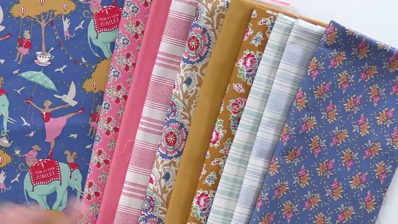
    After every trip to the cutting counter, Stephanie arranges the fabrics in color order on the work surface. Pinks on one end, yellows in the middle, blues and teals on the other. The eye spots imbalance fast when the fabrics are sorted by color rather than scattered.

    Three pinks, three yellows, two blues, one teal. The mustards stacked together overpower the rest of the pull. The single teal looks lonely. Color-order layout is the audit step - it tells you exactly what is missing before you walk back to the cutting counter for a second pass.

    Tip:

    Take a phone photo of the color-order layout in grayscale. The grayscale view shows value contrast (light, medium, dark) without color noise. A quilt with no value contrast reads as flat from across the room, even when the colors are perfect.

    Back to all steps

  6. Step 6: Fill the Color Gaps with Targeted Small-Scale Pulls

    Watch this step · 7:50

    Stephanie goes back to the basics rack for two more pulls: a tiny teal floral to back up the lonely teal and a tiny mustard floral to balance the yellow column. She buys two cuts of the same teal floral print, which becomes the only repeated print in the whole pull.

    Now the layout reads three pinks, four yellows, four blues. Balanced. Small-scale prints are the right tool for gap-filling because they add a color without competing with the focal. A bold large-scale print would steal attention. A tiny floral just adds the color you needed.

    Tip:

    Repeating one print twice is fine when it is doing a specific job - filling a color gap, anchoring a corner block, framing a focal motif. The rule against repeating prints is about avoiding kit-bundle samey-ness, not a ban on intentional repeats.

    Back to all steps

  7. Step 7: Edit the Pull and Pull Anything That Fights the Focal

    Watch this step · 10:20

    Stephanie had grabbed a small dark dot print early on, thinking it might work as a background. Once the rest of the pull came together, she realized the dark dot was too heavy - the lighter basics she pulled later were going to make it pop forward instead of recede. Out it comes. Back to the stash for a different quilt.

    This is the editing step that separates a good fabric pull from a great one. Every fabric has to earn its place by supporting the focal. Buying something you end up not using is fine. Forcing a fabric into a quilt because you already paid for it is how a pull starts feeling muddy.

    Tip:

    If you cannot decide whether a fabric belongs in the pull, take it out. If the pull feels worse without it, put it back. If you do not notice the difference, leave it out. The pull should feel right, not feel justified.

    Back to all steps

How to Applique - Easy Iron-On Method for Quilts

Keep going

How to Applique - Easy Iron-On Method for Quilts

Products Used

The Checklist

How to Choose Quilting Fabric (A Quilter's Fabric Pull Walkthrough)

Tools
3
Materials
4
Steps
7
Video
12 min

Tools we recommend

As an Amazon Associate we earn from qualifying purchases. Links on this page may be affiliate links - clicking them and buying doesn't change your price, but helps support Crafting Step by Step.

Tags

The Crafter's Weekly

New quilting tutorials, every Sunday

One short email with the week's best step-by-step guides. Free, no spam, unsubscribe anytime.

Test your knowledge

Did the lesson stick? Start with this one.

5 questions covering what you just read. No signup, no score saved, and you can stop after this one.

Question 1 of 5

Where do you start a fabric pull?

Quick reference

Key takeaways from How to Choose Quilting Fabric (A Quilter's Fabric Pull Walkthrough)

5 questions, answers, and one-line explanations. Tap to expand.

  1. 1.Where do you start a fabric pull?

    Answer: Start with one focal print you keep coming back to

    Focal print first - it sets the color story for everything that follows.

  2. 2.Why pull half-yard cuts of coordinating prints instead of buying the matching bundle?

    Answer: The pull looks curated instead of factory-assembled

    Mixing your own cuts keeps the quilt from looking like a kit.

  3. 3.What role do solids play in a fabric pull?

    Answer: They give the eye a place to rest between prints

    Solids are visual rest between busy prints, not just filler.

  4. 4.Why arrange the finished pull in color order on the work surface?

    Answer: The eye spots imbalance fast when sorted by color

    A color-sorted lineup makes gaps obvious before you go back for more fabric.

  5. 5.Which fabric category is the right tool for filling color gaps without competing with the focal?

    Answer: A small-scale print (tiny floral, dot, or texture)

    Small-scale prints add the color you need without stealing focus from the focal print.

Did this work for you?

What's next

Similar tutorials

Hand-picked next reads based on the one you just finished.

Liked this quilting tutorial?

Pick the crafts you want to hear about. One email every Sunday with new step-by-step tutorials. No spam, easy to unsubscribe.

Get more like this in your inbox

Weekly digest. Pick the categories you want. Unsubscribe anytime.

Send me tutorials about

We only email about new tutorials. Easy unsubscribe anytime.