How to Draw Mountains: Pencil Landscape Step by Step

Based on a video by Cartooning Club Z

Opens their YouTube channel

Steps written out by CraftingStepByStep · Published · Updated

Watch the original video (opens YouTube)
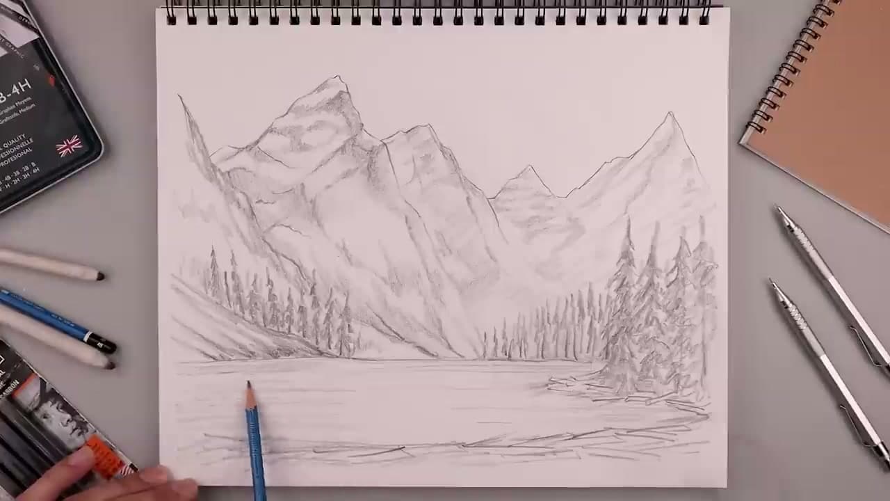
The finished result: How to Draw Mountains: Pencil Landscape Step by Step
Also in:Painting
Step 3 of 6 inLearn to Draw: Nature and Landscapes

Mountains look intimidating until you see how they are actually drawn. They are stacked shapes. Big triangle in front, smaller ones behind, a jagged ridge on top, a pencil-shaded shadow side, and a few snow caps near the peaks. That is the whole trick.

This walkthrough follows MRTY, the verified Cartooning Club Z creator with over six million subscribers, as he builds a full sketchpad scene with a 2B pencil. You will start with a soft horizon line, block in the main mountain, stack a few smaller peaks behind it, sketch trees along the shore, and finish with a quiet lake and a reflection. No fancy tools. One pencil, one sheet of paper.

Layering ranges for depth

Distance changes how things look. Air has haze in it, so the further back a mountain sits, the lighter it gets and the less detail you can see. Artists call this atmospheric perspective, and it is the biggest reason one pencil drawing looks deep and another looks flat.

In pencil that comes down to three rules. The back range gets the lightest pressure and almost no texture. The middle range gets some ridgelines and a soft shadow side. The front mountain gets your darkest darks, the sharpest edges and all the cracks and rock detail. Keep each range a little shorter than the one in front of it, and overlap them so no two peaks line up.

Light side and shadow side

Every mountain has at least two faces. Decide where the sun is before you shade anything and stick to it for every peak on the page. Light from the left means every left face stays pale and every right face gets tone. Switching direction from one peak to the next is what makes a range look like cut-out paper.

The ridgeline is where those two faces meet. Keep that edge crisp near the top and let it soften as it runs down toward the trees.

Snow caps

You do not draw snow. You draw the rock around it and leave the paper white. Snow collects in the high parts and down the gullies, so let it reach down in ragged fingers rather than sitting on top like a flat lid. On the shadow side, give the snow a light grey tone so it still reads as part of the same shape.

Pencil, ink or colour

MediumGood forWatch out for
Graphite (2B-6B)Soft gradients, easy fixesSmudging with your hand
Ink pensBold sketchbook style, hatchingNo erasing, so plan in pencil first
Colour pencil or paintBlue haze, sunset lightMud if the back range goes too dark

The same layering works in paint. Painting mountains with acrylics uses the same light-to-dark order.

Adding a landscape

A mountain on its own floats. Pine trees along the base and a lake in front give it scale and somewhere to stand. The reflection in the water is always darker and softer than the mountain it mirrors, and it sits straight below it. How to draw water covers ripples and reflections in more depth, and how to draw clouds and how to draw a tree fill out the rest of the scene.

Mountain drawing ideas to try next

  • A simple range for kids. Three overlapping triangles, a zigzag snow line on the tallest one and a sun peeking out behind. Ten minutes with a marker.
  • Sunset silhouette. Fill each range in solid tone, darkest in front and palest at the back, against a bright sky. No ridge detail needed.
  • A single big peak. One lopsided mountain filling the page, with deep cracks and gullies on the shadow side. Good practice for rock texture.
  • Mountains by the sea. Drop the lake and run a coastline under the foothills, then add rolling waves in the foreground.

Common mistakes

  • Symmetrical triangle peaks. Real mountains lean, with one long slope and one steep one.
  • Same-size ranges. If every range is the same height, there is no depth.
  • Outlining everything. Let tone make the edges in the back.
  • Dark back mountains. Distance means light. Save the dark for the front.

Want some color? Try how to paint a sunset next. The same composition skills cross over to acrylics.
What you'll need

Step-by-step guide

8 steps, about 14 minutes. Tap a picture to jump to that step. Your progress saves automatically.

Tick each step off as you go.

  1. Step 1: Sketch the Horizon Line and First Main Mountain

    Watch this step · 0:40

    Turn your sketchbook horizontal and draw a soft horizontal line low across the page. That is your horizon. It separates sky from ground and gives every later shape a home to sit on. Keep the pressure light.

    Now block in your first main mountain on the left side. Start at the top, then wobble a line down and across to suggest a ridge. The shape should feel a little lopsided. Real peaks are not symmetrical, and a too-clean triangle reads as cartoon, not landscape.

    Tip:

    Hold the pencil a little further back than you would for writing. Your hand naturally lightens, which keeps these guideline marks soft enough to draw over later.

    Back to all steps

  2. Step 2: Stack Background Mountains Behind the Front Peak

    Watch this step · 1:50

    Working from the top of your first mountain, sketch the next ridge stepping up behind it with a few angled lines coming down. Then add another stack further back. Mountains get lower as your eye moves toward the right and into the distance, so let the peaks drop and the silhouette flatten.

    You are blocking in volume, not finishing yet. Loose, light angles read as a real mountain range. Resist the urge to commit any line until the whole composition is roughed in.

    Tip:

    Look up a photo of a real mountain range for a second before you start stacking. Real ridges almost never line up evenly, and that randomness is what sells the drawing.

    Back to all steps

  3. Step 3: Add Foreground Mountain, Tree Line, and Water Edge

    Watch this step · 2:10

    Bring a smaller foreground mountain in along the right and a low hill across the left. Then drop in a soft tree line where the mountain meets the shore. These are quick spiky marks, not finished trees yet. The shoreline curves around an outcropping and back into a lake.

    Add a line across the bottom for the front edge of the lake. The water itself stays blank for now. Your eye reads the whole scene the moment those shoreline marks land, so you should already see the landscape forming.

    Tip:

    Don't draw individual trees yet. A spiky zig-zag along the shoreline does more work than careful triangles at this stage and saves you from over-committing.

    Back to all steps

  4. Step 4: Define Ridgelines and Mountain Character

    Watch this step · 4:30

    Switch to the tip of your pencil and lightly trace down the ridges of each mountain. These are the lines that run from each peak down toward the bottom, marking where the rock surface changes direction. Keep the marks wandering and slightly broken, not smooth.

    This is where the mountains get character. Sharp peaks read as alpine and dramatic; lower, rounder ridges read as older mountains. Vary them on purpose. A perfectly even row of peaks reads as a kid's drawing of mountains.

    Tip:

    If your line goes too dark, lift it with a kneaded eraser. Real ridgelines are subtle and only a few of them should ever be your darkest marks.

    Back to all steps

  5. Step 5: Build Pine Trees Along the Shore

    Watch this step · 6:35

    Start at the tip of each tree and pull short, angled branches down and outward. These are pine trees, so the silhouette tapers to a point at the top and widens toward the base. Offset each tree slightly. Don't make them all the same height.

    Closer to the water, darken the bases. Trees further back stay lighter and a little blurry, which makes them feel further away. You are building volume here, not detail. A cluster of suggestive trees beats a perfectly drawn single one.

    Tip:

    If the trees start to look like a fence, you are spacing them too evenly. Cluster two or three close together and leave gaps so the eye reads them as a real treeline.

    Back to all steps

  6. Step 6: Shade the Shadowed Sides of the Mountains

    Watch this step · 7:00

    Pick a sun direction in your head. Anything facing away from the sun gets shaded. Turn the pencil onto its side and lay soft tone down one whole face of each mountain, keeping the lit face nearly bare.

    Build the shading up in layers, not in one heavy pass. Two or three light layers blend more naturally than one dark scribble. Stop at the ridgeline. That hard edge between light and dark is what makes the mountain look three-dimensional instead of flat.

    Tip:

    Smudge a heavy edge with a fingertip or the edge of a blending stump to soften it. Real mountain shadows feather out, they don't end on a clean line.

    Back to all steps

  7. Step 7: Add Snow Caps and Rock Layers Near the Peaks

    Watch this step · 6:45

    With the tip of your pencil, add short broken strokes along the ridges near each peak. Leave little patches of bare paper between the strokes. That bare paper reads as snow, the strokes as exposed rock between the snow.

    The mountains in the background get more snow than the ones in front, since they are taller and colder. Add a few horizontal cracks and crevices below the snow line on the closest peak. You don't need a lot. Three or four marks per ridge is enough to suggest a whole rock face.

    Tip:

    Snow on a mountain is shape, not color. If your dark strokes between the snow are placed well, the bare paper does the heavy lifting on its own.

    Back to all steps

  8. Step 8: Add Water Ripples and a Soft Mountain Reflection

    Watch this step · 12:25

    Drop in a few light horizontal marks across the lake to suggest ripples. They should be darker close to the shore and almost invisible near the center of the water. That gradient is what makes water look flat instead of textured.

    Mirror the bottom edge of the mountains and the trees into the water with very light pencil work, then smudge it with a finger to blur it out. Reflections are never as sharp as the real subject. Sign your work, step back, and call it done.

    Tip:

    If the drawing starts to feel busy, stop adding. Pencil landscapes almost always die from one mark too many, almost never from one too few.

    Back to all steps

Keep going

How to Draw a Christmas Ornament

Products Used

The Checklist

How to Draw Mountains: Pencil Landscape Step by Step

Tools
5
Materials
1
Steps
8
Video
14 min

Tools we recommend

As an Amazon Associate we earn from qualifying purchases. Links on this page may be affiliate links - clicking them and buying doesn't change your price, but helps support CraftingStepByStep.

Tags

The Crafter's Weekly

New crafts tutorials, every Sunday

One short email with the week's best step-by-step guides. Free, no spam, unsubscribe anytime.

Test your knowledge

Did the lesson stick? Start with this one.

5 questions covering what you just read. No signup, no score saved, and you can stop after this one.

Question 1 of 5

Why should your first main mountain feel a little lopsided?

Quick reference

Key takeaways from How to Draw Mountains: Pencil Landscape Step by Step

5 questions, answers, and one-line explanations. Tap to expand.

  1. 1.Why should your first main mountain feel a little lopsided?

    Answer: A perfectly symmetric triangle reads as cartoon, not landscape

    Real peaks aren't symmetrical; clean triangles look like a kid's drawing of a mountain.

  2. 2.How should the mountains change as your eye moves into the distance?

    Answer: Get lower and flatter

    Distance flattens silhouettes - that's how the eye reads depth in a landscape.

  3. 3.What is a 'ridgeline' in this context?

    Answer: The line where the rock surface changes direction, running from peak downward

    Ridgelines mark the change in surface plane and give each mountain its character.

  4. 4.How do you create snow caps on the peaks?

    Answer: Short broken strokes that leave patches of bare paper between them

    Bare paper reads as snow; strokes between are exposed rock.

  5. 5.How should the mountain reflection look on the lake?

    Answer: Lightly drawn and smudged with a finger to blur it out

    A blurred reflection sells the illusion of water; a sharp one looks fake.

Did this work for you?

What's next

Related collections

Curated theme pages that include this tutorial.

Similar tutorials

Hand-picked next reads based on the one you just finished.

Liked this crafts tutorial?

Pick the crafts you want to hear about. One email every Sunday with new step-by-step tutorials. No spam, easy to unsubscribe.

Get more like this in your inbox

Weekly digest. Pick the categories you want. Unsubscribe anytime.

Send me tutorials about

We only email about new tutorials. Easy unsubscribe anytime.