How to Draw Water in Pen and Ink (8-Step Seascape Tutorial)

Based on a video by Alphonso Dunn

Opens their YouTube channel

Steps written out by CraftingStepByStep · Published · Updated

Watch the original video (opens YouTube)
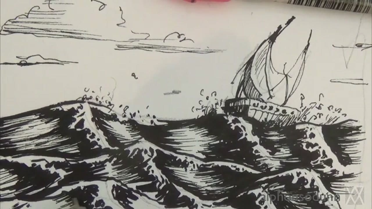
The finished result: How to Draw Water in Pen and Ink (8-Step Seascape Tutorial)
Also in:Painting
Step 4 of 6 inLearn to Draw: Nature and Landscapes

Water looks impossibly hard to draw until somebody shows you the trick: every wave on the page starts as a triangle. Alphonso Dunn builds a whole stormy ocean out of repeating prism shapes, then layers ink on top to turn those triangles into foam, troughs, and crashing crests. By the end you have a seascape with a ship that looks like it took an afternoon, when really the structure is eight simple moves.

Pen and ink is the right tool for choppy water because the hard black-and-white contrast does the work color would have to do in paint. Once you have this method down, the same triangle-and-ink rhythm extends across landscape drawing. Try the cloud-and-eraser approach in how to draw clouds for soft skies, switch over to how to paint a sunset when you want color, or shift to a different subject entirely with how to draw a tree.

All you need is a sketching pencil, a brush-tip ink pen, a finer ink pen for detail, and a sheet of drawing paper. Alphonso uses a Prismacolor brush pen and a Micron 08, but any black brush pen and 05 fineliner will get you the same result.

Water is entirely about where the light is coming from. If the sketching and shading here feel like guesswork, the fundamentals - pencil grades, the light-pass method and picking a light source - are at how to draw.

The same rules carry over to calmer water: still ponds, puddles, ripples and reflections. Big curling breakers get their own walkthrough in how to draw waves, and the painted version lives at how to paint ocean waves.

Drawing water with pen vs pencil

The shapes stay the same. What changes is how you build the darks.

With a pen you can't blend, so tone comes from line density. Tight horizontal hatching reads as deep water. Spaced-out, broken lines read as light on the surface. Decide where the white goes before you ink, because you can't lift it later.

With a pencil you get to smudge. Lay a soft 2B tone over the surface, blend it flat with a tissue, then pull out highlights with a kneaded eraser pinched to a sharp edge. Go back in with a sharp HB for the crisp ripple lines. Pencil forgives more, so it's the better place to practice.

How to draw reflections in water

A reflection is a flipped copy of whatever sits above the water. Draw the object, then mirror it straight down from the waterline - same width, same height, upside down.

Then break it. Cut across the reflection with short horizontal lines and leave thin gaps between them. The more the surface moves, the wider the gaps and the more the reflection wobbles. A glassy pond gets a near-exact mirror. A breezy lake gets one chopped into stripes. Keep reflections a touch darker than the object itself.

Ripples, rings and puddles

  • Rings: draw flattened ovals, not circles. You see water from an angle, so a ring from a dropped pebble squashes into an ellipse. Space the rings wider as they move out.
  • Surface ripples: short, curved dashes, packed closer toward the horizon.
  • Puddles: a flat irregular shape with a hard edge, the sky reflected inside it, and a dark rim where water meets ground.

Let the paper do the highlights

The brightest thing in any water drawing is the paper you didn't touch. Plan those spots early: the sparkle on a ripple, the foam on a crest. In ink, work around them. Untouched paper always looks cleaner than rubbed-out graphite.

Common mistakes when drawing water

  • Overworking it. Every extra line takes away light. Stop sooner than feels right.
  • Too many vertical lines. Calm water is horizontal. Vertical strokes belong in reflections only.
  • Reflections that don't match. A tree leaning left has a reflection leaning left too. Check the angle against the object.
  • Even spacing everywhere. Lines should tighten toward the horizon, or the water stands up like a wall.
What you'll need

Step-by-step guide

8 steps, about 8 minutes. Tap a picture to jump to that step. Your progress saves automatically.

Tick each step off as you go.

  1. Step 1: Sketch the Triangular Prism Wave Shape

    Watch this step · 0:45

    Start with a single triangular prism drawn lightly in pencil. Think of a low pyramid lying on its side, with one slope steeper than the other. This is the shape every wave on the page is going to come from, so spend a minute getting comfortable with how it sits on the paper.

    Keep the line light. Alphonso barely presses down because every pencil mark from here on is throwaway scaffolding. The triangle is the structural skeleton of a wave, not the wave itself.

    Tip:

    Sharpen your pencil to a clean point before you start. A dull pencil makes thick wobbly triangles that get hard to erase later.

    Back to all steps

  2. Step 2: Connect Repeating Triangles Into a Wave Row

    Watch this step · 1:15

    Draw a second prism overlapping the first, then a third, then a fourth. Vary the height and angle of each one so they don't look stamped out. Some peaks should lean left, some right. Some prisms should sit flatter than others.

    Now connect the inside edges into one flowing line that links the prisms together. That single connected line is the silhouette of a wave row, with each prism becoming a wave peak. The triangle scaffolding is doing all the work of placing the peaks where the eye expects them.

    Tip:

    If two prisms end up the same height and angle right next to each other, redraw one. Identical neighbors are the fastest way to make a wave row look fake.

    Back to all steps

  3. Step 3: Block in the Full Ocean Composition

    Watch this step · 2:15

    Lightly sketch a horizon line about a third from the top of the page. Below it, block in three or four overlapping wave rows that recede toward the horizon. Front rows should be larger and have more prism detail. Back rows can flatten out into wavy horizontal lines.

    This is the moment your drawing turns from one wave into an ocean. Don't worry about perfection. Every line here is a guide that will either get inked over or erased.

    Tip:

    Let the foreground waves overlap the wave behind them. Overlap is the cheapest way to create depth on a flat sheet of paper.

    Back to all steps

  4. Step 4: Add the Ship and Refine the Pencil Sketch

    Watch this step · 3:15

    Sketch a small ship sitting on one of the back wave rows on the right side of the page. Keep it basic: a hull, a mast, a triangular sail. The ship sits on top of a wave, never in front of one, or the perspective will read wrong.

    Refine the rest of the sketch. Clean up any wave peaks that look weak. Add a tiny horizon-line shape for a distant boat or a bird. When the pencil sketch looks like an ocean already, you're ready to switch to ink.

    Tip:

    Draw the ship smaller than feels right. A ship that's too big steals attention from the waves, which are the actual subject of the drawing.

    Back to all steps

  5. Step 5: Ink the Top Edge of Each Wave Crest

    Watch this step · 3:45

    Pick up your brush-tip pen and start at the top of one wave. Trace the very top edge of the crest in ink, then follow the curve down where it breaks. Leave little gaps along that top edge - those gaps will read as white foam on the crest.

    Work wave by wave across the row. Don't try to outline anything cleanly. The ink line should be slightly jagged, with a few small ticks and bumps to suggest foam already forming. Alphonso uses a Prismacolor brush pen for this because the variable line weight builds that ragged crest naturally.

    Tip:

    Hold the brush pen loosely and let the tip wobble. Tense fingers make tight controlled lines, which is the opposite of what you want for foaming water.

    Back to all steps

  6. Step 6: Fill the Wave Troughs with Solid Ink

    Watch this step · 4:30

    Now block in the dark trough under each crest. Lay down solid ink in the shadow side of each prism, leaving the highlight side white. The contrast between solid black trough and pure white foam is what makes water read as water.

    Don't fill everything. Leave tiny white channels running through the troughs - those are the streaks of foam that always trail behind a breaking wave. Vary how dark each trough gets. Some can be solid black. Others just need a few heavy strokes.

    Tip:

    Save the deepest, blackest trough for the wave closest to the viewer. The eye reads pure black as nearest, so your darkest ink should be in the foreground.

    Back to all steps

  7. Step 7: Add Horizontal Strokes for Distant Water and Foam

    Watch this step · 5:30

    Switch to your finer Micron pen and lay down horizontal strokes for the distant water between the waves and the horizon. Long, mostly straight lines with small breaks read as flat ocean stretching back into the distance. Keep them lighter and thinner the closer they get to the horizon.

    Then go back to the wave area and stipple in foam splash around each crest. Tiny dots and short curls of ink above the wave tops sell the moment water hits air. Don't overdo it. Three or four dots per crest beats fifty.

    Tip:

    Use shorter horizontal strokes near the horizon than near the foreground. Compressed strokes at the back fool the eye into reading distance.

    Back to all steps

  8. Step 8: Finish the Sky, Sails, and Clouds

    Watch this step · 6:45

    Ink in the ship: outline the hull, fill the mast, draw the triangular sail with a few diagonal rigging lines. Keep the ship simple - it's a focal point, not a portrait.

    Above the horizon, add a few loose horizontal cloud bands. Open ovals and broken lines work better than fully outlined clouds. The sky should feel like air, not paper. Step back and look at the whole drawing. If anything competes too hard with the waves, lighten it. If a corner feels empty, add one more cloud or a tiny distant bird.

    Erase any leftover pencil scaffolding that's still showing. That's the basic pen-and-ink water method. The same triangle-prism-to-ink rhythm scales up to crashing storm seas or down to a quiet pond - what changes is how dark you push the troughs and how rough you leave the crests.

    Tip:

    If your foam looks too tidy, dip the brush pen tip into the page and flick small ink specks above the waves. Real ocean spray is messy, and a few random splatter dots sell the chaos better than careful stippling.

    Back to all steps

Keep going

How to Draw a House: Cartoon Cottage Step by Step

Products Used

The Checklist

How to Draw Water in Pen and Ink (8-Step Seascape Tutorial)

Tools
5
Steps
8
Video
8 min

Tools we recommend

As an Amazon Associate we earn from qualifying purchases. Links on this page may be affiliate links - clicking them and buying doesn't change your price, but helps support CraftingStepByStep.

Tags

The Crafter's Weekly

New crafts tutorials, every Sunday

One short email with the week's best step-by-step guides. Free, no spam, unsubscribe anytime.

Test your knowledge

Did the lesson stick? Start with this one.

5 questions covering what you just read. No signup, no score saved, and you can stop after this one.

Question 1 of 5

What basic shape is the building block of every wave in this method?

Quick reference

Key takeaways from How to Draw Water in Pen and Ink (8-Step Seascape Tutorial)

5 questions, answers, and one-line explanations. Tap to expand.

  1. 1.What basic shape is the building block of every wave in this method?

    Answer: A triangular prism

    A row of triangular prisms gives you the wave skeleton before any inking.

  2. 2.How dark should the pencil scaffolding be?

    Answer: Very light - most marks get inked over or erased

    Pencil work is scaffolding only; press lightly so it disappears later.

  3. 3.To make a wave crest read as foamy white, what do you do with the ink?

    Answer: Leave little gaps in the ink along the top edge

    Gaps in the ink line read as white foam. Solid black would look like glass.

  4. 4.What does the contrast between solid-black trough and white crest do for the drawing?

    Answer: Sells the image as moving water

    Water reads as water because of that high-contrast jump between shadow and foam.

  5. 5.For distant water near the horizon, what pen and stroke does the tutorial recommend?

    Answer: Finer Micron pen with horizontal strokes lighter near the horizon

    Long horizontal strokes that lighten toward the horizon mimic distance.

Did this work for you?

What's next

Related collections

Curated theme pages that include this tutorial.

Similar tutorials

Hand-picked next reads based on the one you just finished.

Liked this crafts tutorial?

Pick the crafts you want to hear about. One email every Sunday with new step-by-step tutorials. No spam, easy to unsubscribe.

Get more like this in your inbox

Weekly digest. Pick the categories you want. Unsubscribe anytime.

Send me tutorials about

We only email about new tutorials. Easy unsubscribe anytime.