How to Paint a Sunset: 5-Step Acrylic Tutorial

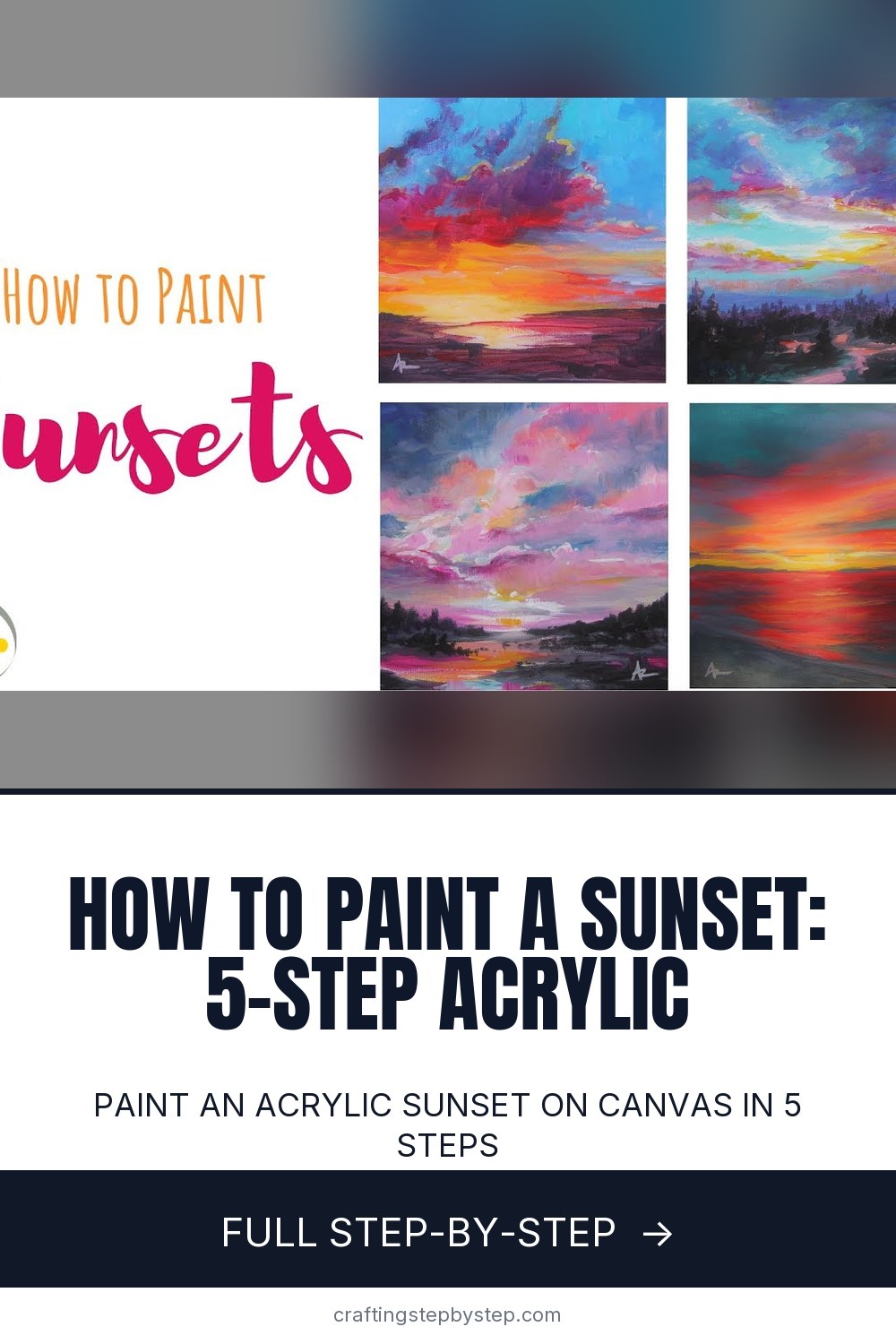
The finished result: How to Paint a Sunset: 5-Step Acrylic Tutorial
  • Difficulty: Easy
  • About 45 minutes
  • 5 steps

You tapped Save

Save this project for later

We'll email you a link, no password.

How to Paint a Sunset: 5-Step Acrylic Tutorial

  • Your saved projects in one list
  • Your ticked steps on any device

Check your inbox for an email from us. Not there? Look in your spam folder.

Print

Steps written out by Crafting Step by Step from Createful Art with Ashley Krieger's video (opens YouTube) (8:49). Published .

Also in:Crafts

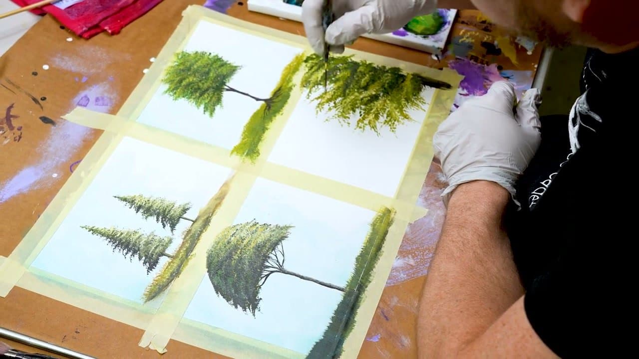
Acrylic sunsets are a great first landscape because they hide a lot of beginner mistakes. The colors are forgiving, the composition is simple (sky on top, foreground on the bottom), and the layering technique builds confidence without requiring you to draw anything. Once the sunset feels familiar, move on to a layered acrylic forest for your next landscape.

Ashley Krieger from Createful Art breaks the process into five steps and explains the order matters: warm bright colors first, then cool colors and grays, then the sky, then a drama layer over the brights, and finally the foreground silhouette. Skip the layering and the sunset goes muddy fast.

A sunset is one long gradient, so the blend is the whole painting. See how to blend acrylic paint for three ways to get a smooth transition without hard edges.

What you need

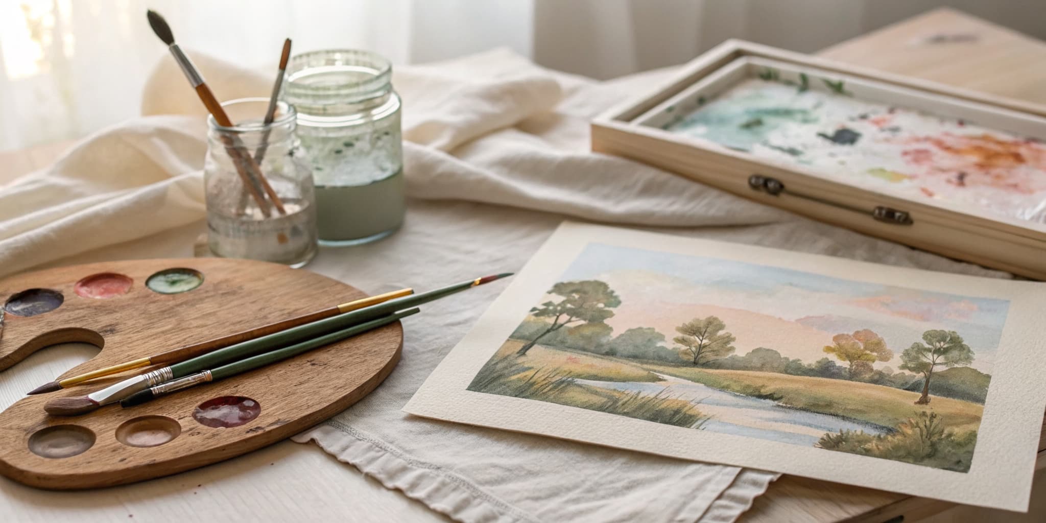
  • A small canvas, around 8x8 inches. A small square is easier to blend across before the paint dries.
  • A small flat brush for the bands and a small round for the drama strokes
  • Yellow, orange, red, magenta, dioxazine purple, cerulean blue, a little phthalo green, titanium white and black
  • A stay-wet palette or a damp paper towel under your paint, plus a spray bottle of water

Sunset color order, from the sun up

Work outward from the sun. Yellow at the hot spot, then orange, then pink and magenta, then purple, then blue at the top of the canvas. Each color sits beside its neighbor on the color wheel, so every edge blends into a clean in-between shade.

Trouble starts when opposites touch while wet. Purple dragged into yellow turns brown. Blue pulled through orange goes grey-brown. Keep a band of pink or magenta between the warm zone and the purple, and wipe your brush every time you cross from one family to the other.

Blending acrylic wet-into-wet

Acrylic gives you a few minutes before it skins over, less in a warm room. Paint one band at a time and blend each edge while both colors are still wet. Long horizontal strokes, light pressure, a damp brush that is not dripping.

If an edge dries hard, don't scrub it. Paint a thin layer of both colors back over the seam and blend again. A light mist from the spray bottle buys you another minute. Want clouds in the sky? Add them once the gradient is dry so they don't drag the background around with them.

Silhouettes and reflections

The foreground turns a gradient into a place. Palm trees, a row of pines, a dock running out into the water, a low line of hills. Paint them in black or in a dark purple mix (dioxazine purple with a touch of black). The purple version looks richer against the sky and still reads as dark.

Over water, repeat the sky colors in the bottom third. The brightest patch goes straight below the sun, broken into short horizontal dashes with thin dark gaps between them, so it reads as rippled water instead of a mirror. For moving water and foam, try painting ocean waves.

Common sunset mistakes

  • A muddy brown middle. Purple met yellow while wet. Let it dry and repaint a magenta band between them.
  • Hard stripes. Each band dried before the next went on. Work smaller sections, or rewet and blend the seam.
  • A pale foreground. A mid-grey silhouette fights the sky. Take it darker than feels right.
  • A horizon across the middle. Set it low for a big sky or high for a big reflection, and nudge the sun off-center.
  • Blending the drama layer. Those stabs of pure color only glow if you leave them alone.

Free printable

Print the steps and supply list for this project

One page you can take to the table. Free with a free account, no password.

Get the free printable

What you'll need

Free, for this project

Get this checklist by email

  • All 15 tools and materials, with tick boxes
  • A link to print all 5 steps on paper, to keep by you while you craft

No password. The whole tutorial stays free on this page.

Quick answer

Paint an acrylic sunset on canvas in 5 steps. An easy project: about 45 minutes. Materials cost about $12 to $20. You need 15 things, including Cadmium Yellow Light acrylic, Cadmium Orange acrylic and Cadmium Red acrylic. The 5 steps: block In the Bright Colors, add Cool Colors and Grays, paint the Upper Sky, add the Drama Layer and finish the Sky and Add the Foreground.

Step-by-step guide

5 steps, about 9 minutes. Tap a picture to jump to that step. Your progress saves automatically.

Tick each step off as you go.

  1. Step 1: Block In the Bright Colors

    Watch this step · 1:45

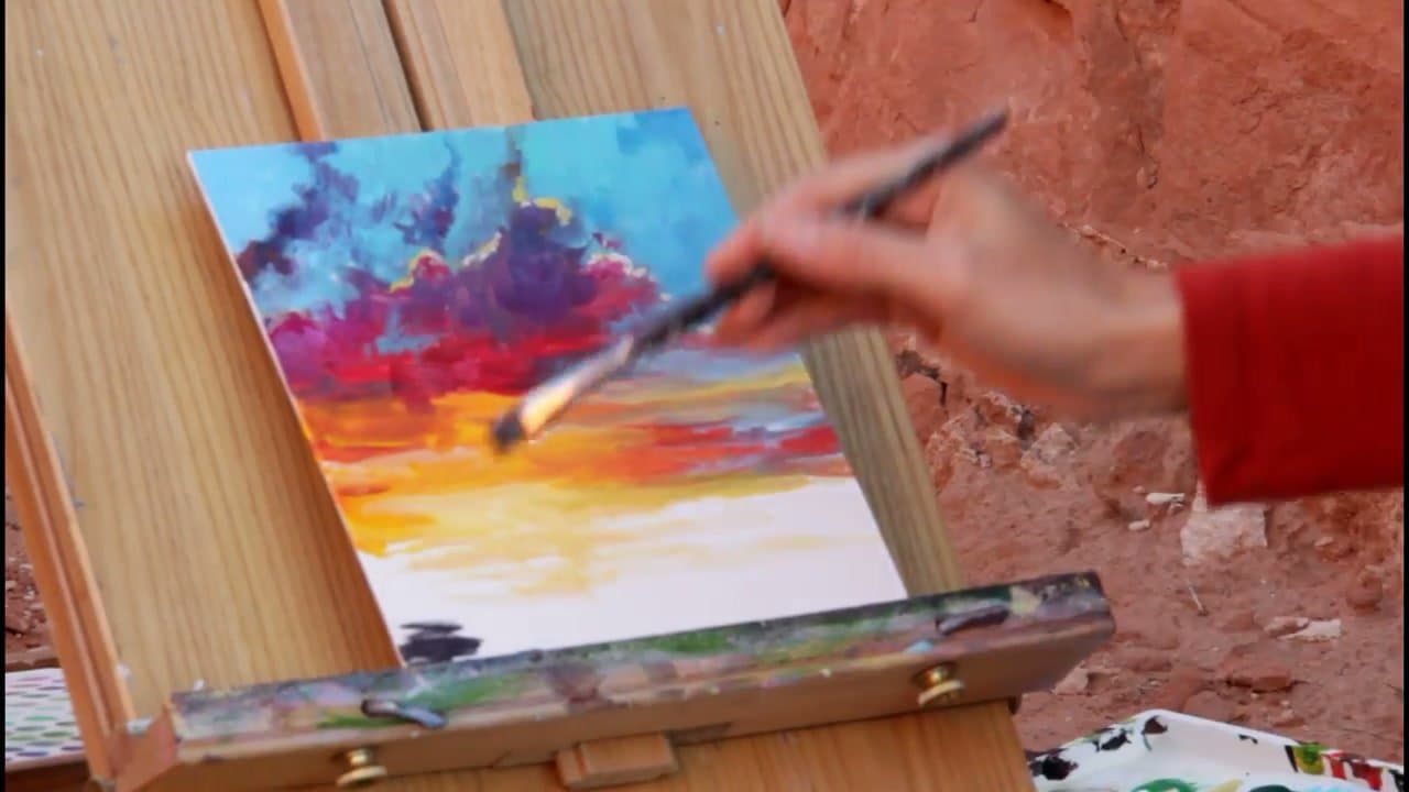
    Start with the warmest colors. Lay yellow where you want the sun, then add orange around it. Brush in horizontal strokes so the colors blend at the edges - sunsets work in horizontal bands, not vertical streaks.

    Don't worry about precision. The bright colors will be softened and partially covered by everything you do after this. Acrylics layer well, so starting bright keeps the colors saturated when you go back over them later.

    Tip:

    Mix a tiny bit of white into the center of the sun area while the paint is still wet. That's where the light is brightest and you want it to glow when you build the drama layer.

    Back to all steps

  2. Step 2: Add Cool Colors and Grays

    Watch this step · 2:20

    Now add the magentas and dioxazine purple above the warm zone. The colors get darker and cooler as you move away from the sun - that's the visual rule that makes a sunset read as a sunset.

    Mix a small bit of black into the purple, then add a touch of white to make a gray. Lay narrow gray strokes between the warm and cool zones - this is the move that makes the bright colors pop. Without grays, the painting looks too saturated everywhere.

    Back to all steps

  3. Step 3: Paint the Upper Sky

    Watch this step · 3:15

    Paint cerulean blue across the top of the canvas. Blend it down into the cool clouds you laid in step 2. If you go over the magentas a little, that's fine - acrylics dry fast enough that the layers don't mix into mud.

    Add a tiny bit of phthalo green to the blue near the warm zone for a turquoise band. The turquoise sits next to the orange and creates a complementary contrast that makes the sun area look brighter than it actually is.

    Back to all steps

  4. Step 4: Add the Drama Layer

    Watch this step · 3:45

    Go back over the brightest spots with pure pigment - thick paint, no blending. Stab strokes of magenta and red into the cool clouds, swipe pure orange and yellow back over the sun area. This is the layer that makes the painting look like it has actual light in it.

    Don't blend at this stage. The whole point is the unblended brushstrokes catch the eye and read as highlights. Use a smaller brush than you used for the base layers.

    Tip:

    Iridescent or metallic acrylic paint over the sun spot reads as actual glow when the painting catches light at an angle. Optional but worth trying.

    Back to all steps

  5. Step 5: Finish the Sky and Add the Foreground

    Watch this step · 4:25

    Soften the transitions with a light dry-brush stroke between zones. Then paint the foreground - water, trees, mountains, whatever fits your composition. Keep it dark so it doesn't compete with the sunset.

    If your foreground is water, bring some of the warm sunset colors down into it as a reflection. If it's mountains or trees, fade the distant ones lighter than the close ones to create depth. Sign the corner and step back.

    Back to all steps

How to Paint a Tree: 5 Acrylic Tree Techniques

Keep going

How to Paint a Tree: 5 Acrylic Tree Techniques

5 steps · about 10 minutes

Keep going with painting

More on this topic, picked for this sunset.

You reached the last step

Save this project to come back to it

Your ticked steps, the free printable and your other saved makes, together in My Projects. Free, no password.

You tapped Save

Save this project for later

We'll email you a link, no password.

How to Paint a Sunset: 5-Step Acrylic Tutorial

  • Your saved projects in one list
  • Your ticked steps on any device

Check your inbox for an email from us. Not there? Look in your spam folder.

Free printable

Printable sheet and shopping list for this project

The bonus is hidden until you sign up.

Free with a free account, no password. Every step above stays open to everyone.

Products Used

The Checklist

How to Paint a Sunset: 5-Step Acrylic Tutorial

Tools
6
Materials
9
Steps
5
Video
9 min

Tools we recommend

As an Amazon Associate we earn from qualifying purchases. Links on this page may be affiliate links - clicking them and buying doesn't change your price, but helps support Crafting Step by Step.

Tags

The Crafter's Weekly

New painting tutorials, every Sunday

One short email with the week's best step-by-step guides. Free, no spam, unsubscribe anytime.

Test your knowledge

Did the lesson stick? Start with this one.

5 questions covering what you just read. No signup, no score saved, and you can stop after this one.

Question 1 of 5

What stroke direction blends best for a sunset sky?

Quick reference

Key takeaways from How to Paint a Sunset: 5-Step Acrylic Tutorial

5 questions, answers, and one-line explanations. Tap to expand.

  1. 1.What stroke direction blends best for a sunset sky?

    Answer: Horizontal strokes - sunsets work in bands

    Vertical streaks read as rain; horizontal bands read as sky.

  2. 2.As you paint AWAY from the sun, should the colors get warmer or cooler?

    Answer: Cooler (purples and blues)

    The cool-as-you-move-away rule is what makes a painted sunset read as a sunset.

  3. 3.Why add narrow GRAY strokes between the warm and cool zones?

    Answer: Without grays, the painting looks too saturated everywhere - grays make the bright colors pop

    Grays in the transition zone make the brights look brighter by contrast.

  4. 4.For the upper sky, what blue is recommended?

    Answer: Cerulean blue, with a touch of phthalo green near the warm zone for a turquoise band

    Cerulean is the right hue for evening sky; phthalo green added gives a turquoise that contrasts with orange.

  5. 5.What is the 'drama layer'?

    Answer: Stab strokes of pure pigment with no blending, over the brightest spots

    Unblended bright stabs of paint catch the eye and read as actual highlights/light.

Did this work for you?

What's next

Related collections

Curated theme pages that include this tutorial.

Similar tutorials

Hand-picked next reads based on the one you just finished.

Liked this painting tutorial?

Pick the crafts you want to hear about. One email every Sunday with new step-by-step tutorials. No spam, easy to unsubscribe.

Get more like this in your inbox

Weekly digest. Pick the categories you want. Unsubscribe anytime.

Send me tutorials about

We only email about new tutorials. Easy unsubscribe anytime.