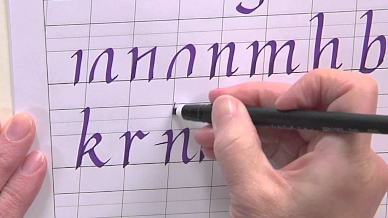
Once your lowercase italic is steady, capitals are the fun part. Joanne Fink, a calligrapher who teaches for Sakura of America, walks through the whole swash capital alphabet in about eight minutes with a 3mm Pigma Calligrapher pen. If you have not learned the small letters yet, start with how to write in italic, which covers the lowercase a to z in the same hand. This page picks up where that one stops.
You need the 3mm pen, the free 3mm italic lettering guide from Sakura's printables page, and smooth paper. That is the whole kit.
What swash capitals are for
Swash caps are decorative capitals with extra entry strokes and tails. Joanne is clear about one rule: use them to start a word, never to write a whole word. A line of swash capitals side by side turns into a tangle. One swash capital followed by lowercase italic looks elegant. Think of a name on a place card, the first letter of a quote, or a monogram on a gift tag.
How tall italic capitals should be
Capitals stand taller than the lowercase x-height but a little shorter than the ascenders on letters like b and l. A common rule of thumb is about 7 nib widths for capitals against 5 for the x-height. The lettering guide takes care of this for you. Line the top of each capital up with the guide and keep the height the same across the row.
The forward slant stays the same as your lowercase, and so does the pen angle. If your capitals lean more than your small letters, the word looks like it is falling over.
Plain or swash: when to use each
Every swash capital has a plain version underneath it. Strip off the entry stroke and the tail and you have a simple italic capital. Use the plain ones in a block of text, an address, or anywhere legibility comes first. Save the swashes for headings, names and the first word of a card. Joanne also points out that some letters, like I, O, S and X, look best with little or no flourish. Not every letter is meant to be dressed up.
Pairing capitals with lowercase
Watch how Joanne writes K and Q. She ends the K swash right at the line and writes a lowercase i next to it, and she drops the Q tail below the line so a lowercase u fits beside it. That is the test for any capital: can a small letter sit comfortably after it? If a swash reaches into the space the next letter needs, shorten it.
Leave a little more space after a swash capital than between two lowercase letters. The flourish needs room to breathe.
Common mistakes with italic capitals
- Changing the pen angle mid-letter. Thick and thin strokes land in the wrong places. Set the angle once and hold it. On diagonal letters like V and W, Joanne does tweak it slightly so the strokes do not differ too much.
- Uneven M shoulders. Keep both humps at the same height so the two counter spaces match. Build the M in several strokes rather than one.
- Swashes colliding. Long tails on G, J and Y can hit the line below. Leave extra line space or shorten the tail.
- Letters getting wide. Italic is a narrow hand. Pull diagonal strokes in on N and X.
Mistakes are part of it. As Joanne says, the worst thing that happens is you write it again, and that is more practice.
Where to go next
For the bigger picture on nibs, paper and practice routines, see how to learn calligraphy and how to do calligraphy. Want a similar look with an ordinary pen? Try faux calligraphy.