How to Do Faux Calligraphy

CalligraphyEasy11:5510 stepsBrowse more →
The finished result: How to Do Faux Calligraphy
Also in:Crafts

By CraftingStepByStepPublished

Based on a video by Loveleigh Loops | Calligraphy & iPad Lettering.

Real calligraphy pens change the thickness of the line depending on how hard you press or which way you go. Faux calligraphy skips all of that. You write the letter with a pen that draws one constant width, then go back and draw in the thick parts by hand. The finished lettering looks the same to anybody who is not holding a magnifying glass, and you can do it with a biro on the back of an envelope.

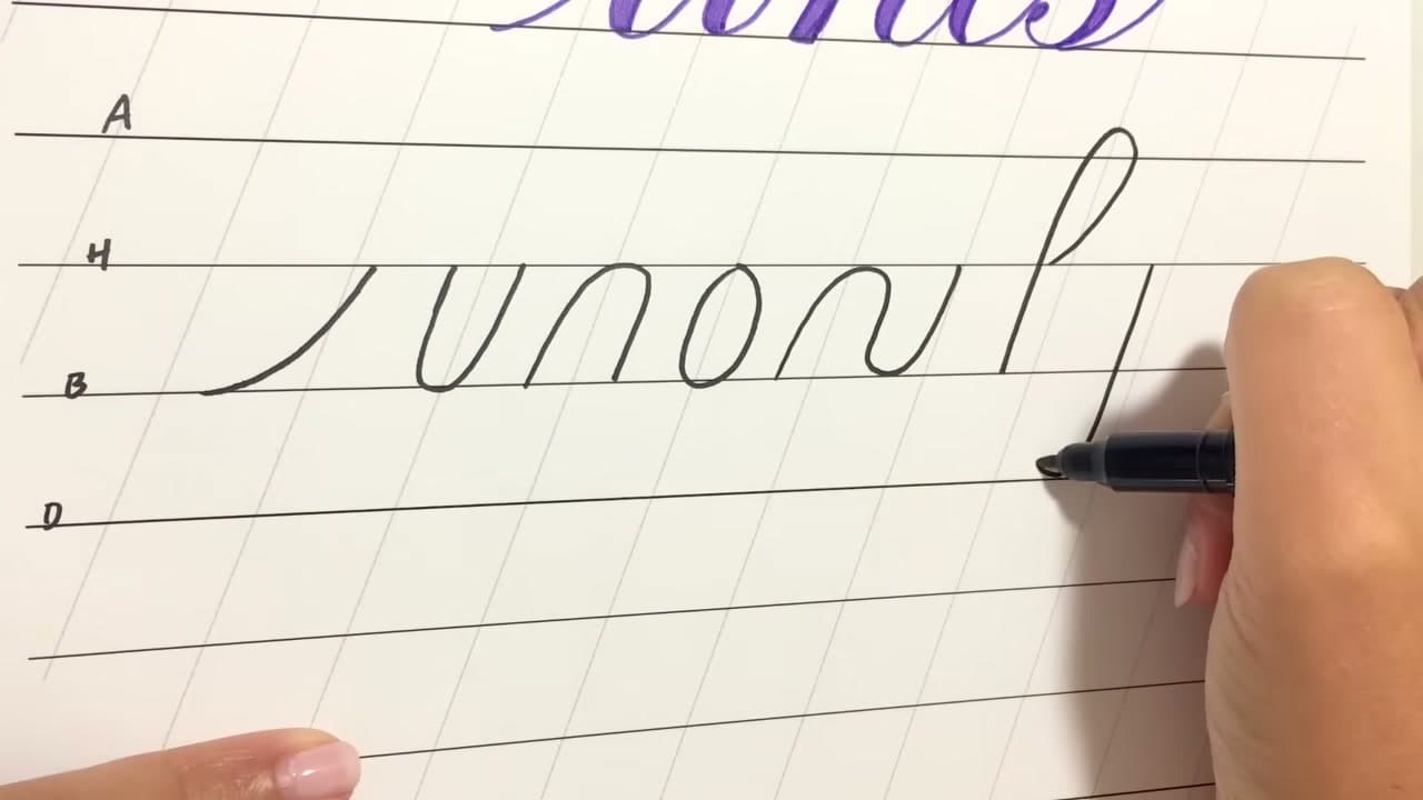
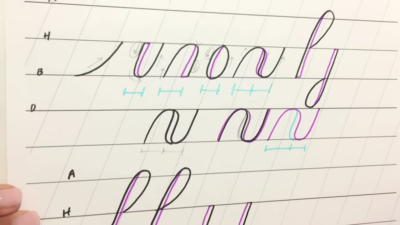
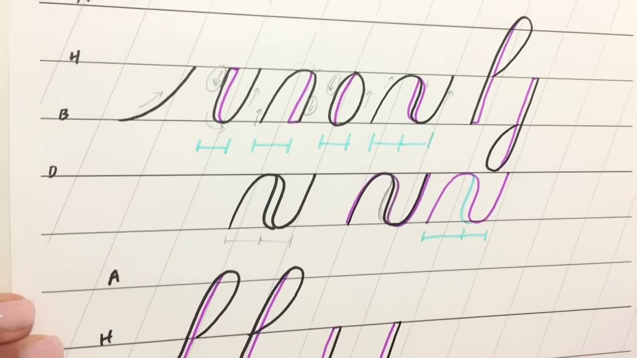
Leigh at Loveleigh Loops starts where every calligraphy course starts, with the seven basic shapes that all the letters are built from. Entrance stroke, underturn, overturn, oval, compound curve, and the two stem loops. Learn where the weight goes on those seven and you already know where it goes on every letter of the alphabet, because the letters are only these shapes joined up.

The rule underneath it all is simple: thicken the downstrokes, leave the upstrokes thin. The fiddly part is where exactly to put that thickness so the letter does not get fatter, and that is most of what this covers. If you want the wider context, the calligraphy overview and how to learn calligraphy set the scene, and brush pen calligraphy is the natural next step once these shapes are automatic.

Step-by-Step Guide

10 steps · about 12 minutes.Check off each step as you go and your progress saves automatically.

1

Step 1: Get Onto Lined Paper

0:25
Step 1: Step 1: Get Onto Lined Paper

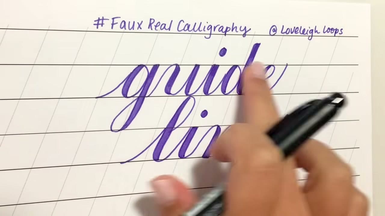
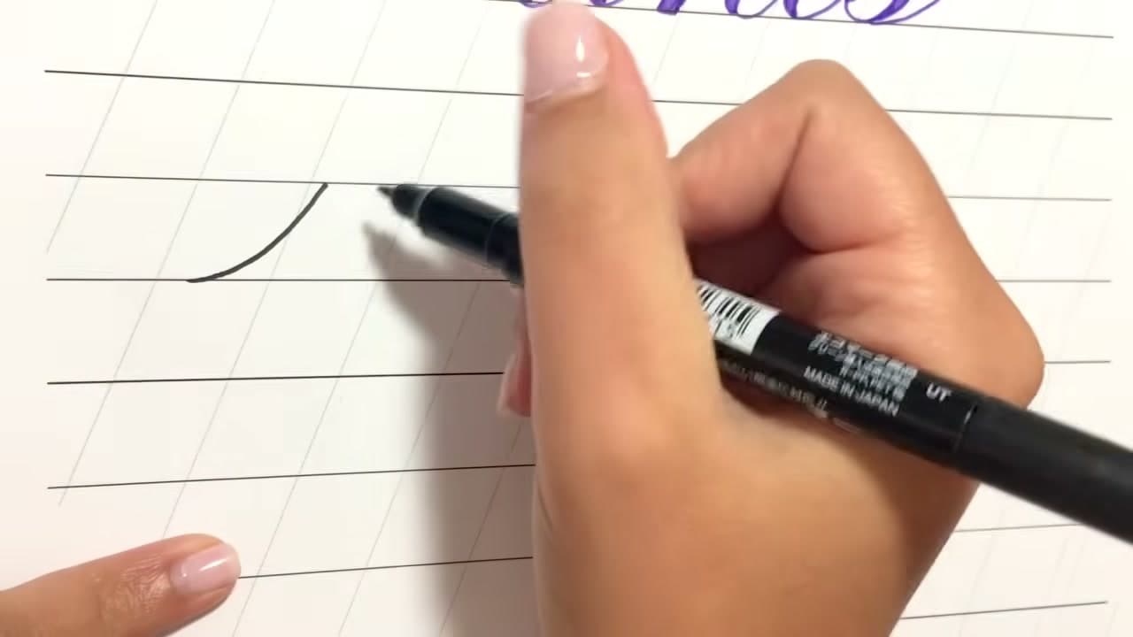
Work on paper with lines. You need a baseline for the letters to sit on and a header line for the x-height to reach, and slanted lines help you keep a consistent angle across the whole word.

Ordinary ruled notebook paper is enough to start. Printable calligraphy guide sheets give you the slant lines too, and if you are practising regularly they are worth printing a stack of.

Tip

Slip a printed guide sheet under a sheet of lightweight paper if you want the lines to help you without showing up in the finished piece. Watch this step
2

Step 2: Pick Any Monoline Pen

1:18
Step 2: Step 2: Pick Any Monoline Pen

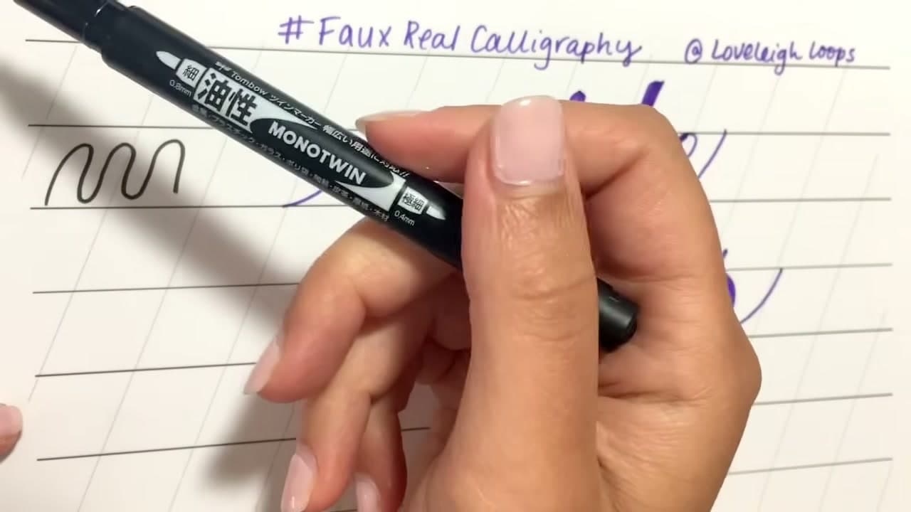
Monoline just means the line does not change width no matter how you push the pen. A fineliner, a gel pen, a pencil, a ballpoint from the kitchen drawer. All fine. This is the entire appeal of faux calligraphy: no special tools.

A dual-tip pen like the Tombow Monotwin is handy because the fine end draws the outline and the fatter end fills the thick sections in, but you can do the whole thing with one pen and a bit more patience.

Tip

Avoid brush pens for this. They change width on their own and fight the technique you are trying to learn. Watch this step

3

Step 3: Draw the Entrance Stroke

2:02
Step 3: Step 3: Draw the Entrance Stroke

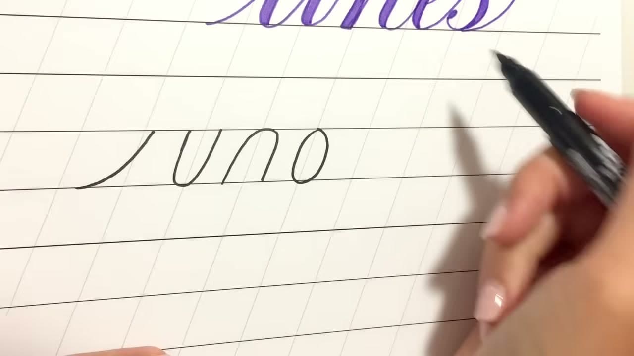
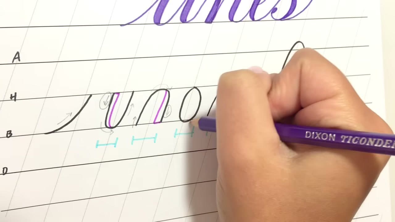
The first shape is the easiest: a thin line curving upward from the baseline. It is the little lead-in that starts most lowercase letters and joins one letter to the next.

It stays thin, always. There is no downward movement in it at all, so when you go back to add weight later this shape gets nothing. That is worth noticing now, because it is the clearest example of the rule.

Tip

Keep the whole shape between the baseline and the header line, following the slant. Consistent slant is what makes a word look deliberate. Watch this step

Products used in this step

4

Step 4: Add the Underturn, Overturn and Oval

2:40
Step 4: Step 4: Add the Underturn, Overturn and Oval

Three more shapes. The underturn is a U that starts at the header line, dips to the baseline and comes back up. The overturn is the same thing upside down. The oval is an o, drawn in one direction so you always know which side is the downstroke.

Fit each one between the baseline and the header line, leaning on the same slant. Getting them all the same size and the same angle is more of the work than getting the shapes right.

Tip

Always draw the oval the same way round, starting at the top and going anticlockwise. Consistency here means the shade always lands on the same side. Watch this step

5

Step 5: Finish With the Compound Curve and Two Stem Loops

3:33
Step 5: Step 5: Finish With the Compound Curve and Two Stem Loops

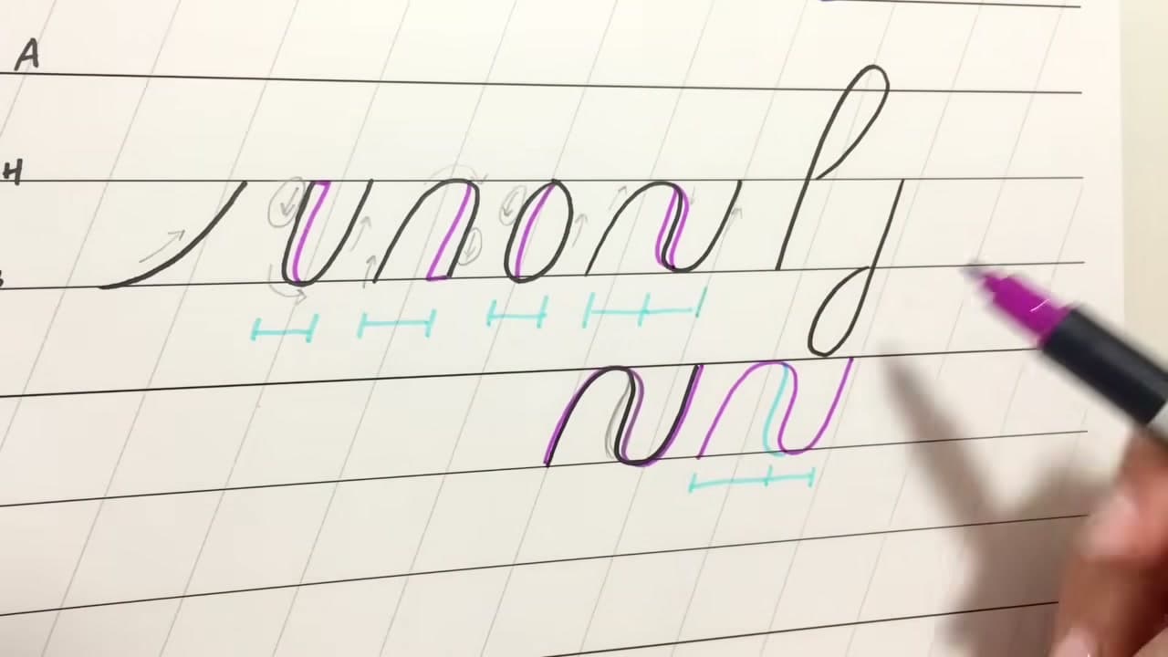
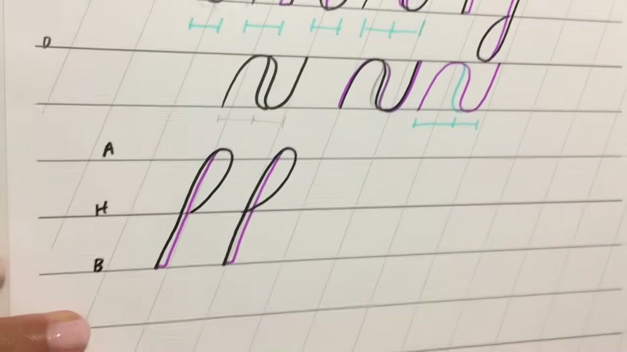
The compound curve is an underturn running straight into an overturn, which is what the middle of an n or an m is made of. Then the two loops: an ascending loop that climbs above the header line, and a descending loop that drops below the baseline.

Mark an A line above and a D line below your normal writing lines so the loops have somewhere consistent to reach. Every ascender in a word should hit the same height, and every descender the same depth.

Tip

The ascending loop starts at the header line, goes up, loops around and cuts back down. Starting it from the baseline gives you an oddly tall, thin loop. Watch this step

6

Step 6: Thicken Only the Downstrokes

4:08
Step 6: Step 6: Thicken Only the Downstrokes

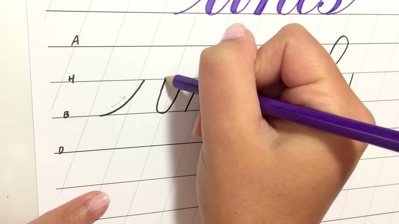
Here is the whole technique in one line. Go back over each shape and add weight to any part of it where the pen travelled downward. Upward and sideways movement stays thin.

Go through the seven shapes and mark them off. The entrance stroke went up only, so nothing. The underturn came down and back up, so the first half gets weight. The overturn went up, over and down, so the last half does. The oval has a downstroke on one side only. Once you see it this way you never have to guess again.

Tip

If you cannot remember which way a stroke went, redraw it slowly and watch your hand. The answer is always in the direction, never in the shape. Watch this step

7

Step 7: Add the Weight on the Inside

5:42
Step 7: Step 7: Add the Weight on the Inside

This is where most people go wrong. Add the thickness on the inside of the shape, running along the existing downstroke, so the outside edge of the letter does not move.

Draw it on the outside and the letter grows. Do that inconsistently across a word and the letters end up different widths, which reads as wobbly even when every individual shape is fine. Keeping the outline fixed and eating inward keeps the whole word even.

Tip

Outline the thick section first, then fill it in. Trying to freehand a thick stroke in one pass gives you a lumpy edge. Watch this step

8

Step 8: Keep Every Shade the Same Width

7:58
Step 8: Step 8: Keep Every Shade the Same Width

All the thick sections in a word should be the same weight as each other. This is easy on a single shape and surprisingly hard across a whole word, so check it as you go.

The compound curve is the awkward one. Its downstroke sits in the middle of the shape with a hump on either side, so adding weight to just one side leaves the two humps different widths. The fix is to widen the first hump slightly as you draw the shape, then bring the shade inward. Alternatively add half the thickness to each side of the line, though that leaves a faint line down the middle if you are not filling the shape solid.

Tip

If you are going to fill your letters in solid at the end, none of this matters much. It only shows when you leave the thick sections hollow or patterned. Watch this step

9

Step 9: Leave a Gap Where the Loops Close

10:28
Step 9: Step 9: Leave a Gap Where the Loops Close

On both stem loops, stop the returning line just short of where it would meet the loop. That small gap gives the shade somewhere to go without a hard line running through the middle of the loop.

Make the loops a bit wider than feels natural too. Adding weight to the inside of a tight loop closes the hole up completely and you lose the shape.

Tip

On a descending loop it is often easier to draw the inside line first, loop around, and add the shade on the outside instead. Watch this step

10

Step 10: Drill the Shapes Until They Are Automatic

11:32
Step 10: Step 10: Drill the Shapes Until They Are Automatic

Fill a page with the seven shapes, then another. Every letter in the alphabet is these shapes joined together, so time spent here is not practice for the real thing, it is the real thing.

Once the shapes and the shading feel automatic, start on letters. Three at a time is plenty. The hand learns this the way it learns anything physical, by repetition rather than by understanding.

Tip

Date the corner of each practice page and keep them. A month of pages side by side is the most encouraging thing you will see. Watch this step

Keep going

How to Write in Calligraphy - 7 Step Beginner Tutorial

7 steps · about 10 minutes

Products Used

☐ The Checklist

How to Do Faux Calligraphy

Tools
3
Materials
3
Steps
10
Video
12 min

Tools we recommend

Your Guide

Loveleigh Loops | Calligraphy & iPad Lettering

As an Amazon Associate we earn from qualifying purchases. Links on this page may be affiliate links - clicking them and buying doesn't change your price, but helps support ShowMeStepByStep.

Tags

Sunday How-To

New calligraphy tutorials, every Sunday

One short email with the week's best step-by-step guides. Free, no spam, unsubscribe anytime.

Did this work for you?

What's next

Related collections

Curated theme pages that include this tutorial.

Weekly Digest

Liked this calligraphy tutorial?

Pick the categories you want to hear about. Weekly digest of new step-by-step tutorials. No spam, easy unsubscribe.

Send me tutorials about

We only email about new tutorials. Easy unsubscribe anytime.