Italic is the calligraphy hand that beginners learn first for a reason. The strokes are mostly straight lines with a few graceful curves, the pen stays at one consistent angle the whole way through, and every lowercase letter is built from one of just four basic shape families. Once you can write the families, you can write the alphabet.
Joanne Fink is a working calligrapher who has been teaching italic for decades. In this video for Sakura, she takes you through the entire lowercase italic alphabet in under eleven minutes - not by drilling letter by letter, but by grouping the 26 letters into four families that share the same core strokes. Learn the family, learn five or six letters at once.
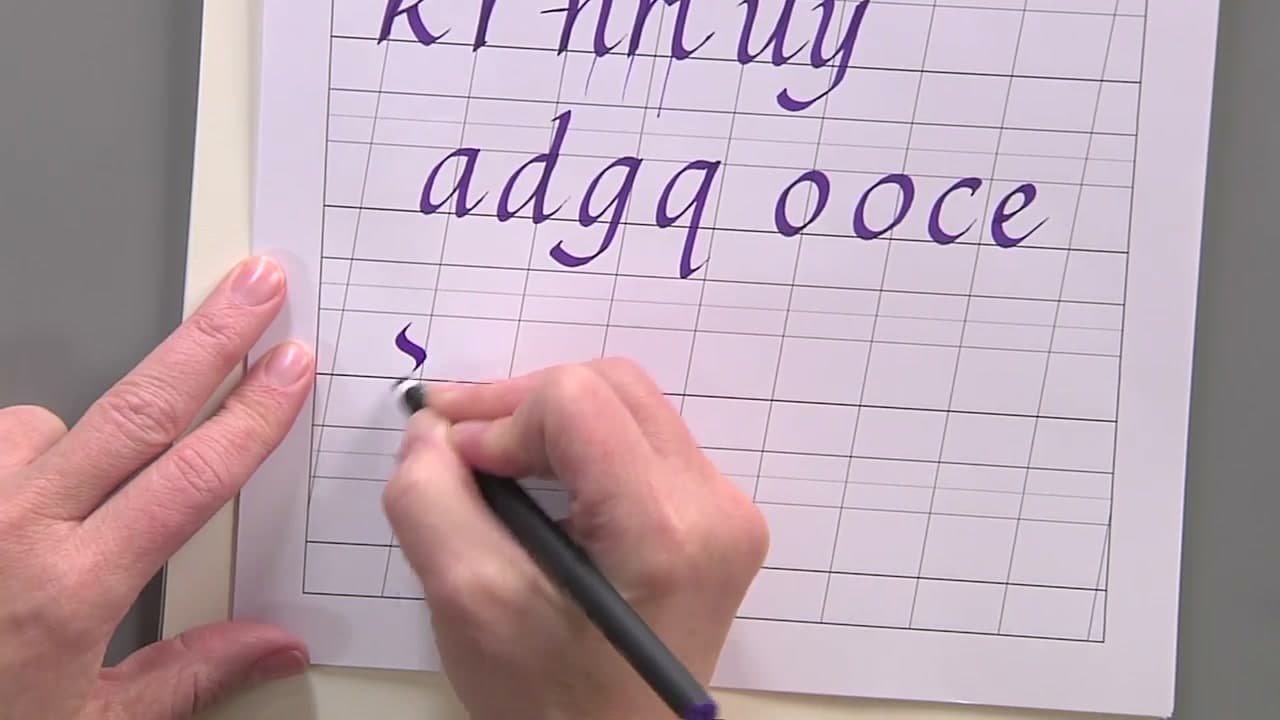
You will need a 3mm Sakura Pigma Calligrapher pen and Sakura's free 3mm italic lining guide (download from sakuraofamerica.com/printables). The lining guide gives you ruled rows already sized to the 3mm nib so your x-height is correct on the first try. If you would rather start with a different letterform, the calligraphy and hand lettering theme page has every alphabet style we have written up so far.
What Italic Handwriting Style Actually Is
Italic sits between everyday handwriting and formal calligraphy. It came out of Renaissance Italy as a quicker way to write the rounded humanist script, which is why it leans forward. The letters stay separate instead of joining up, so it stays readable even when you speed up.
Three things define the hand. The pen angle holds at 35 degrees and never moves. The letters slant forward by roughly 5 degrees. And the round letters are ovals rather than circles, which is what keeps the whole alphabet narrow and even.
Italic Handwriting or Italic Calligraphy?
Both names describe the same letterforms. What changes is the tool and the pace.
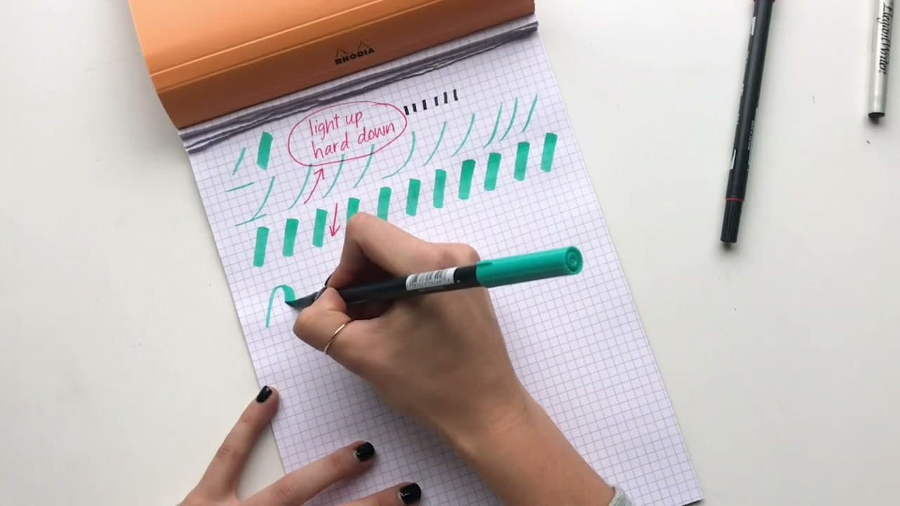
Written slowly with a broad-edged pen and spaced carefully, italic is calligraphy. Written with an ordinary pen at normal speed, those same shapes become a legible daily hand. People learning italic for their handwriting keep the slant and the oval bowls and let go of the thick-and-thin contrast, since that part needs a chisel nib to happen at all.
Start with the calligraphy version even if handwriting is the goal. A broad nib shows you exactly where your pen angle drifts, and seeing that is what fixes your shapes.
The Italic Alphabet, A to Z
All 26 lowercase letters come out of four families. Learn a family and you get five or six letters at once, which is why the video does not run alphabetically.
- Straight: i, l, t, f, j. One slanted down-stroke with a small exit curve.
- Branching: n, m, h, b, p, k, r, plus u and y as inversions. A stem, then a thin upstroke that branches into an arch.
- Elliptical: a, d, g, q, o, c, e. An oval bowl with a stem attached to it.
- Diagonal: s, v, w, x, z. Steeper strokes, and the s is the hardest letter in the set.
Capitals are a separate study. They are built on Roman proportions rather than these four families, so most people learn the lowercase first and use plain printed capitals in the meantime.
Ruling Your Own Guidelines
You do not have to print Sakura's sheet. Set the body of the letters at five nib widths, mark ascenders and descenders three to four nib widths beyond that, then add slant lines about 5 degrees off vertical so the lean stays consistent across the page.
Rule the guidelines on a separate sheet and slip it underneath if your paper is thin enough to see through. Lines drawn on the practice sheet itself are difficult to erase without lifting ink.
Once the lowercase alphabet feels steady, cursive is the natural next hand to try, and our general calligraphy guide covers the pens and papers worth buying once you move past practice sheets.