How to Do Calligraphy and Hand Lettering for Beginners

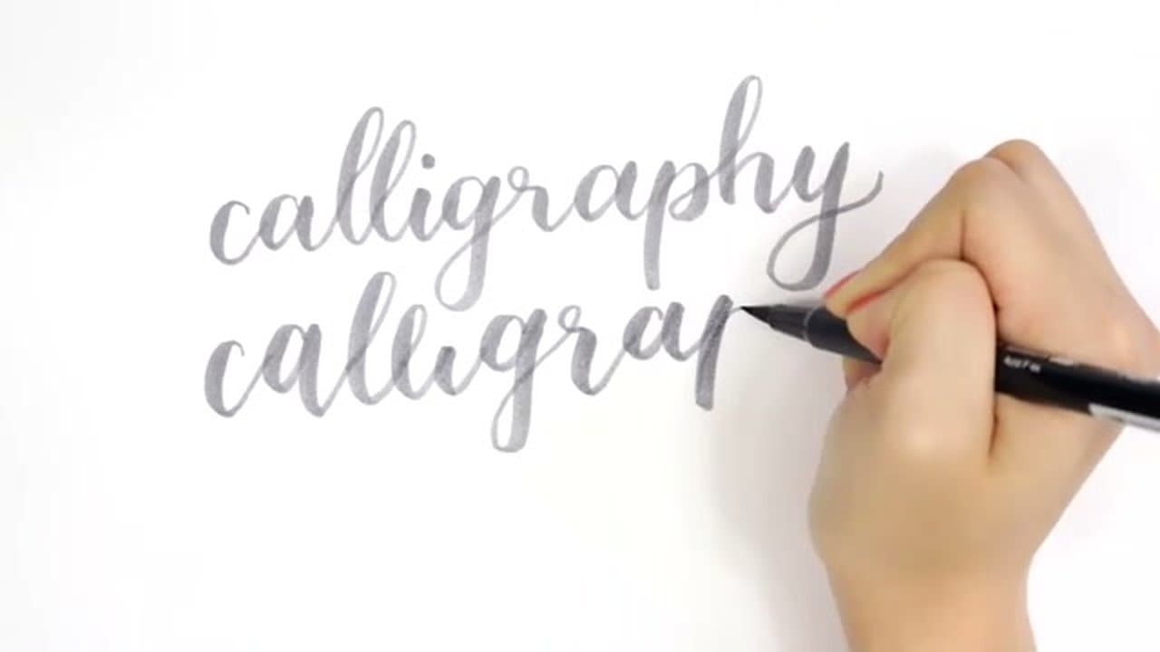
The finished result: How to Do Calligraphy and Hand Lettering for Beginners
Also in:Crafts

By CraftingStepByStepPublished Updated

Based on a video by AmandaRachLee.

Modern calligraphy isn't traditional pointed-pen work. It's brush lettering - softer, more forgiving, and what most people picture when they search for it. A brush pen does the job the dip pen and ink pot used to.

The technique reduces to one rule: light pressure on every upstroke, heavy pressure on every downstroke. That thin/thick contrast is what makes writing read as calligraphy rather than cursive. Ten minutes a day and it clicks inside a week.

What you need

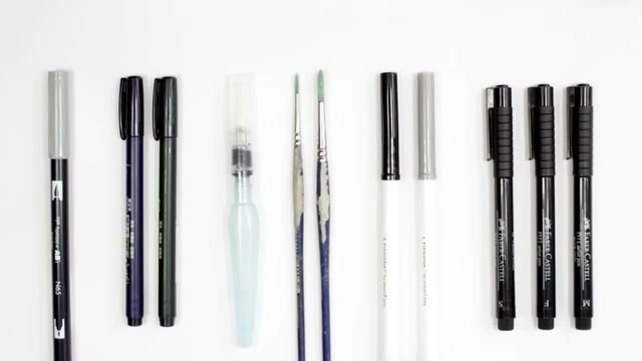
  • One brush pen. Tombow Dual Brush for large writing, Fudenosuke for small.
  • Smooth paper. Printer paper for drills, marker paper for keepers.
  • A fine liner, for the faux method before you buy a brush pen.
  • Pencil and ruler for guidelines.

Working through the calligraphy alphabet

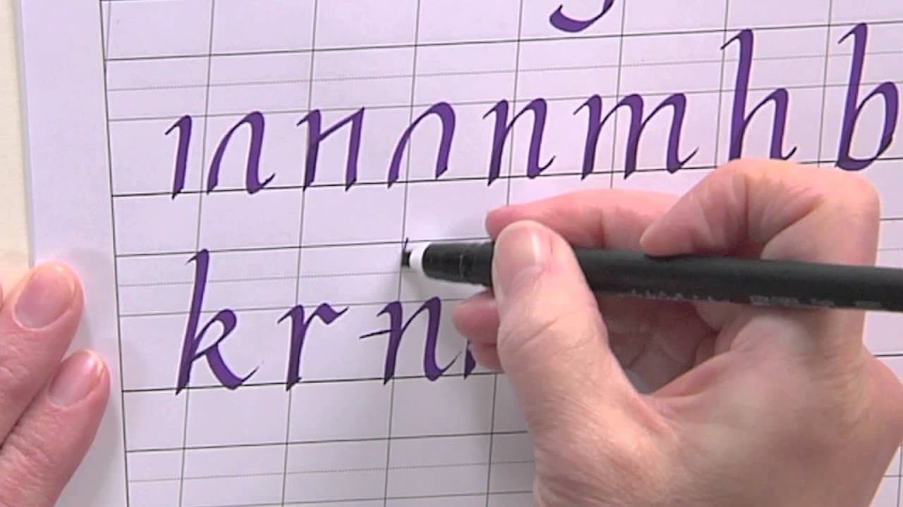
Grinding the calligraphy alphabet A to Z is the slow way round. The lowercase letters come out of a few repeated shapes - learn one and you pick up a whole group.

  • Ovals - a, c, d, g, o, q. All open with the same round downstroke. Get it consistent and six letters land at once.
  • Underturns - i, u, w, t. Thick down, curve at the bottom, thin back up.
  • Overturns - m, n, v, y. Thin up, arch over, thick down.
  • Loops - b, f, h, k, l. The upper line letters, climbing past the x-height to the top guide. Keep them one width or the word goes lopsided.
  • Loners - e, r, s, z, x, p. Nothing to group them with. Drill them alone.

The s causes most of the grief: its spine changes direction mid-stroke, so pressure comes off and back on inside one movement. Capitals come last.

Calligraphy versus hand lettering

The two get swapped constantly and they are different crafts. Calligraphy is written: a letter comes out of one stroke, and the thick parts exist because you leaned on the pen while it moved. Hand lettering is drawn: you outline the letter and fill it in. The steps here teach the written kind; step 7 crosses into lettering on purpose, covered on its own at faux calligraphy.

Dip pen, brush pen, or the marker in your drawer

A pointed dip pen gives the finest hairlines and fights you for them - the nib catches on upstrokes and you dip every few words. Good for the classical look, wrong as a starter. A brush pen gets the same contrast with none of the mess, and every step below uses one. More on tips in brush pen calligraphy. A rounded-tip marker works too, and plenty of people learn on Crayola Super Tips.

The basic strokes

Drill strokes before letters: entrance stroke, full-pressure downstroke, underturn, overturn, compound curve, oval, ascending loop, descending loop. The transition is the whole game - pressure changes while the pen is moving. Early writing goes wrong when the hand slams down at the top of a downstroke and lets go at the bottom - a blunt club instead of a taper.

Italic handwriting style is the hand most people learn first, since the pen angle never changes. Learning calligraphy has a longer practice plan, and writing in cursive sharpens the joins.

When it goes wrong

  • Ink feathers. Toothy stock wicks ink sideways. Move to smooth marker paper.
  • The tip scratches going up. Too much pressure, or the pen is too upright. Drop it nearer 45 degrees.
  • Shaky lines. A tight grip tires the hand fast. Loosen off and slow through the bends.
  • The slant drifts. Rule faint pencil slant lines and erase them once the ink is dry.

Credit to AmandaRachLee for the source video.
What you'll need

Step-by-Step Guide

7 steps · about 9 minutes.Check off each step as you go and your progress saves automatically.

1

Gather Your Supplies

2:10
Step 1: Gather Your Supplies - How to Do Calligraphy and Hand Lettering for Beginners

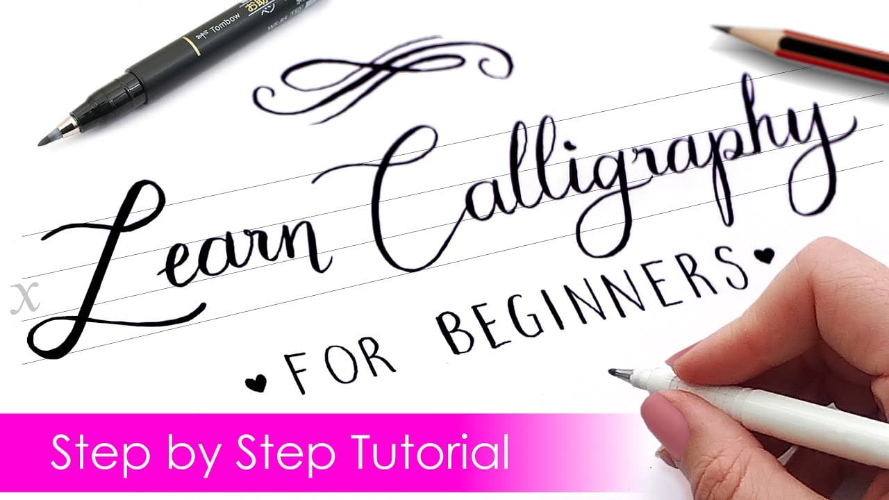
The most popular starter tool is Tombow Dual Brush Pens - one tip works as a brush pen, the other as a fine line marker. Tombow Fudenosuke pens are smaller and more precise, good for tighter writing. Crayola Super Tips markers are a cheap alternative that work surprisingly well. Watercolor brushes and Pentel water brushes work too if you already have them.

Whatever pen you pick, the paper has to be smooth. Any texture frays the marker tip after a few strokes and breaks up the line. Standard printer paper works for practice; smooth marker paper is the upgrade once you're ready to make finished pieces.

2

Practice Upstrokes and Downstrokes

2:25
Step 2: Practice Upstrokes and Downstrokes - How to Do Calligraphy and Hand Lettering for Beginners

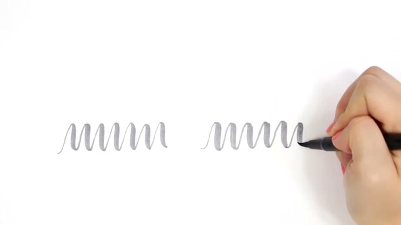
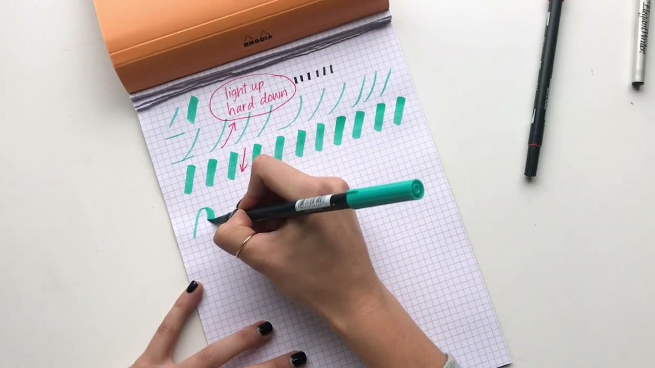
Before any letters, practice the pressure mechanic on its own. Draw a wavy line that looks like a series of side-by-side U shapes. On every upstroke (the part going up), press lightly so the line is thin. On every downstroke (the part going down), press hard so the line gets thick.

Hold the pen at a diagonal, not perpendicular to the paper. The diagonal grip gives you control over the pressure transition - if you hold the pen straight up, you can't ease into a heavier stroke. Do this exercise across a full page before you ever try a letter.

Tip

The wavy line exercise is also where you find the right grip. If your wrist gets tired or your strokes are inconsistent, you're gripping too hard. Loosen up.

Used in this stepCalligraphy Practice Pad
3

Learn the Typography Guidelines

2:55
Step 3: Learn the Typography Guidelines - How to Do Calligraphy and Hand Lettering for Beginners

Draw four parallel horizontal lines like the ruled paper from kindergarten. From top to bottom: ascender line, top guide, baseline, descender line. The middle space (between top guide and baseline) is the x-height - that's where lowercase letters like a, n, o, x sit.

Letters with ascenders (h, t, l, b, k) climb up to the top line. Letters with descenders (p, j, q, g, y) drop down past the baseline to the descender line. Knowing where each letter belongs keeps your writing consistent across a whole word or page.

4

Practice the Full Alphabet

3:50
Step 4: Practice the Full Alphabet - How to Do Calligraphy and Hand Lettering for Beginners

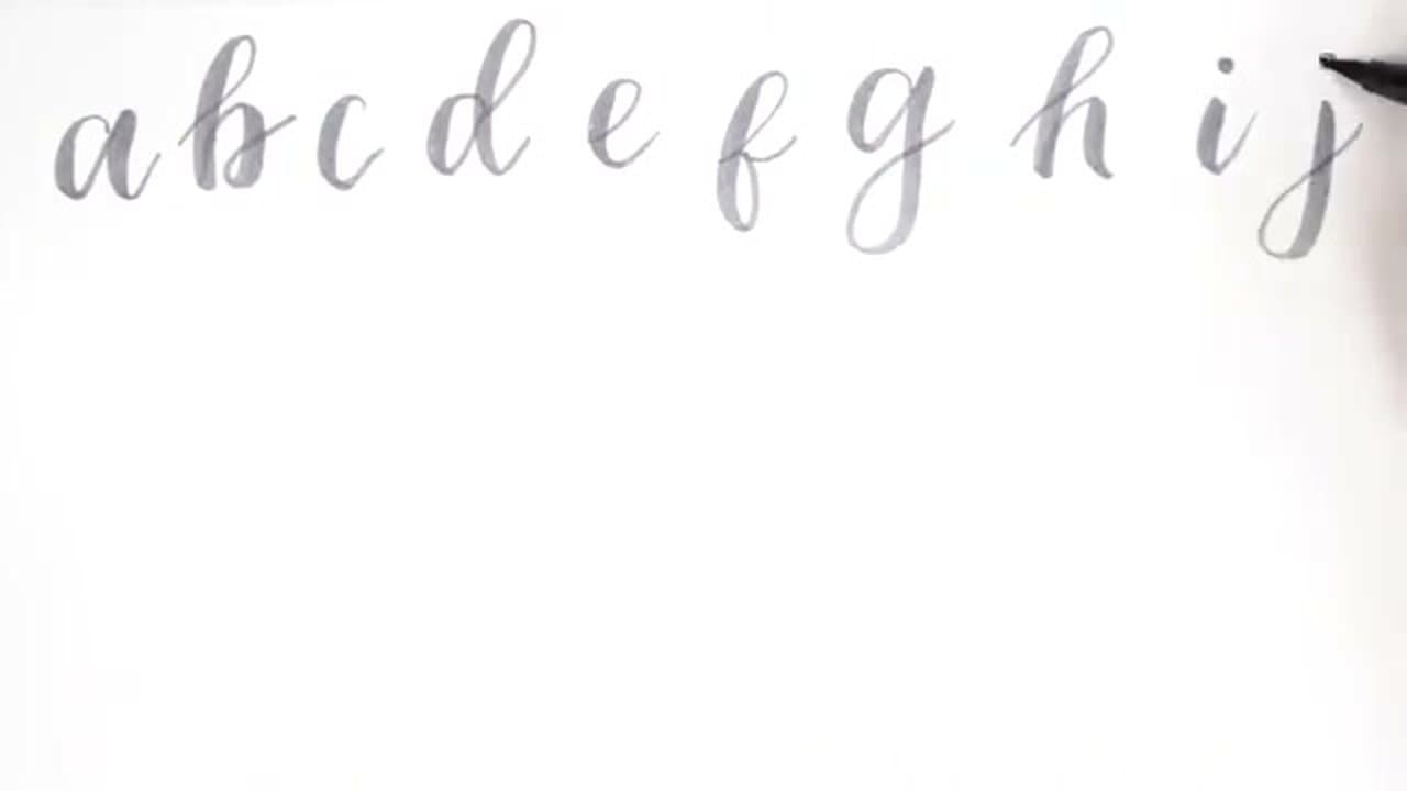
Work through every lowercase letter with thin upstrokes and thick downstrokes. There's no single correct way to draw any letter in modern calligraphy - try several variations of S, R, F, K and pick what you like.

Repeat the alphabet many times. This is the bulk of the actual practice. By round three or four you'll start to feel which letter shapes feel natural to your hand and which need more work.

5

Connect Letters Into Words

4:30
Step 5: Connect Letters Into Words - How to Do Calligraphy and Hand Lettering for Beginners

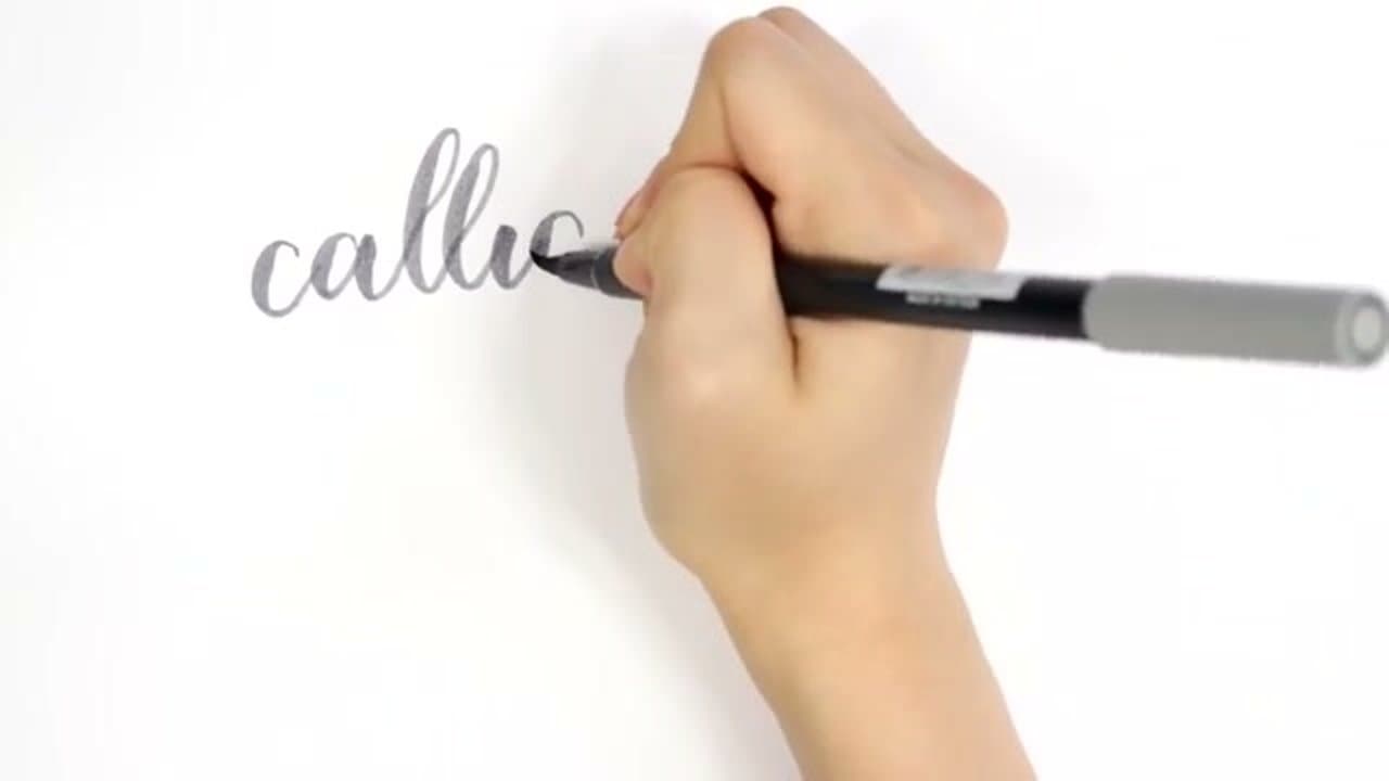
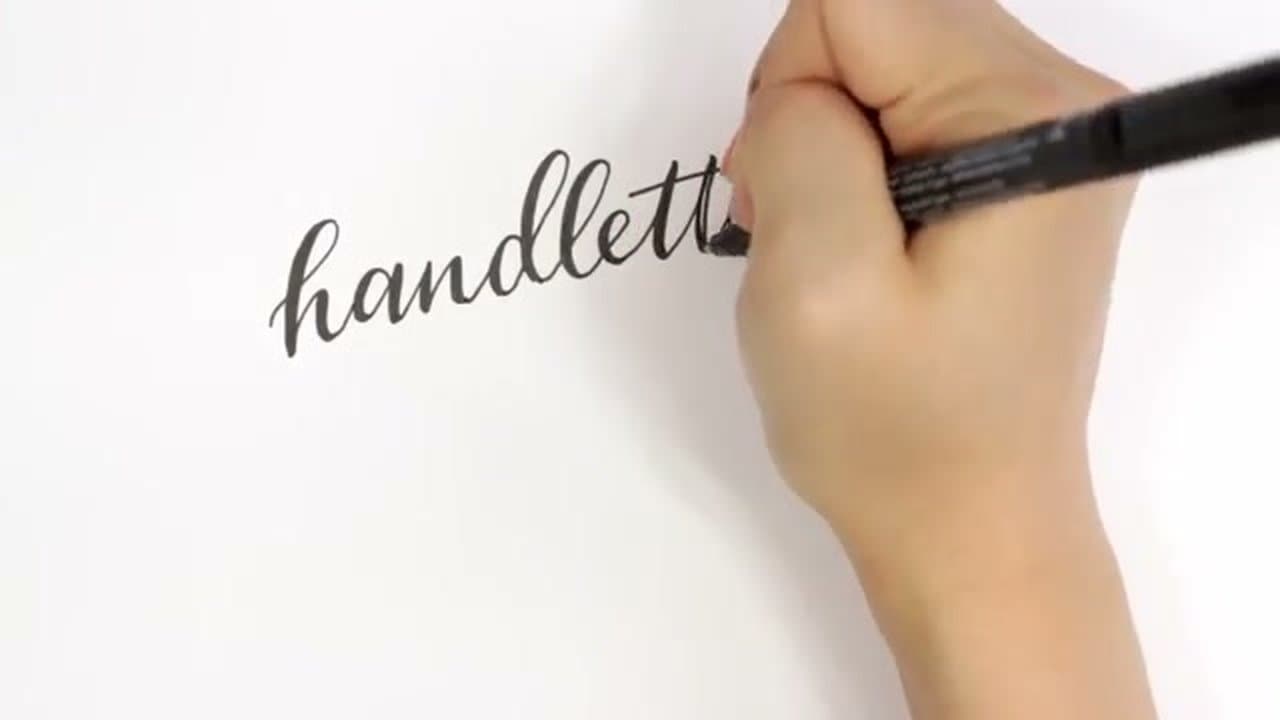
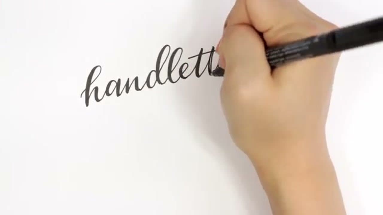
Move at a steady pace through a whole word. Too fast and the strokes go sloppy; too slow and the line gets shaky. The thin upstroke at the end of one letter naturally feeds into the thick downstroke of the next, so the connections feel automatic once the alphabet practice is solid.

If you want consistent x-height across a word, pencil in the typography guidelines first and erase them after the ink dries. Practice short words first (cat, hello, calligraphy) before tackling phrases.

6

Add Personality with Baseline and Spacing

5:05
Step 6: Add Personality with Baseline and Spacing - How to Do Calligraphy and Hand Lettering for Beginners

Once a word is comfortable, start playing with the rules. Vary the baseline so each letter sits at a slightly different height - one letter dips low, another rises high. The result feels whimsical and hand-drawn rather than mechanical.

Or change the spacing. Squish the letters together for a tall, narrow look, or open them up for an italicized airy feel. There's no formula. Pick what fits the message and the mood.

7

Fake Calligraphy with a Fine Liner

7:40
Step 7: Fake Calligraphy with a Fine Liner - How to Do Calligraphy and Hand Lettering for Beginners

If you don't want to buy a brush pen, you can fake the look with any fine-tipped pen. Write a word in regular cursive at normal size. Then go back over each downstroke with a parallel line right next to it - hold the pen on the same side of the letter throughout so the thickening is consistent.

Fill in the gap between the two lines with the same pen and the letter looks just like brush calligraphy. Slower than a real brush pen but works with any pen you have, and it's a great gateway technique before committing to brush pen supplies.

Tip

Faux calligraphy is also useful when the pen you want isn't available - chalk markers, paint pens, gel pens. Anything that won't bleed when you double up the line works.

Keep going

How to Do Brush Pen Calligraphy - 7 Step Beginner Guide

7 steps · about 7 minutes

Products Used

The Checklist

How to Do Calligraphy and Hand Lettering for Beginners

Tools
5
Materials
3
Steps
7
Video
9 min

Tools we recommend

Your Guide

AmandaRachLee

As an Amazon Associate we earn from qualifying purchases. Links on this page may be affiliate links - clicking them and buying doesn't change your price, but helps support CraftingStepByStep.

Tags

Sunday How-To

New calligraphy tutorials, every Sunday

One short email with the week's best step-by-step guides. Free, no spam, unsubscribe anytime.

Test your knowledge

Did the lesson stick? Start with this one.

5 questions covering what you just read. No signup, no score saved, and you can stop after this one.

Question 1 of 5

What single pen brand is the most popular starter for modern calligraphy?

Quick reference

Key takeaways from How to Do Calligraphy and Hand Lettering for Beginners

5 questions, answers, and one-line explanations. Tap to expand.

  1. 1.What single pen brand is the most popular starter for modern calligraphy?

    Answer: Tombow Dual Brush Pens

    Tombow Dual Brush Pens are the most-pinned starter set; one tip is brush, the other a fine line marker.

  2. 2.What's the entire pressure rule of modern calligraphy?

    Answer: Light pressure on upstrokes, hard pressure on downstrokes

    Thin on every up, thick on every down - the whole technique reduces to one rule.

  3. 3.What kind of paper should you AVOID?

    Answer: Anything textured like watercolor or sketch paper

    Any texture frays the marker tip after a few strokes and breaks up the line.

  4. 4.What's the 'x-height' guideline?

    Answer: The middle space between top guide and baseline where lowercase letters sit

    The x-height is where the main body of lowercase letters (a, n, o, x) lives.

  5. 5.How can you 'fake' calligraphy without a brush pen?

    Answer: Write in cursive, then draw a parallel line next to each downstroke and fill the gap

    Faux calligraphy doubles the downstroke lines and fills the gap; works with any pen.

Did this work for you?

What's next

Related collections

Curated theme pages that include this tutorial.

Weekly Digest

Liked this calligraphy tutorial?

Pick the categories you want to hear about. Weekly digest of new step-by-step tutorials. No spam, easy unsubscribe.

Send me tutorials about

We only email about new tutorials. Easy unsubscribe anytime.