How to Do Brush Pen Calligraphy - 7 Step Beginner Guide

Save it for later. We'll email you a link, no password.

Find it again on your phone or computer, with your finished steps ticked.

You tapped Save

Save this project for later

We'll email you a link, no password.

How to Do Brush Pen Calligraphy - 7 Step Beginner Guide

  • Your saved projects in one list
  • Your ticked steps on any device

Check your inbox for an email from us. Not there? Look in your spam folder.

  • 7 steps
  • 6:52 video
  • Difficulty: Easy
  • About 30 minutes
  • Materials about $15 to $25
  • Calligraphy

Based on a video by The Happy Ever Crafter

Opens their YouTube channel

Steps written out by Crafting Step by Step · Published · Updated

The finished result: How to Do Brush Pen Calligraphy - 7 Step Beginner Guide
Also in:Crafts

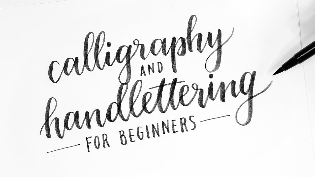
Modern calligraphy looks intimidating until you learn the rule that does all the work. Light pressure on the way up. Hard pressure on the way down. That's it. Every thin line and every thick line you see in calligraphy comes from those two pressures applied with a flexible brush pen.

Becca from The Happy Ever Crafter walks beginners through the full setup in this 7-step guide: how to tell a real brush pen from a chiseled calligraphy pen, why paper choice matters, the 45-degree grip, light upstrokes, heavy downstrokes, and finally how those strokes link up into letters. She uses Tombow Dual Brush Pens on Rhodia paper - both are forgiving enough for day-one practice and standard kit for bullet journal and brush lettering hobbyists.

If you don't own a brush pen yet, start with how to do calligraphy - same pressure idea taught with a pencil. Already comfortable with cursive script? How to write in cursive is the closest neighbor for everyday handwriting. Italic is the more formal cousin if you'd rather lean classic - see how to write in italic.

What you'll need

Free, for this project

Get this checklist by email

  • All 6 tools and materials, with tick boxes
  • A link to print all 7 steps on paper, to keep by you while you craft

No password. The whole tutorial stays free on this page.

Quick answer

Learn modern brush pen calligraphy with Tombow pens. An easy project: about 30 minutes. Materials cost about $15 to $25. You need 6 things, including Tombow Dual Brush Pen set, Smooth marker paper and Optional brush lettering practice workbook. The 7 steps start with make Sure You Have a Real Brush Pen, pick the Right Pen and Smooth Paper, hold the Pen at 45 Degrees, practice Light Upstrokes, practice Heavy Downstrokes and the One Rule - Light Up, Hard Down.

Step-by-step guide

7 steps, about 7 minutes. Tap a picture to jump to that step. Your progress saves automatically.

Tick each step off as you go.

  1. Step 1: Make Sure You Have a Real Brush Pen

    Watch this step · 0:21
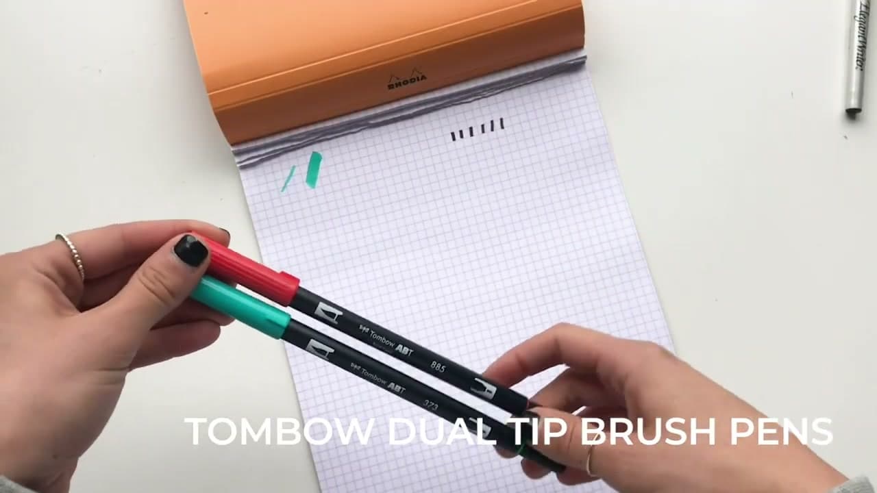
    A brush pen and a calligraphy pen are not the same thing. Walk into any art store and the 'calligraphy' rack will hand you a pen with a chiseled flat tip. Push down hard, push down soft - same line width every time. That's not what you want for modern brush calligraphy.

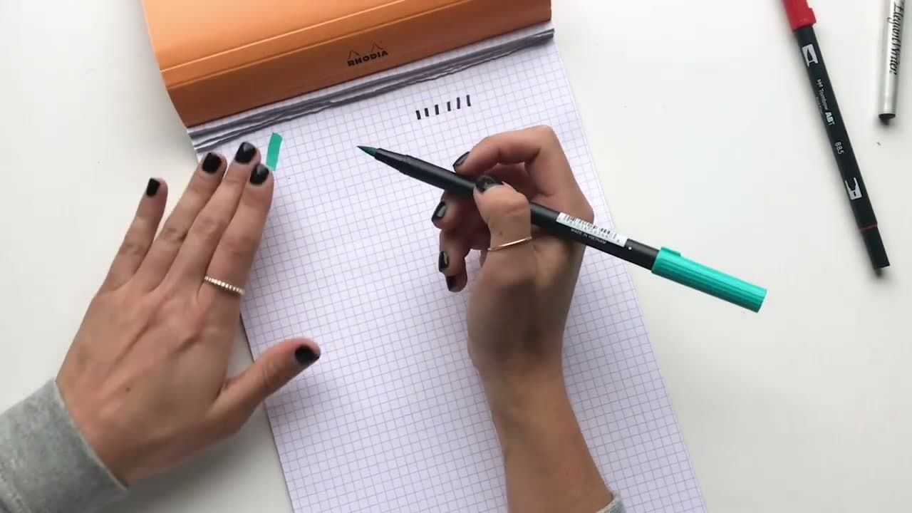
    A real brush pen has a flexible tip. Press light and the line goes thin. Press hard and the line goes thick. That difference in line weight - controlled by pressure alone - is the entire foundation of brush lettering. Before you buy anything else, confirm the tip flexes when you push it.

    Tip:

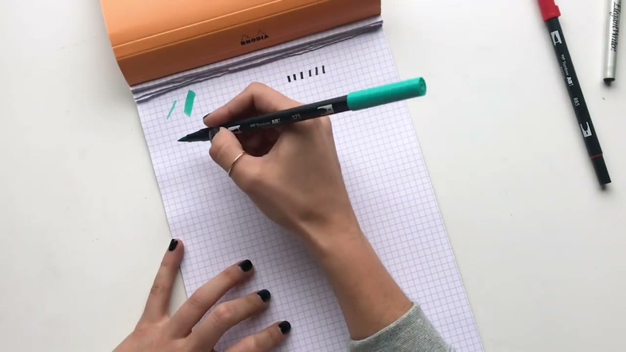
    Becca uses Tombow Dual Brush Pens in this tutorial. The big end is the brush tip you'll letter with. The small felt-tip end on the other side is a regular marker - useful for decoration but not for calligraphy.
    Back to all steps

  2. Step 2: Pick the Right Pen and Smooth Paper

    Watch this step · 1:35

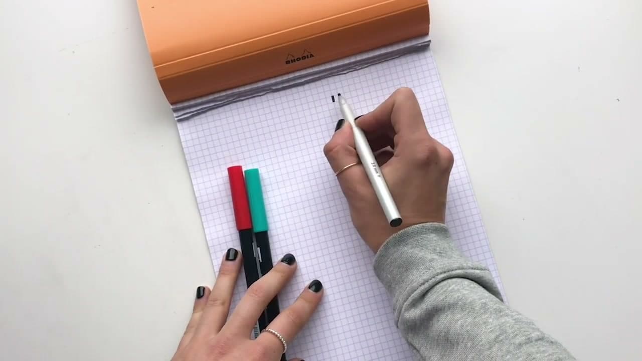
    Tombow Dual Brush Pens are Becca's go-to and a fair starting point for everyone. They come in dozens of colors, the brush tip is forgiving for beginners, and a 10-pack runs cheap enough that a fried tip isn't a tragedy. Serious letterers usually grab the 96-color set once they're hooked.

    Paper matters more than people expect. Anything toothy or textured - watercolor paper, printer copy paper, sketch paper - tears at the brush bristles and ruins a new pen within a week. Pair the pens with smooth high-quality paper. Rhodia dot pads and grid pads are the standard. Marker paper works too.

    Tip:

    If your brush tip already looks frayed at the edges, your paper is too rough. Switch to smooth paper and use the damaged pen for warm-ups, not finished work.

    Back to all steps

  3. Step 3: Hold the Pen at 45 Degrees

    Watch this step · 2:25

    Don't force a fancy grip. Hold the pen however feels natural - pencil grip, three-finger, whatever you already do for handwriting. What matters is two things: the pen sits at about a 45-degree angle to the page, and the pen runs perpendicular to the paper (sideways, not pointed straight down).

    That angle lets the belly of the brush tip - the wider middle section, not just the point - do the heavy lifting on your downstrokes. Hold it too steep and you'll only ever get thin lines no matter how hard you press. Get the angle right and the line-weight difference shows up automatically.

    Tip:

    Quick angle check: lay the pen flat on the page with the cap end pointing back over your shoulder. The barrel should sit about halfway between flat and vertical. If your wrist hurts, lower the angle - 45 degrees is the target, not a rule.

    Back to all steps

  4. Step 4: Practice Light Upstrokes

    Watch this step · 3:10

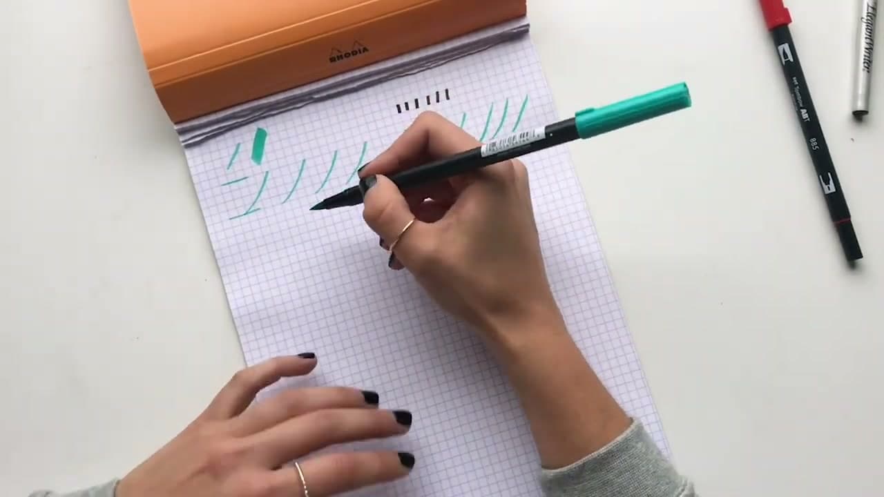
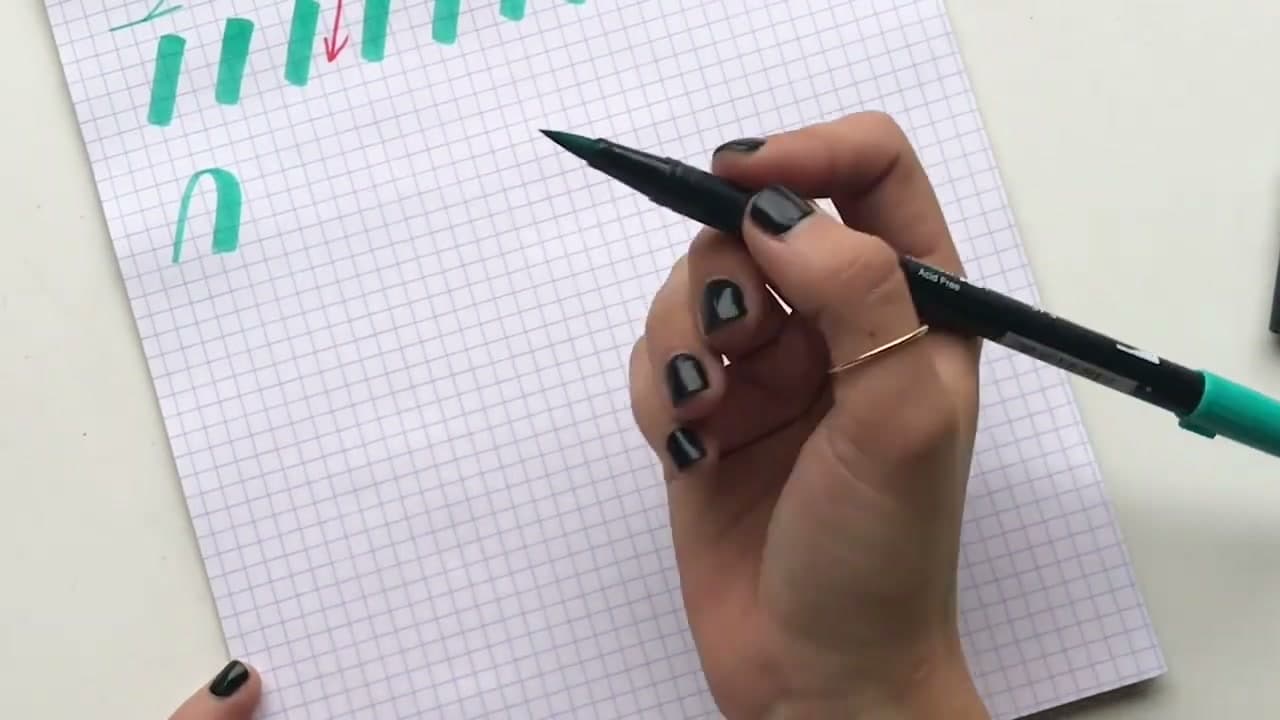
    Hold the 45-degree angle and barely touch the page. Draw thin upward lines from the baseline to the waistline (about four grid boxes tall on Rhodia dot paper). Curve them slightly to the right - not a big swoop, just a hint of a lean. Keep the pen on the same angle the whole time.

    You're aiming for consistency, not perfection. Every upstroke should be the same hair-thin width. No 'eyelashes' (where the line gets thicker partway up because you pressed). Run a full row of these. If they look uneven, lift up more - the lightest possible touch on the page.

    Tip:

    If your upstrokes keep going thick, you're gripping too tight. Loosen your fingers and let the weight of the pen alone make contact with the paper. That's how light it should feel.

    Back to all steps

  5. Step 5: Practice Heavy Downstrokes

    Watch this step · 4:07

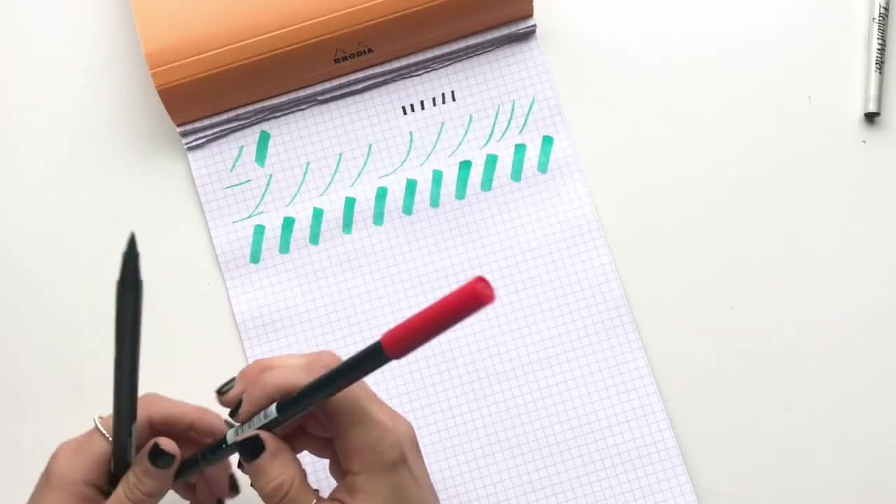
    Same pen angle. Now reverse direction and press hard. Start at the waistline, push down to the baseline, and let the brush tip splay wide on the page. Don't be careful - brush pens are designed to be pressed on. You should see a dramatic thick line, much wider than your upstrokes.

    Run a row of downstrokes right under your upstrokes so you can compare the line weights side by side. The difference should be obvious - hair-thin going up, fat and bold going down. If the two rows look about the same thickness, you're not pressing hard enough on the downstrokes.

    Tip:

    Rotate the pen a quarter turn in your fingers every few downstrokes. Brush tips wear down on one side if you always press from the same angle - rotating spreads the wear and your pen lasts much longer.

    Back to all steps

  6. Step 6: The One Rule - Light Up, Hard Down

    Watch this step · 4:50

    Here's the entire technique in one sentence. Anywhere the pen moves upward, light pressure. Anywhere the pen moves downward, hard pressure. That's all of brush calligraphy.

    The thick chunks in a calligraphy word aren't shadows added later. They're downstrokes - the moments inside each letter where the pen happened to be moving down the page. Apply 'light up, hard down' to every single stroke you make and your handwriting will start looking like calligraphy almost immediately. It works on print letters, cursive, decorative scripts - the rule doesn't care which alphabet you're writing.

    Tip:

    Mid-stroke transitions are where beginners trip. When a curve flips from going up to going down, your pressure has to flip at the same moment - smoothly, not abruptly. Practice slow loops where you can feel the pressure rolling from light to heavy and back.

    Back to all steps

  7. Step 7: Combine Strokes Into Letters

    Watch this step · 5:48

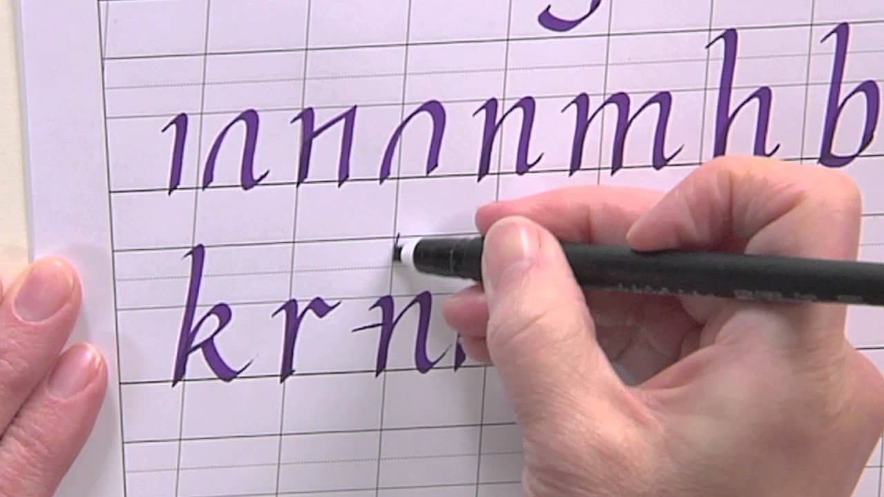
    Once 'light up, hard down' is automatic, every letter in the calligraphy alphabet is just a few basic strokes glued together. The basic strokes are short building blocks: upstroke, downstroke, ascending loop, compound curve, underturn, overturn, and oval.

    For a lowercase h, link an upstroke into an ascending loop, drop a downstroke, then trail off with a compound curve. The pressure rule still applies on every piece - thin on every up-motion, thick on every down-motion. Practice the basic strokes until they're effortless before chaining them into letters. The work you do at the stroke level shows up in your finished alphabet.

    Tip:

    Drill the basic strokes for ten minutes before any lettering session. Pros do this their whole career - it's the calligraphy equivalent of a musician's scales. Your hand needs the warm-up even after you know the strokes by heart.

    Back to all steps

How to Do Faux Calligraphy

Keep going

How to Do Faux Calligraphy

10 steps · about 12 minutes

Products Used

The Checklist

How to Do Brush Pen Calligraphy - 7 Step Beginner Guide

Tools
3
Materials
3
Steps
7
Video
7 min

Tools we recommend

As an Amazon Associate we earn from qualifying purchases. Links on this page may be affiliate links - clicking them and buying doesn't change your price, but helps support Crafting Step by Step.

Tags

The Crafter's Weekly

New calligraphy tutorials, every Sunday

One short email with the week's best step-by-step guides. Free, no spam, unsubscribe anytime.

Test your knowledge

Did the lesson stick? Start with this one.

5 questions covering what you just read. No signup, no score saved, and you can stop after this one.

Question 1 of 5

How is a brush pen different from a chisel-tip 'calligraphy pen'?

Quick reference

Key takeaways from How to Do Brush Pen Calligraphy - 7 Step Beginner Guide

5 questions, answers, and one-line explanations. Tap to expand.

  1. 1.How is a brush pen different from a chisel-tip 'calligraphy pen'?

    Answer: The brush pen's tip flexes; the chisel tip does not

    A flexible tip is what makes line-weight variation possible.

  2. 2.Why does paper choice matter so much for brush pens?

    Answer: Toothy paper tears the brush tip and ruins the pen within a week

    Watercolor or printer paper has texture that destroys brush bristles fast.

  3. 3.At what angle should you hold the pen against the page?

    Answer: About 45 degrees to the page

    45 degrees lets the belly of the brush do the heavy work on downstrokes.

  4. 4.What's the entire rule of brush pen calligraphy?

    Answer: Light pressure going up, hard pressure going down

    Thin on every upstroke, thick on every downstroke - the rule applies to every letter.

  5. 5.Why do letters look like calligraphy when you apply the pressure rule consistently?

    Answer: The thick chunks in calligraphy ARE just downstrokes, not shadows added later

    What looks like decorative shading is just the moments the pen was moving down the page.

Did this work for you?

What's next

Related collections

Curated theme pages that include this tutorial.

Similar tutorials

Hand-picked next reads based on the one you just finished.

Liked this calligraphy tutorial?

Pick the crafts you want to hear about. One email every Sunday with new step-by-step tutorials. No spam, easy to unsubscribe.

Get more like this in your inbox

Weekly digest. Pick the categories you want. Unsubscribe anytime.

Send me tutorials about

We only email about new tutorials. Easy unsubscribe anytime.