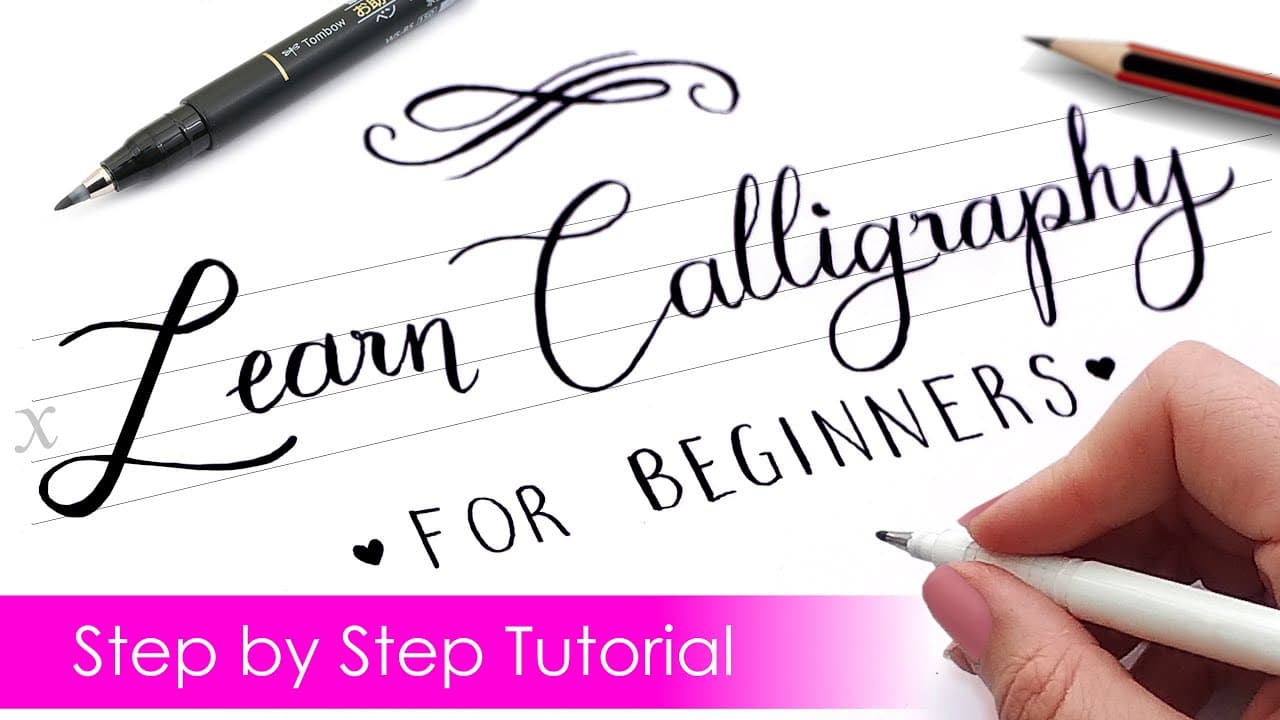
How to Write in Cursive - 7 Tips for Neat Handwriting

Also in:Crafts

By CraftingStepByStepPublished Updated

Based on a video by JetPens.

A lot of schools don't teach cursive anymore. If you grew up after the changeover and want to fill the gap, the technique itself is straightforward - the slow part is the practice that builds muscle memory.

JetPens walks through the basics in this short tutorial. The flow is: pick a style guide, set up your tools, master individual letters, then connect them one pair at a time. Once your fingers know the standard letterforms, full words flow naturally.

The mistakes most beginners make are mechanical: a paper that's too flat (cramps the wrist), a pen that's too thick (illegible at small sizes), and rushing the connection between letters before the individual shapes are second nature. Slow it down and the rest works.

Step-by-Step Guide

1

Find a Style Guide

0:40
Step 1: Find a Style Guide

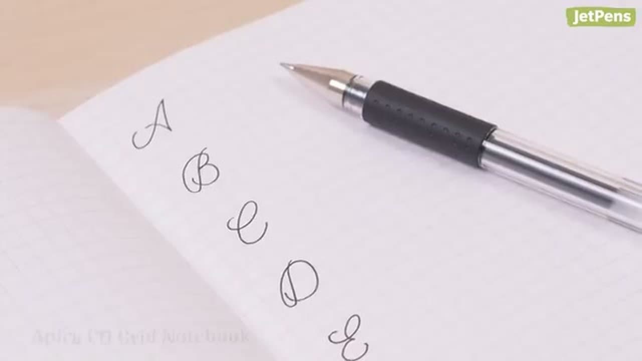
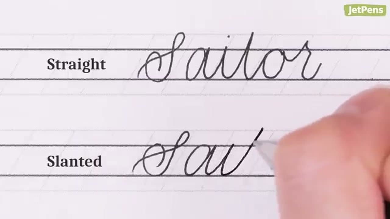
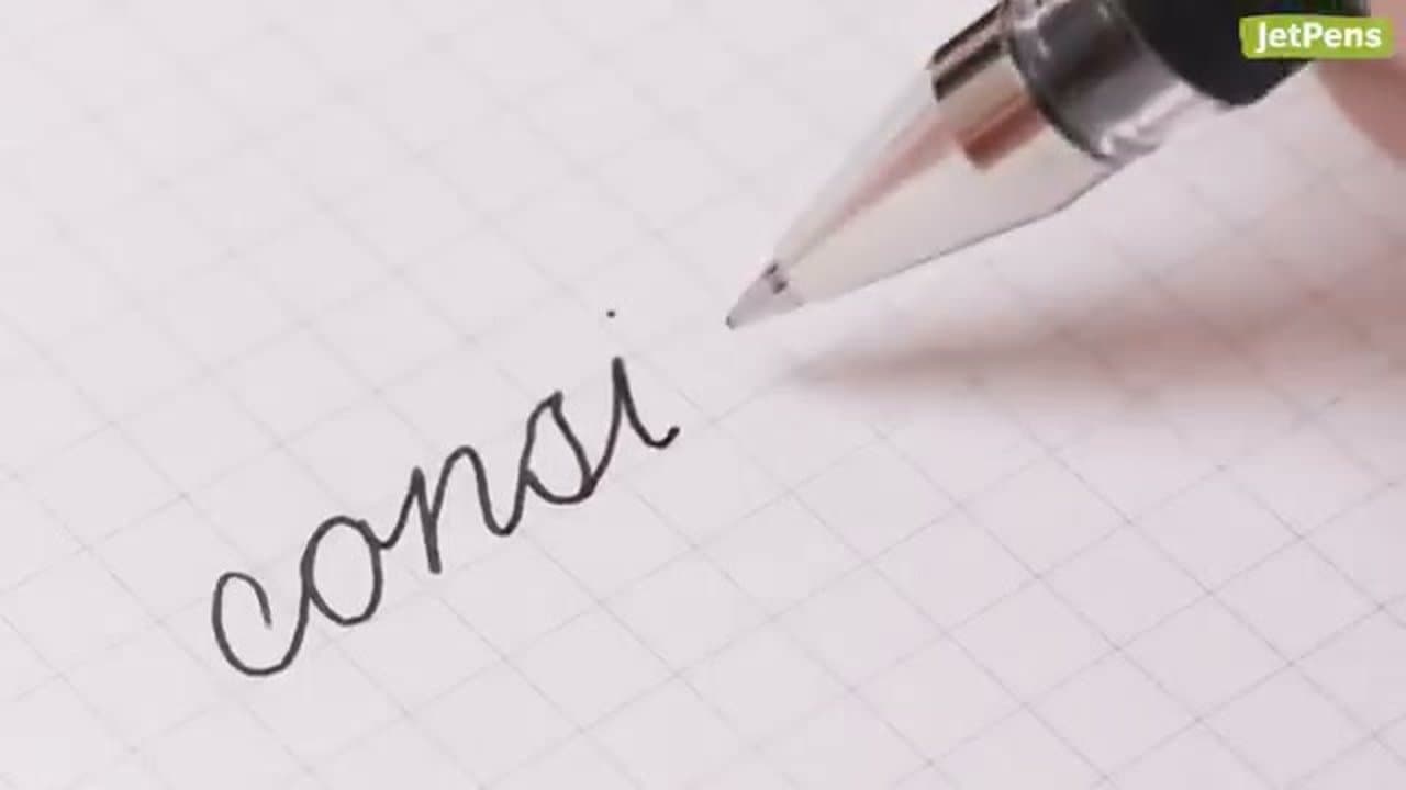
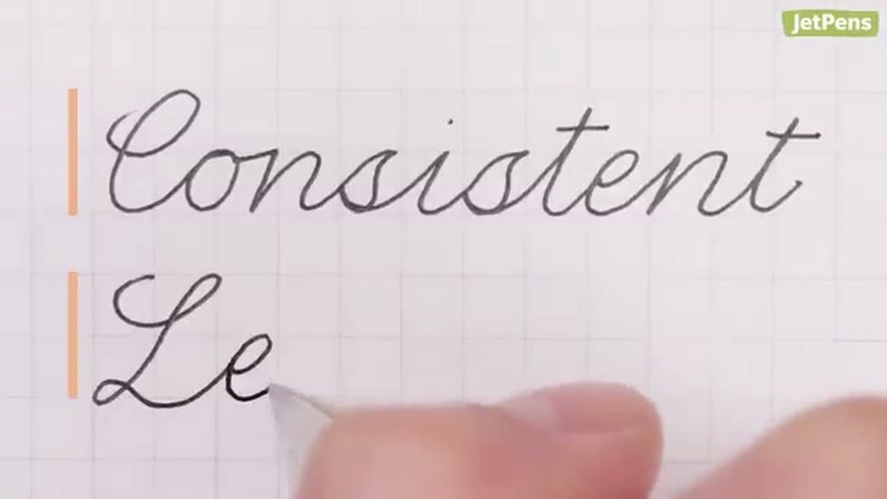
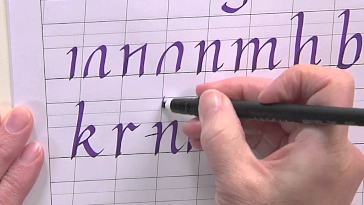
Before you write a single letter, find a cursive style you actually want to copy. Print a free practice worksheet, use grid paper, or download a cursive alphabet reference - JetPens hosts free downloadable worksheets on their blog.

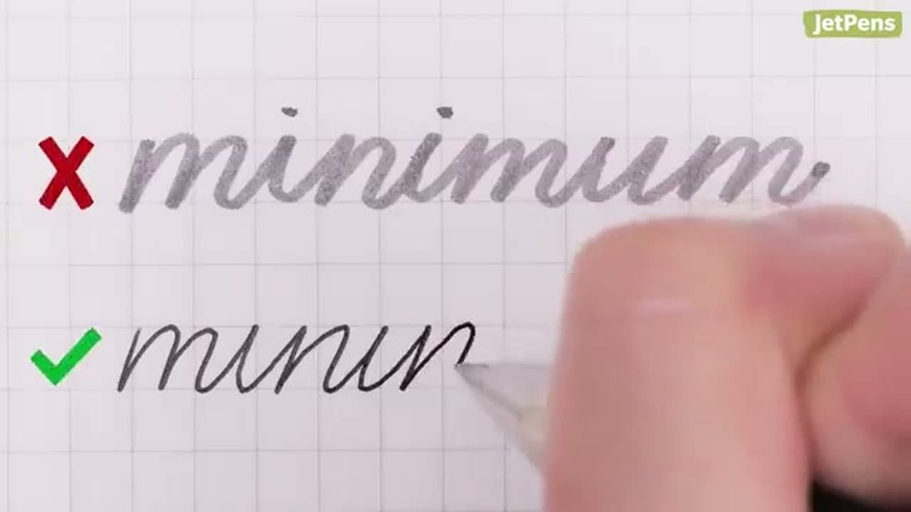
The guideline matters more than the style. Without a reference, your slant drifts and your letter heights wander.

Tip

Spencerian is elegant and old-school. Modern looped cursive is the most common American style. Pick one and stick to it for the first month - mixing styles is what makes practice feel chaotic.

2

Tilt Your Paper

0:55
Step 2: Tilt Your Paper

Slide your paper at about a 30-45 degree angle to the edge of your desk. Right-handed writers tilt the top to the left; left-handers tilt to the right.

The tilt is more comfortable for your wrist and forearm, and naturally introduces the slant that makes cursive look balanced. Small mistakes also become less visible at an angle.

Tip

If your wrist is sore after writing, your paper isn't tilted enough. The angle should let your forearm drag in a straight line as you move across the page.

3

Pick a Smooth Pen

1:15
Step 3: Pick a Smooth Pen

Use a gel pen or a fine liner with a fine or medium point. They glide across the paper without much pressure.

Avoid ballpoint pens (you press too hard and your hand cramps), broad markers (lines are too thick to read at small sizes), and pencils (the lead wears unevenly into a wedge tip and your line width changes mid-word).

Tip

If you're left-handed, look for a quick-drying gel ink to avoid smudging. Pilot G2 and Uniball Signo are popular smooth-writing options.

4

Master Individual Letters

2:10
Step 4: Master Individual Letters

Don't try to write whole words yet. Work through the alphabet one letter at a time, paying attention to where each letter starts and ends.

The tail of one letter has to blend into the start of the next, so knowing the entry and exit points is what makes connection feel natural later.

Tip

Spend extra time on the letters you'll write most often: a, e, i, o, n, t. Capital Q and Z get less practice in real writing, so don't sweat them on day one.

5

Practice Common Letter Pairs

2:55
Step 5: Practice Common Letter Pairs

Before tackling whole words, practice common letter pairings: or, an, in, ing, ed, the. These pairs show up in almost every word, and the connection between letters is what cursive is really about.

Pay extra attention to awkward connections - 'be' or 'ne' where the loop joins differently. Practice capitals connected to lowercase too.

Tip

If a connection looks ugly, slow down to half speed. Most awkward joins come from rushing the transition between two letter shapes you already know.

6

Write Clear Letter Shapes

4:30
Step 6: Write Clear Letter Shapes

Slow down. Letters with open tops (a, o, g) look like u or y when you rush, which makes your handwriting harder to read.

Skip excessive loops. The decorative loops on f, p, and y look elegant in samples but clutter the letters when you write at speed. Closed shapes and short loops read better.

Tip

Finish the entire word before going back to dot your i's or cross your t's. Pausing mid-word breaks your rhythm and the connection between letters looks awkward.

7

Keep Size and Slant Consistent

6:00
Step 7: Keep Size and Slant Consistent

Lowercase o and e should be the same height. Capital C and L should match each other. The whole word should slant at the same angle - one straight letter and one slanted one in the same word looks messy.

Don't write too large or too small. Find a comfortable size and stick with it. Tiny variations are fine; consistent ones across the page is what makes cursive look polished.

Tip

If you've been writing on a big practice worksheet, scale back to normal notebook lines for daily practice. Writing at the size you'll actually use builds the right muscle memory.

Products Used

☐ The Checklist

How to Write in Cursive - 7 Tips for Neat Handwriting

Tools
3
Materials
1
Steps
7
Video
9 min

Your Guide

JetPens

As an Amazon Associate we earn from qualifying purchases. Links on this page may be affiliate links - clicking them and buying doesn't change your price, but helps support ShowMeStepByStep.

Tags

Test your knowledge

Did the lesson stick? Find out in 2 minutes.

5 quick questions covering what you just read. No signup, no score saved — just a gut check.

Quick reference

Key takeaways from How to Write in Cursive - 7 Tips for Neat Handwriting

5 questions, answers, and one-line explanations. Tap to expand.

  1. 1.What's the FIRST step before writing a single letter?

    Answer: Find a cursive style guide to reference

    Without a reference, your slant drifts and letter heights wander.

  2. 2.At what angle should you tilt your paper?

    Answer: About 30 to 45 degrees

    30-45 degrees is comfortable for wrist and forearm and introduces the natural cursive slant.

  3. 3.Which writing tool does the tutorial recommend?

    Answer: A gel pen or fine liner

    Gel pens glide without pressure; ballpoints make you press too hard and cramp your hand.

  4. 4.Why practice letter PAIRS before whole words?

    Answer: The CONNECTION between letters is what cursive is really about

    The tail of one letter has to blend into the start of the next - that's cursive.

  5. 5.Which of these is the bigger sin in everyday cursive?

    Answer: Excessive decorative loops on f, p, and y

    Loops look elegant in samples but clutter the letters at writing speed; closed shapes and short loops read better.

What's next

Related collections

Curated theme pages that include this tutorial.

Weekly Digest

Liked this calligraphy tutorial?

Pick the categories you want to hear about. Weekly digest of new step-by-step tutorials. No spam, easy unsubscribe.

Send me tutorials about

We only email about new tutorials. Easy unsubscribe anytime.