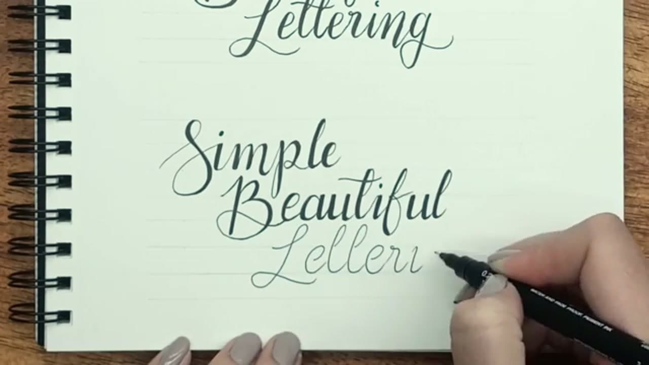
How to Write in Calligraphy - 7 Step Beginner Tutorial

By CraftingStepByStepPublished Updated

Based on a video by Torryn Marie.

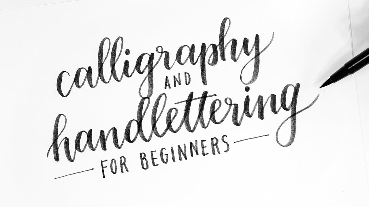
Calligraphy looks like a skill that takes years to learn. It's not. The whole technique is pressure control - light pressure on every upstroke, heavy pressure on every downstroke - and six basic strokes that combine to form every letter of the alphabet. Once those two ideas click, you're writing calligraphy.

This walkthrough from Torryn Marie covers the entire beginner path in 7 steps. You'll set up your supplies, drill the basic strokes, write the alphabet on guidelines, add decorative flair, link letters into words, try bounce lettering, and learn how to simulate calligraphy with a regular fine liner if you don't own a brush pen.

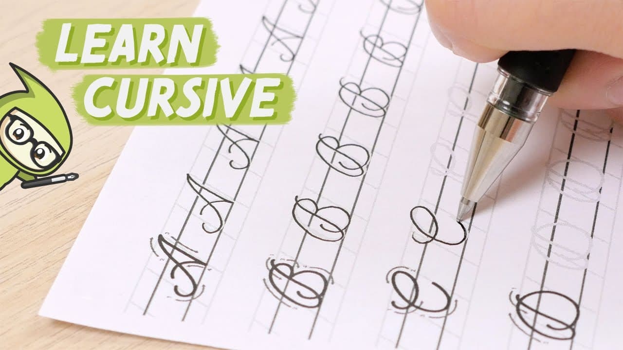
If you're brand new to lettering, try the pencil-only foundation in how to do calligraphy first - same eight-strokes idea with a softer learning curve. Already comfortable with cursive? How to write in cursive is the closest neighbor for handwriting that's neat without going all the way to brush-pen calligraphy.

Step-by-Step Guide

1

Step 1: Gather Your Supplies

0:28
Step 1: Step 1: Gather Your Supplies

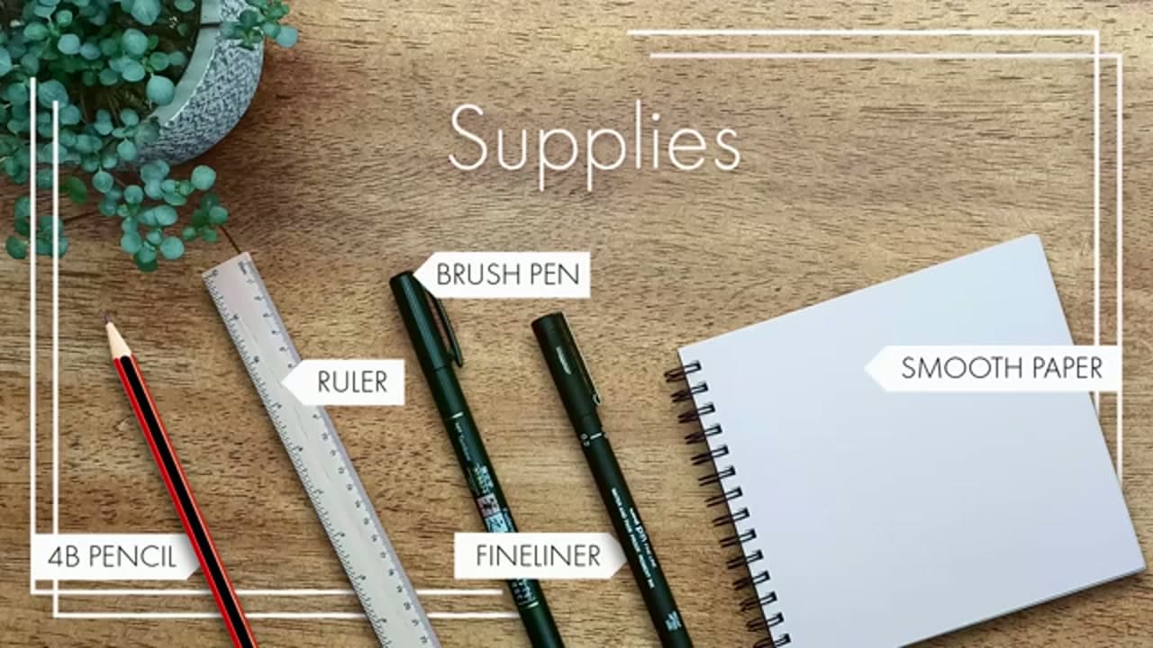
You need five things before you start: a soft pencil for warming up (4B is ideal), a ruler for drawing guidelines, a brush pen, a fine liner, and smooth paper. Torryn uses a Tombow Fudenosuke brush pen and a Uni Pin 0.2 fine liner in this tutorial.

Smooth paper matters. Textured or toothy paper shreds the bristles of a new brush pen within a few practice sessions. A sketchbook with smooth cartridge paper or a brush-pen-friendly pad like Rhodia keeps your pen tip sharp.

Tip

If you only own one brush pen, save it for the alphabet and word-writing steps. Drill the basic strokes with a soft pencil first - it's free practice and you won't blunt your new pen on stroke drills.
2

Step 2: Drill the Six Basic Strokes

1:03
Step 2: Step 2: Drill the Six Basic Strokes

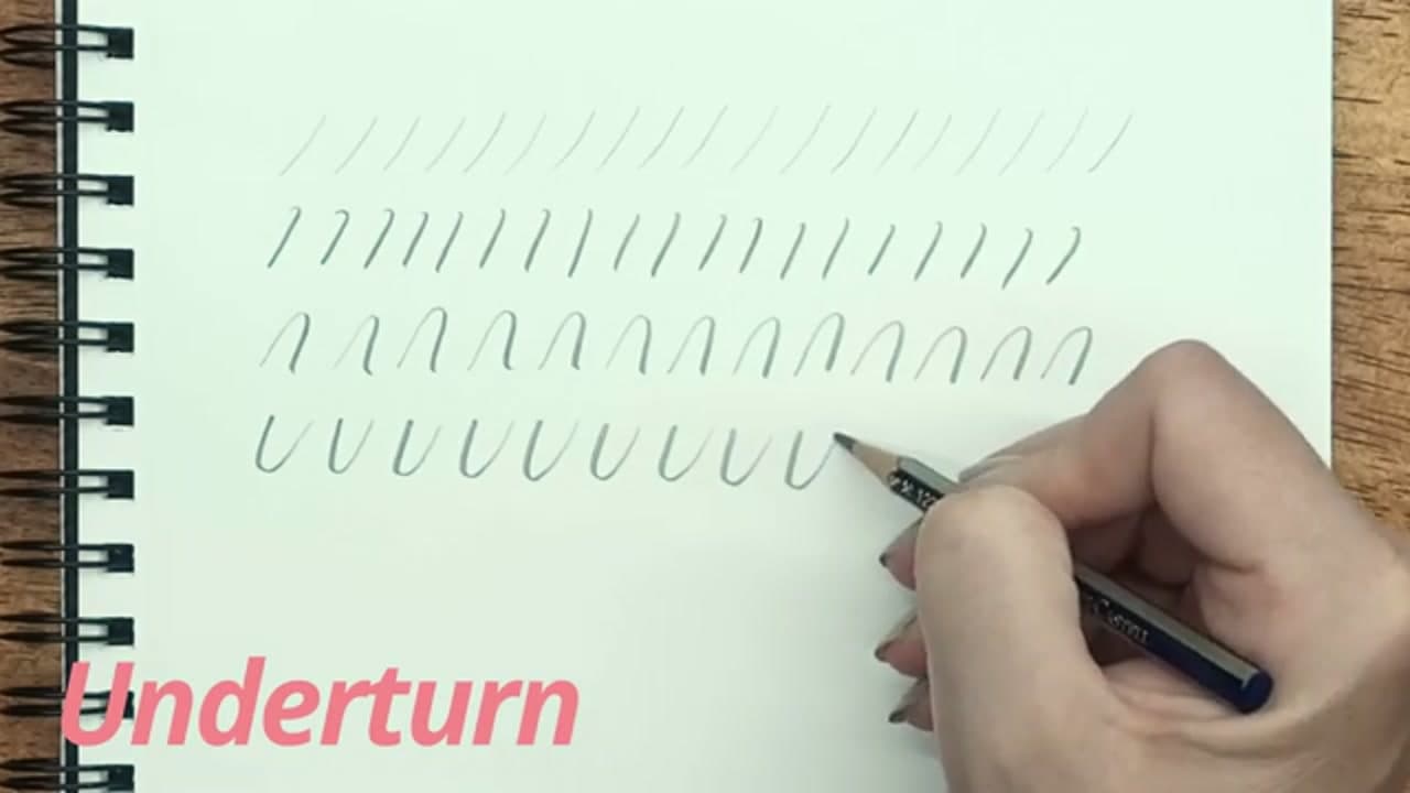
Every letter of the calligraphy alphabet is built from six basic strokes. Drill them in order: upstroke (light pressure, thin line going up at a slight forward angle), downstroke (heavy pressure, thick line coming straight down), overturn (light up, curve over, heavy down - looks like an upside-down U), and underturn (heavy down, curve under, light up - looks like a regular U).

Then the last two: compound curve (light-heavy-light, like a flattened W) and the oval (start on the upper right, heavy down the left side, light back up the right). The whole technique is in one sentence - light going up, heavy going down. Repeat each stroke ten or fifteen times in a row until your hand feels warm.

Tip

If your downstroke and upstroke look the same thickness, you're not varying pressure enough. Exaggerate the difference at first - press almost too hard on the way down, almost too light on the way up. You can soften it later.

3

Step 3: Rule Guidelines and Write the Alphabet

3:19
Step 3: Step 3: Rule Guidelines and Write the Alphabet

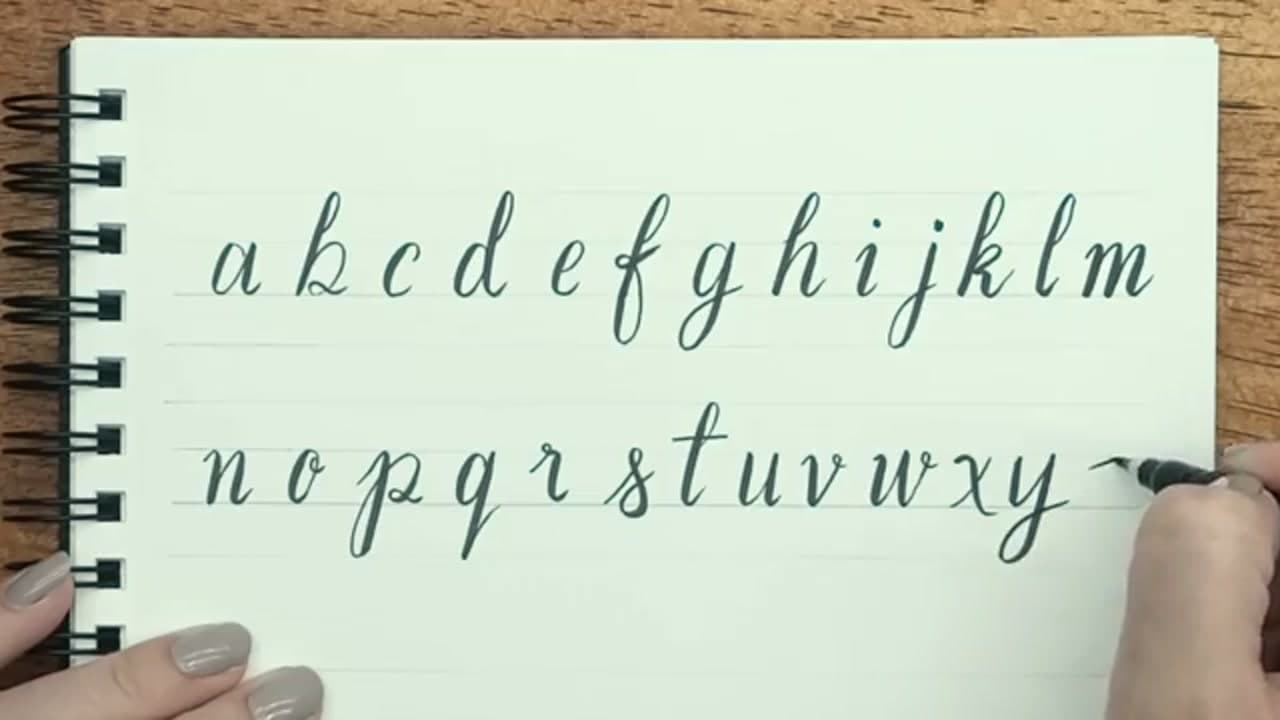
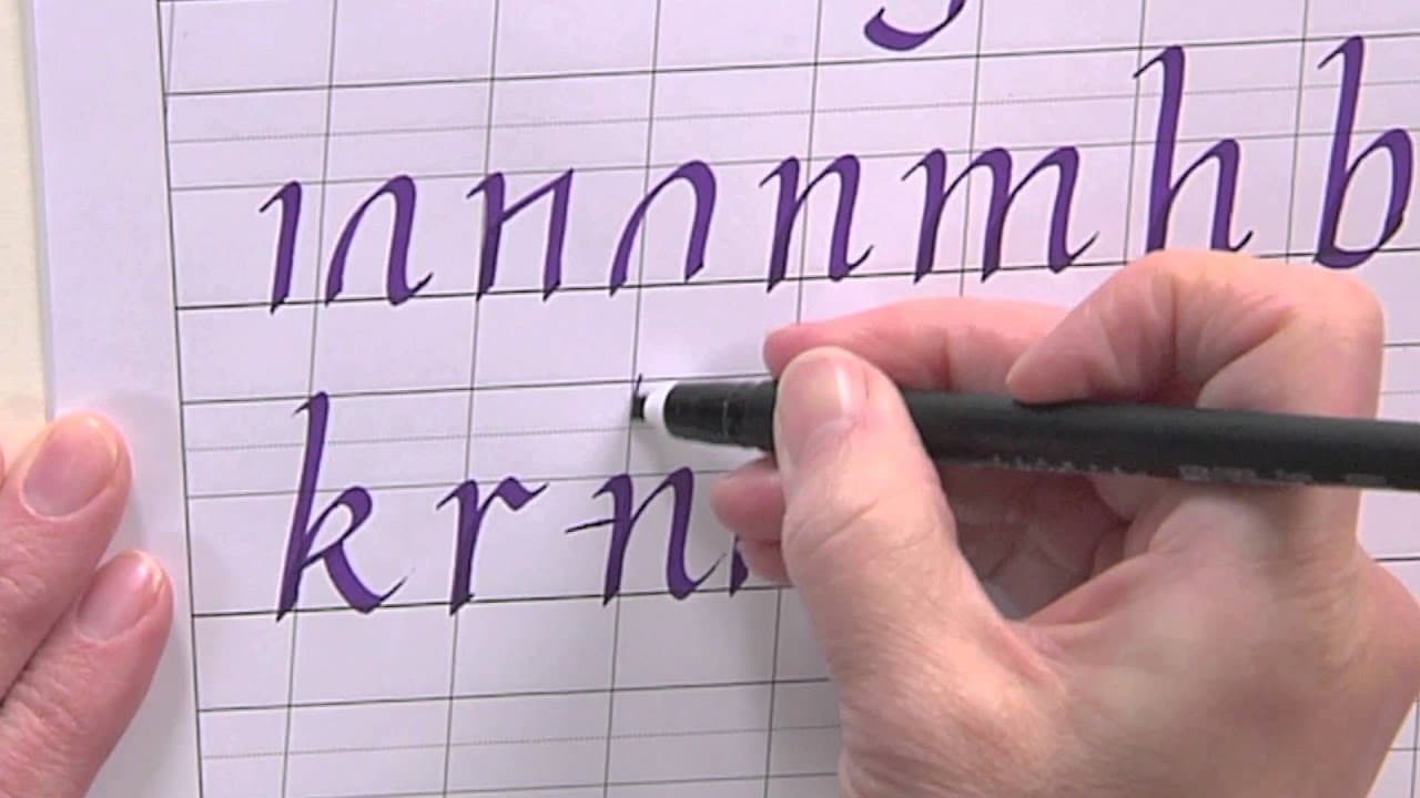
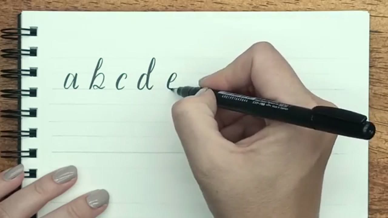
Rule four parallel guidelines across your page, equally spaced. The middle space is the x-height - it holds the body of every lowercase letter. The top space holds tall strokes (b, d, f, h, k, l, t). The bottom space holds descenders (g, j, p, q, y).

Hold your brush pen at a 45-degree angle to the page. The angle gives you more control over the pressure transition and stops you getting bumpy edges on your downstrokes. Now write through the alphabet a to z. Apply the light-up, heavy-down rule on every letter, even when the strokes feel small or quick.

Tip

Grid paper or pre-printed lettering guidesheets save you the time of ruling lines for every practice session. Search for free downloadable brush lettering worksheets - most calligraphy YouTubers post them.

4

Step 4: Add Flair with a Decorative Alphabet

4:49
Step 4: Step 4: Add Flair with a Decorative Alphabet

Once the basic alphabet feels familiar, walk through it again and add decorative flourishes. Loop the entry stroke on the b and the d. Rotate the curve on the e. Curl the exit tail on the y, p, and g. The capital alphabet gets the most flourish room - crossbar swashes, looped descenders, dropped tails.

There's no single right answer here. Pick the embellishments that match your taste and use them consistently. Curly and round, sharp and angular, retro flourishes - just commit to one style across the alphabet and your work looks intentional instead of inconsistent.

Tip

Save photos of styles you like from Pinterest or Instagram before you embellish your own alphabet. Copying specific letterforms is faster than inventing them. Calligraphers steal from each other constantly - that's how style evolves.

5

Step 5: Link Letters into Words

5:36
Step 5: Step 5: Link Letters into Words

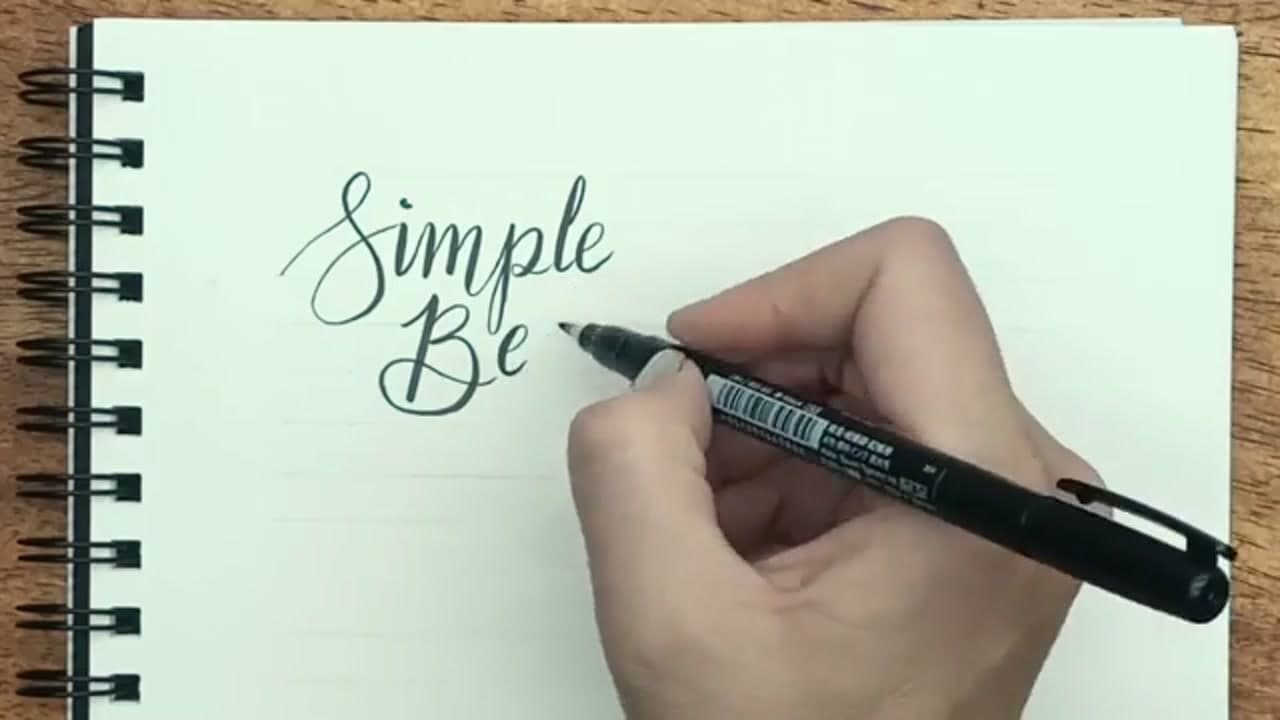
Now combine letters into a short phrase. Pick something with letters you enjoy drawing - a few s, b, and e shapes if you have favorites. Link the exit stroke of one letter into the entry stroke of the next, keeping the same slant and x-height across the word.

The light-up, heavy-down rule still applies on every stroke, even when one letter chains into the next. The connecting strokes between letters are all upstrokes, so they should all be thin.

Tip

If a word looks crammed, your letter spacing is too tight. Calligraphy letters need air around them. Lowercase letters should sit roughly one o-width apart; whole words need a clear word-width gap between them.

6

Step 6: Try Bounce Lettering

6:25
Step 6: Step 6: Try Bounce Lettering

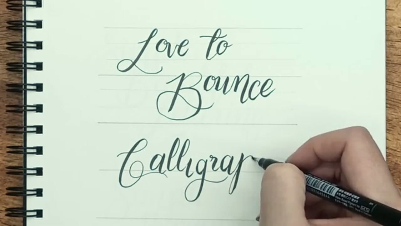
Bounce lettering is the modern look you see on Pinterest quotes and Instagram posters. Instead of every letter sitting on the same straight baseline, move each letter up or down a little. The baseline becomes a soft wave.

Same letter shapes, same pressure rule - the only change is where each letter starts vertically. A bouncy 'love to bounce' reads as relaxed and hand-drawn. The straight-baseline version reads as mechanical. For cards and posters, bouncy almost always wins.

Tip

Don't bounce randomly. Pick a rhythm and stick to it - like up-down-up-down across the word, or dropping every third letter. A consistent pattern reads as intentional even when it looks free-form.

7

Step 7: Simulate Calligraphy with a Fine Liner

8:04
Step 7: Step 7: Simulate Calligraphy with a Fine Liner

If you don't own a brush pen yet, you can still get the calligraphy look with a regular fine liner. Write your word in cursive first using the same letter formations. Then go back and thicken every downstroke - draw a second parallel line right next to the existing one and fill the gap with the fine liner.

The result reads as real brush calligraphy even though you only used a single-width pen. It takes longer than the brush pen (a few minutes per word vs a few seconds), but the look is identical. This is the method to use when you're on a trip, in a meeting, or want to add lettering to a notebook that doesn't have a brush pen at hand.

Tip

Only thicken the downstrokes. Upstrokes stay single-width. That's the trick - if you thicken everything uniformly, the word stops looking like calligraphy and just looks like bold text.

Products Used

☐ The Checklist

How to Write in Calligraphy - 7 Step Beginner Tutorial

Tools
5
Materials
1
Steps
7
Video
10 min

Your Guide

Torryn Marie

As an Amazon Associate we earn from qualifying purchases. Links on this page may be affiliate links - clicking them and buying doesn't change your price, but helps support ShowMeStepByStep.

Tags

What's next

Related collections

Curated theme pages that include this tutorial.

Weekly Digest

Liked this calligraphy tutorial?

Pick the categories you want to hear about. Weekly digest of new step-by-step tutorials. No spam, easy unsubscribe.

Send me tutorials about

We only email about new tutorials. Easy unsubscribe anytime.