How to Write in Blackletter (Gothic Calligraphy)

The finished result: How to Write in Blackletter (Gothic Calligraphy)
  • Difficulty: Easy
  • About 30 minutes
  • 9 steps

You tapped Save

Save this project for later

We'll email you a link, no password.

How to Write in Blackletter (Gothic Calligraphy)

  • Your saved projects in one list
  • Your ticked steps on any device

Check your inbox for an email from us. Not there? Look in your spam folder.

Print

Steps written out by Crafting Step by Step from Tamer Ghoneim Art's video (opens YouTube) (12:41). Published .

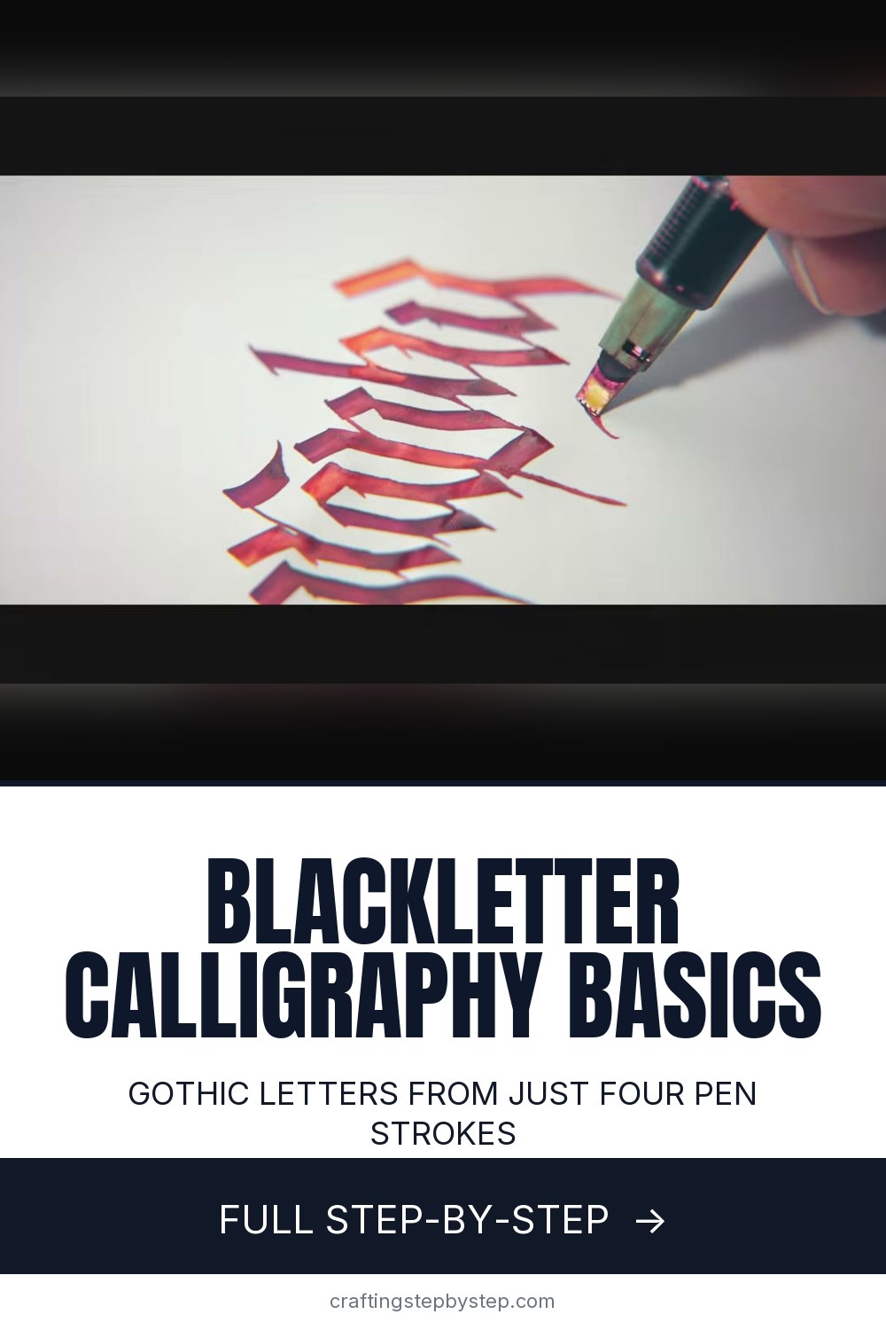
Blackletter is the tall, spiky script you see on old Bibles, diplomas and newspaper mastheads. It looks hard. It is mostly straight lines. Tamer Ghoneim of Tamer Ghoneim Art breaks the whole style down to a few tools, a set of guide lines and four strokes, then writes an a and a b to show how the strokes fit together. Gothic calligraphy is the same thing under another name.

What you need for blackletter calligraphy

  • A broad-edge pen. The Pilot Parallel in 2.4 mm or 3 mm is the easy start.
  • Smooth paper that does not bleed, like a marker paper pad
  • A pencil and a ruler, or a parallel line ruler
  • Printed guide sheets and a lightbox (optional, but they save a lot of ruling)

No pen yet? Tape two sharp pencils together side by side. The two points act like the two corners of a broad nib, and you get the thick and thin shapes for free.

Why the guide lines matter so much

Blackletter is a rhythm script. Every stem is the same height and the same distance apart, so a crooked line shows at once. Guide lines keep the height steady. The beginner ratio in the video is 5 nib widths for the body of the letter and 2 above and 2 below. The printed sheets use 3-5-3 for a little more room. Both work. Pick one and stick to it on a page.

Holding the pen at the right angle

The guide sheet in the video is marked 35 degrees. That is the angle of the nib edge to the baseline, and it stays the same for almost every stroke. Hold it steady and the pen makes the thick and thin parts for you. If your verticals come out thin, the nib has turned. Rotate it back.

Blackletter mistakes beginners make

  • Letters lean. Turn the paper, not your wrist, so the stems pull straight toward you.
  • Gaps between stems wander. Aim for white space inside a letter equal to the space between letters. Blackletter should look like a picket fence.
  • Ink feathers into the paper. Printer paper is too soft. Switch to marker paper or a smooth layout pad.
  • Corners look blobby. Lift the pen between strokes. Do not drag one stroke into the next.

How to practice without getting bored

Fifteen to thirty minutes a few times a week beats one long session, says Tamer. Write a row of one letter, then try to change it: taller, wider, a flat top, a slanted foot. The video spends a full minute on variations of the letter a, all made from the same four strokes. Once a and b feel easy, the rest of the lowercase alphabet uses the same parts.

Where to use it

Blackletter suits names on certificates, place cards, a family name sign, Halloween party signs and the front of a handmade card. If the pen is new to you, start with how to use a calligraphy pen. For a rounder broad-nib hand, try italic calligraphy. No broad pen at all? Faux calligraphy fakes the thick strokes with any pen, and envelope calligraphy puts your new letters on the mail.

Free printable

Print the steps and supply list for this project

One page you can take to the table. Free with a free account, no password.

Get the free printable

What you'll need

Free, for this project

Get this checklist by email

  • All 8 tools and materials, with tick boxes
  • A link to print all 9 steps on paper, to keep by you while you craft

No password. The whole tutorial stays free on this page.

Quick answer

Learn blackletter (gothic calligraphy) with a broad-edge pen: rule guide lines in nib widths, master four strokes and write your first letters. An easy project: about 30 minutes. You need 8 things, including printed blackletter guide sheets, Parallel pen ink cartridges and Pilot Parallel pen. The 9 steps start with choose a Broad-Edge Pen for Blackletter Calligraphy, rule the Baseline and Waistline for Your Blackletter Letters and add Ascender and Descender Space Above and Below the X-Height.

Step-by-step guide

9 steps, about 13 minutes. Tap a picture to jump to that step. Your progress saves automatically.

Tick each step off as you go.

  1. Step 1: Choose a Broad-Edge Pen for Blackletter Calligraphy

    Watch this step · 1:18

    Blackletter needs a pen with a flat, wide tip. Tamer likes the Pilot Parallel Pen. For your first tries, pick the 2.4 mm size for the easiest writing, or the 3 mm if you want a bit more challenge. Pair it with smooth paper. Canson XL marker paper is thin enough to see a guide sheet through, and the ink does not feather on it.

    Tip:

    Empty Parallel cartridges can be rinsed and refilled with any fountain pen ink you like.

    Back to all steps

  2. Step 2: Rule the Baseline and Waistline for Your Blackletter Letters

    Watch this step · 3:48

    Draw a pencil line for the baseline, where the letters sit. Then draw a second line above it for the waistline, the top of short letters like a, c, e and o. The gap between them is the x-height. For a 3.8 mm pen that is about 2 cm. A parallel line ruler makes this quick, since you can glide it up and down and stay level.

    Tip:

    Use a light hand with the pencil so the lines erase cleanly after the ink dries.

    Back to all steps

  3. Step 3: Add Ascender and Descender Space Above and Below the X-Height

    Watch this step · 4:32

    Some letters reach higher or lower than the rest. The tall parts of b, d and f are ascenders. The tails of g, y and p are descenders. Leave a band of space above the waistline and another below the baseline for them. Label each zone in pencil the first few times. It helps you remember where every stroke starts and stops.

    Tip:

    A good beginner ratio is 2 nib widths above, 5 in the middle and 2 below.

    Back to all steps

  4. Step 4: Measure the Blackletter X-Height in Nib Widths

    Watch this step · 6:18

    Your guide lines should match your pen. Hold the nib flat and make a small square mark. Make another square that touches its corner, and keep going in a zigzag until you have 5 squares. That stack is your x-height. Do the same with 2 squares above and below. No math is needed, and the guides fit any nib size.

    Tip:

    If you prefer numbers, multiply the nib width by 5. A 3.8 mm nib gives about 1.9 cm.

    Back to all steps

  5. Step 5: Slide a Blackletter Guide Sheet Under Your Paper on a Lightbox

    Watch this step · 8:02

    Ruling every page gets old fast. Print a blackletter guide sheet for your pen size, lay it on a lightbox and put your writing paper on top. The light shines through and you can see every line. Tape the corners or use drafting dots so nothing slides. Thin marker paper works even without a lightbox, because the lines show through.

    Tip:

    Tamer offers free guide sheets for six pen sizes, from 1.5 mm to 6 mm.

    Back to all steps

  6. Step 6: Practice the Four Basic Blackletter Pen Strokes

    Watch this step · 7:42

    The whole alphabet comes from four strokes. Line 1 is a wide vertical pulled straight down. Line 2 is a wide diagonal, a short slanted stroke for the tops and feet. Line 3 is a thin diagonal made by sliding the nib sideways on its edge. Line 4 is a wide horizontal. Fill a row with each one before you try a letter.

    Tip:

    Keep the nib angle the same for all four. Only the direction of the stroke changes.

    Back to all steps

  7. Step 7: Build a Lowercase Blackletter A From Straight Strokes

    Watch this step · 8:18

    Begin your a slightly below the waistline. Pull a vertical stroke down, add a short diagonal at the foot, then a diagonal across the top to make the closed bowl. Finish with a vertical stroke on the right and a last diagonal foot. A short thin stroke can join the bowl. Every piece is one of the four lines.

    Tip:

    Lift the pen between strokes. Clean corners come from separate strokes, not one long drag.

    Back to all steps

  8. Step 8: Write a Lowercase Blackletter B Next to the A

    Watch this step · 8:28

    The b starts higher, up in the ascender space. Pull a long vertical stroke from there down to the baseline. Add a diagonal to close the bottom, then another diagonal at the top of the bowl, and a short vertical on the right to finish it. That is only two of the four strokes. Space it as far from the a as the stems inside each letter.

    Tip:

    Check the gaps. Even spacing between stems is what makes blackletter look like blackletter.

    Back to all steps

  9. Step 9: Play With Variations of the Blackletter A

    Watch this step · 10:15

    Now have fun. Write the a again and change one thing each time. Flatten the top with a horizontal stroke. Stretch it taller. Start halfway down. Pull the bowl out wider to the left, or add a tiny diagonal in the middle. Tamer fills a whole line this way in about a minute. Each version uses the same four strokes.

    Tip:

    Pick your favorite a and use its shapes to guide the rest of your alphabet.

    Back to all steps

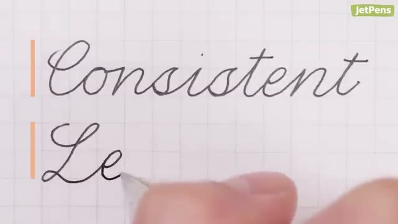
How to Write in Cursive - 7 Tips for Neat Handwriting

Keep going

How to Write in Cursive - 7 Tips for Neat Handwriting

Keep going with calligraphy

More on this topic, picked for this project.

You reached the last step

Save this project to come back to it

Your ticked steps, the free printable and your other saved makes, together in My Projects. Free, no password.

You tapped Save

Save this project for later

We'll email you a link, no password.

How to Write in Blackletter (Gothic Calligraphy)

  • Your saved projects in one list
  • Your ticked steps on any device

Check your inbox for an email from us. Not there? Look in your spam folder.

Free printable

Printable sheet and shopping list for this project

The bonus is hidden until you sign up.

Free with a free account, no password. Every step above stays open to everyone.

Products Used

The Checklist

How to Write in Blackletter (Gothic Calligraphy)

Tools
5
Materials
3
Steps
9
Video
13 min

Tools we recommend

As an Amazon Associate we earn from qualifying purchases. Links on this page may be affiliate links - clicking them and buying doesn't change your price, but helps support Crafting Step by Step.

Tags

The Crafter's Weekly

New calligraphy tutorials, every Sunday

One short email with the week's best step-by-step guides. Free, no spam, unsubscribe anytime.

Did this work for you?

What's next

Related collections

Curated theme pages that include this tutorial.

Similar tutorials

Hand-picked next reads based on the one you just finished.

Liked this calligraphy tutorial?

Pick the crafts you want to hear about. One email every Sunday with new step-by-step tutorials. No spam, easy to unsubscribe.

Get more like this in your inbox

Weekly digest. Pick the categories you want. Unsubscribe anytime.

Send me tutorials about

We only email about new tutorials. Easy unsubscribe anytime.