How to Make a Father's Day Card with Bold Stencil Ink Blending

Based on a video by Mindy Eggen Design

Opens their YouTube channel

Steps written out by CraftingStepByStep · Published · Updated

Watch the original video (opens YouTube)
The finished result: How to Make a Father's Day Card with Bold Stencil Ink Blending
Also in:Crafts

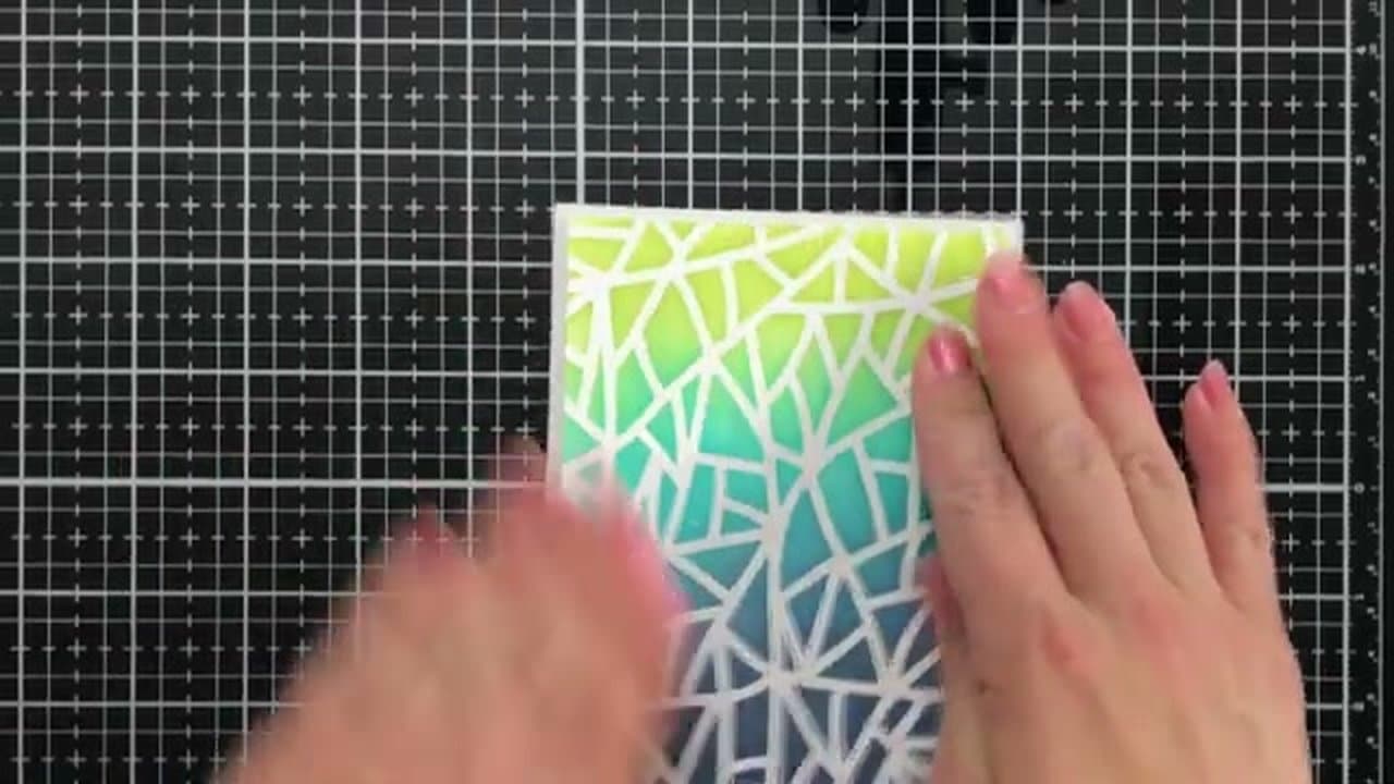
Most pre-made Father's Day cards play it safe with neckties and golf clubs. This one goes bold: a Shattered stencil masked over Sugar Cube card stock, ink-blended top-to-bottom in three vibrant Taylored Expressions colors, finished with stacked die-cut DAD letters and a heat-embossed greeting strip.

The card uses some specialty supplies (Taylored Expressions stencil, Dad die, Dad Isms stamp set, Life Changing Blender brushes), but the techniques transfer to whatever you have on hand. Any stencil + any blender brush + any three coordinating ink colors gets you the same look.

Credit to Mindy Eggen Design for the source video.

What you'll need

Step-by-step guide

7 steps, about 6 minutes. Tap a picture to jump to that step. Your progress saves automatically.

Tick each step off as you go.

  1. Step 1: Tape the Stencil Over Your Card Panel

    Watch this step · 0:25
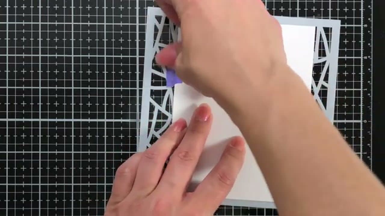
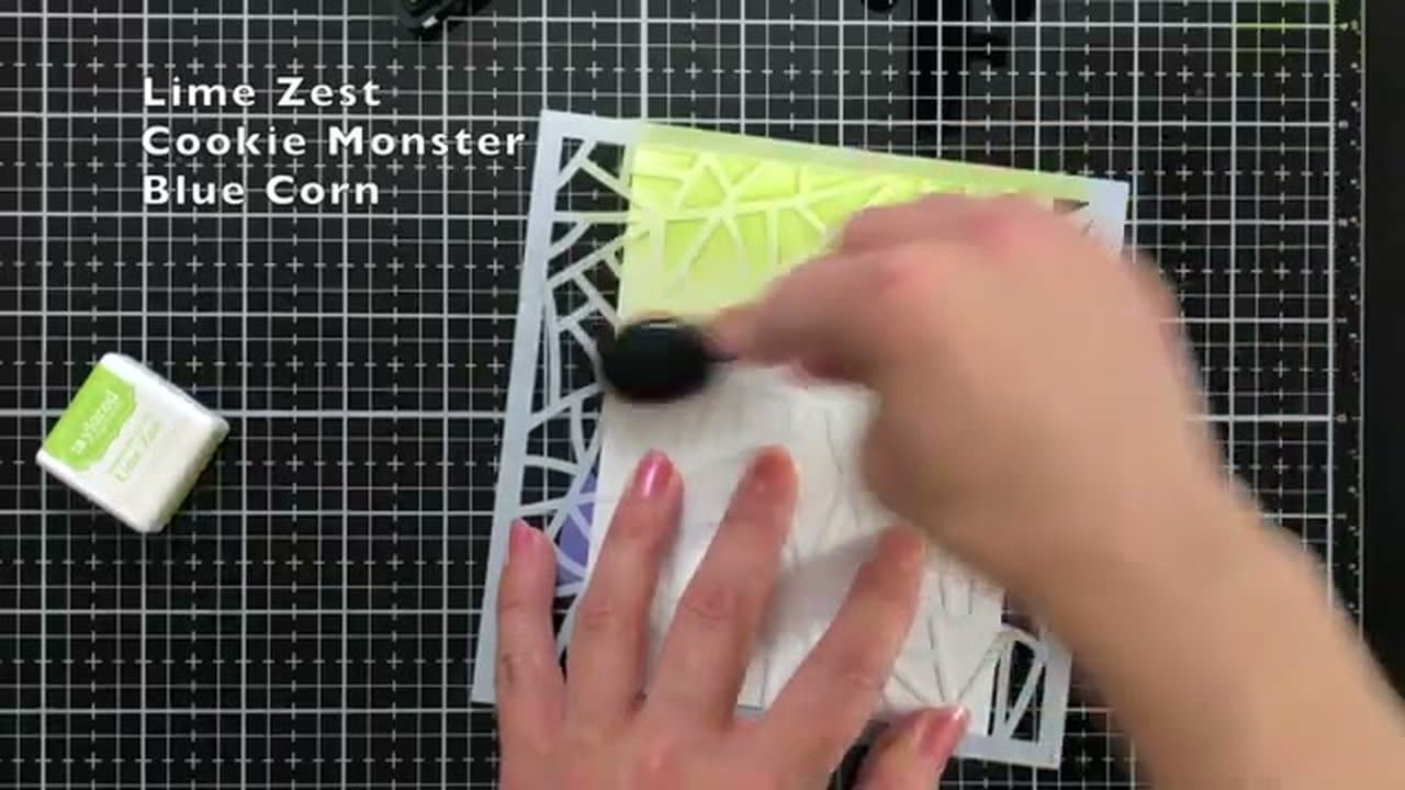
    Trim Sugar Cube card stock to 4-1/4 by 5-1/2 inches. Lay the Shattered stencil over the card stock and tape the back with low-tack purple tape so the stencil can't shift while you blend.

    Working on a glass media mat is worth doing if you have one. The smooth surface lets the blender brush glide between the cut openings of the stencil instead of catching on a textured craft mat.
    Back to all steps

  2. Step 3: Blend the Middle Band with Cookie Monster

    Watch this step · 1:30

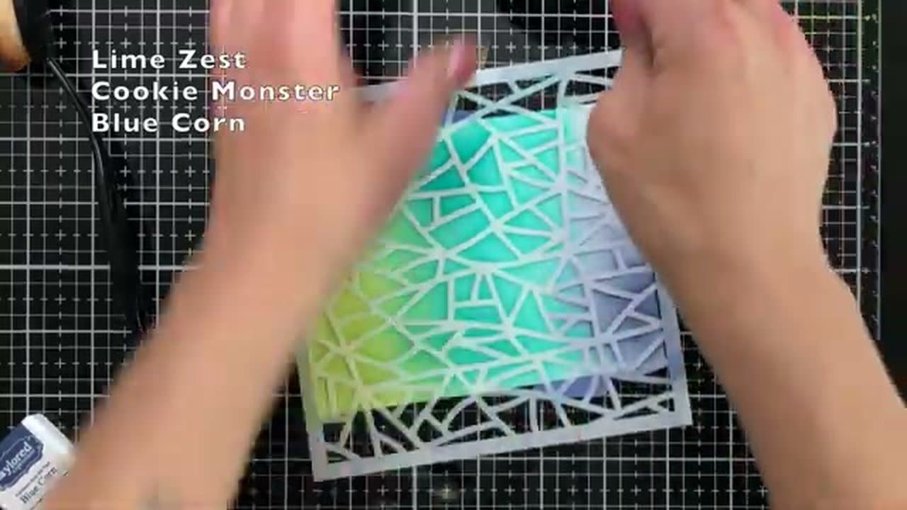
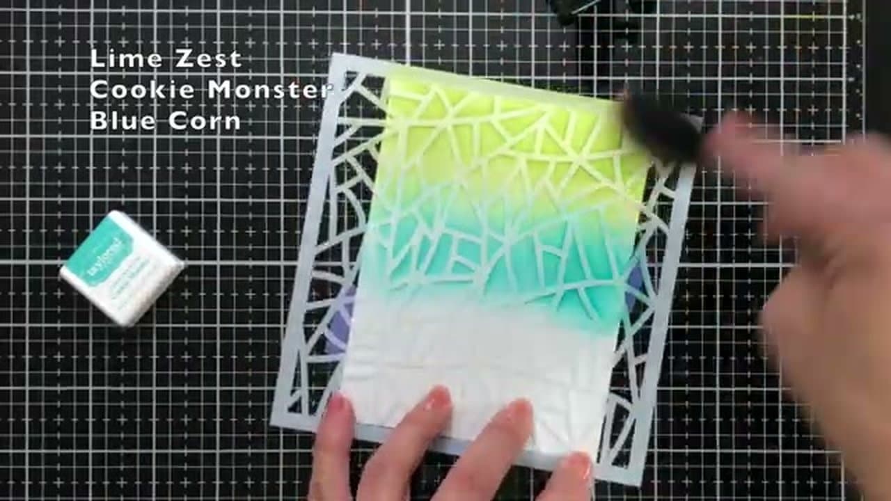
    Switch to a fresh brush and load it with Cookie Monster blue. Start where the Lime Zest fades out and blend down through the middle third of the panel.

    Where the two colors meet, work the brush back and forth across the seam so the colors melt into each other. The transition zone is what sells the gradient - if there's a hard line, the look falls flat.

    Back to all steps

  3. Step 4: Blend Blue Corn at the Bottom

    Watch this step · 1:55

    Take a third brush and load it with Blue Corn. Work from the bottom edge of the panel up into the Cookie Monster blue. Same circular blending motion, same overlap zone for the transition.

    Three vibrant colors top to bottom with two soft transitions creates the bold gradient the card is built around. Hold the panel up and check from a distance - the colors should read as one cohesive sweep, not three stripes.

    Back to all steps

  4. Step 5: Spray Shimmer and Lift the Stencil

    Watch this step · 2:30

    Mist a fine layer of sparkle shimmer spray across the panel from about a foot away. A few light passes is enough - heavy spray pools and warps the card stock.

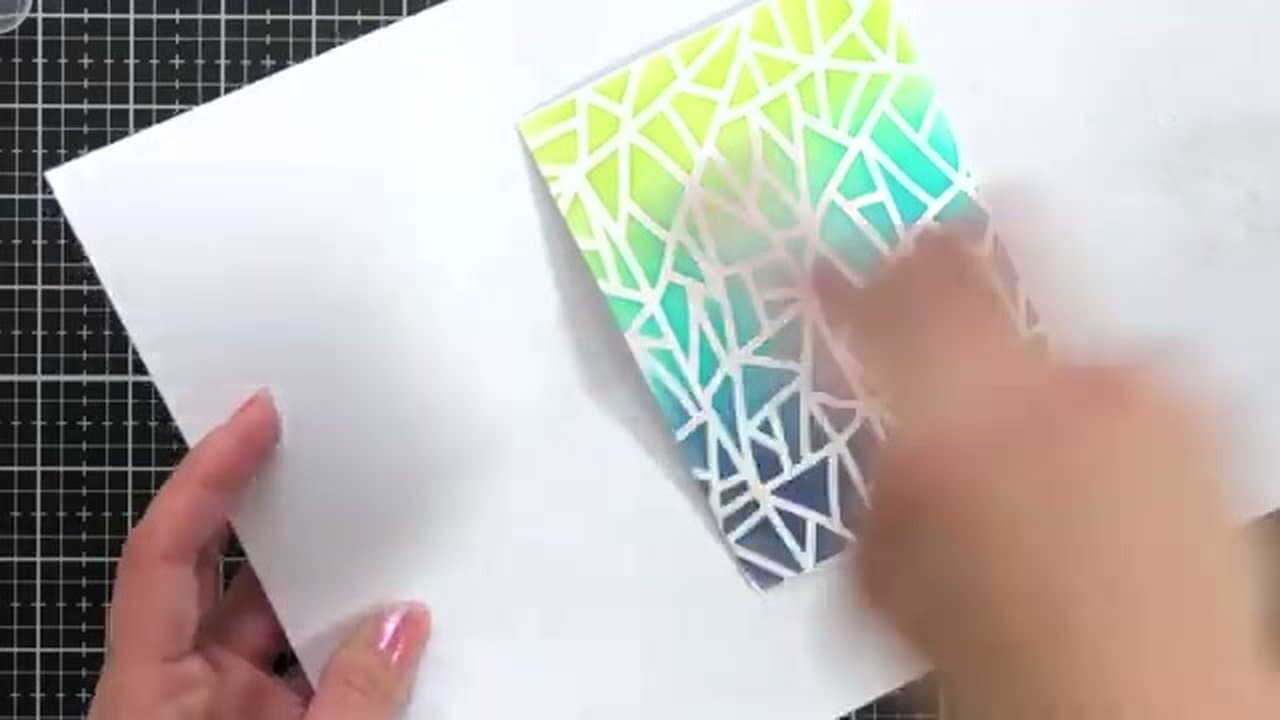
    Once the panel is dry, peel the tape and lift the stencil straight up to reveal the white shattered pattern across the gradient. The contrast between the bold colors and the clean white stencil pattern is the visual hook of the card.

    Tip:

    If you don't have shimmer spray, water plus a few drops of Liquid Pearls in a spray bottle works the same way. Or skip it - the gradient stands on its own.

    Back to all steps

  5. Step 6: Die Cut and Stack the DAD Letters

    Watch this step · 3:00

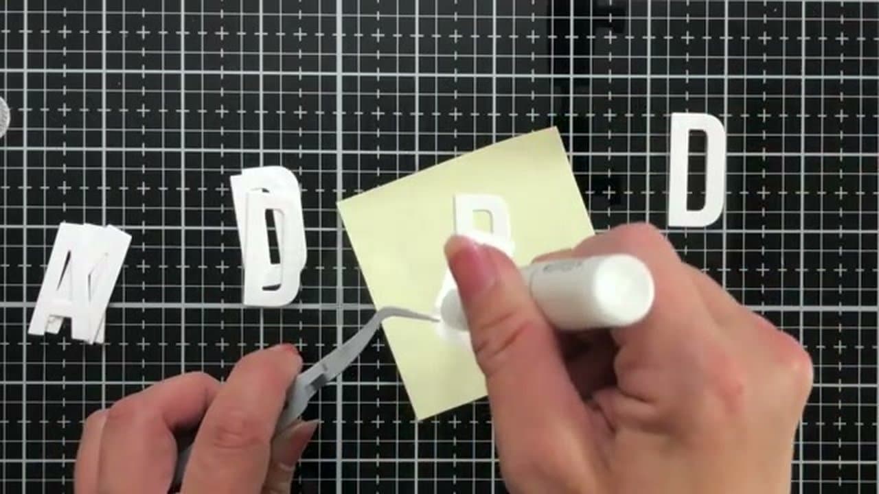
    Run the Dad die through your machine three times on Sugar Cube card stock. You'll have three identical sets of D-A-D letters.

    Stack the three sets together with Gina K Connect liquid glue between the layers, lining the edges up carefully. The triple-thick stack gives the letters real dimension on the front of the card so they cast a shadow under photography.

    Back to all steps

  6. Step 7: Heat Emboss the Sentiment and Assemble

    Watch this step · 4:50

    Stamp 'I love you. That is all.' on black card stock using embossing ink. Dust generously with white embossing powder, tap off the excess, and heat-set with a heat tool until the powder melts into a glossy raised line.

    Trim the gradient panel to 4 by 5-1/4 inches and mount it on a Sea Salt card base (cut 4-1/4 by 5-1/2 inches and folded) using foam tape on the back. Trim the embossed sentiment into a thin strip and adhere it across the bottom of the panel with another piece of foam tape. Glue the stacked DAD letters just above the sentiment with the connect glue, lining them up centered above the strip.

    Tip:

    Use tweezers to position the small DAD letters - finger placement is messy with three-layer stacks of liquid glue. The Dad Isms stamp set has plenty of other sentiments if 'I love you. That is all.' isn't your style. 'Thanks for killing all those spiders.' is also a contender.

    Back to all steps

Keep going

How to Make a Card: Beginner's Guide to Handmade Greeting Cards

8 steps · about 6 minutes

Products Used

The Checklist

How to Make a Father's Day Card with Bold Stencil Ink Blending

Tools
7
Materials
14
Steps
7
Video
6 min

Tools we recommend

As an Amazon Associate we earn from qualifying purchases. Links on this page may be affiliate links - clicking them and buying doesn't change your price, but helps support CraftingStepByStep.

Tags

The Crafter's Weekly

New card making tutorials, every Sunday

One short email with the week's best step-by-step guides. Free, no spam, unsubscribe anytime.

Test your knowledge

Did the lesson stick? Start with this one.

5 questions covering what you just read. No signup, no score saved, and you can stop after this one.

Question 1 of 5

When using a stencil, what surface lets the blender brush glide best?

Quick reference

Key takeaways from How to Make a Father's Day Card with Bold Stencil Ink Blending

5 questions, answers, and one-line explanations. Tap to expand.

  1. 1.When using a stencil, what surface lets the blender brush glide best?

    Answer: A glass media mat (smooth)

    Smooth glass lets the brush glide between cut openings; texture catches and tears the stencil.

  2. 2.Why use a FRESH brush for each ink color?

    Answer: Mixing brushes muddies the ink and you lose the saturation that makes vibrant blends work

    A fresh brush per color keeps each color saturated and vibrant.

  3. 3.At the transition between two ink colors, what should you do?

    Answer: Blend back and forth across the seam so the colors melt into each other

    A blended transition zone is what sells a gradient; hard lines make the look fall flat.

  4. 4.Why die-cut and stack the DAD letters THREE times?

    Answer: The triple-thick stack gives the letters real dimension on the front of the card so they cast a shadow

    Triple-stacked die-cut letters create physical dimension on the card front.

  5. 5.What is 'heat embossing' the sentiment?

    Answer: Stamping with embossing ink, dusting with embossing powder, then heat-setting until the powder melts into a glossy raised line

    Heat embossing creates the glossy raised text - much more striking than plain stamping.

Did this work for you?

What's next

Related collections

Curated theme pages that include this tutorial.

Similar tutorials

Hand-picked next reads based on the one you just finished.

Liked this card making tutorial?

Pick the crafts you want to hear about. One email every Sunday with new step-by-step tutorials. No spam, easy to unsubscribe.

Get more like this in your inbox

Weekly digest. Pick the categories you want. Unsubscribe anytime.

Send me tutorials about

We only email about new tutorials. Easy unsubscribe anytime.