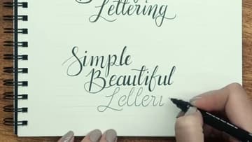
How to Write in Calligraphy - 7 Step Beginner Tutorial
Source: Torryn Marie • Full tutorial: www.craftingstepbystep.com/calligraphy/how-to-write-in-calligraphy
- Difficulty
- Easy
- Hands-on time
- About 30 minutes
Tools
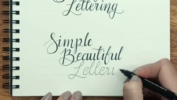
- 4B soft pencil
- Ruler
- Brush pen (Tombow Fudenosuke)
- Fine liner (Uni Pin 0.2 or similar)
- Smooth-paper sketchbook
Materials
- Lined or grid practice paper
Steps
1. Gather Your Supplies
You need five things before you start: a soft pencil for warming up (4B is ideal), a ruler for drawing guidelines, a brush pen, a fine liner, and smooth paper. Torryn uses a Tombow Fudenosuke brush pen and a Uni Pin 0.2 fine liner in this tutorial.
Tip: If you only own one brush pen, save it for the alphabet and word-writing steps.
2. Drill the Six Basic Strokes
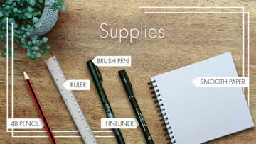
Every letter of the calligraphy alphabet is built from six basic strokes. Drill them in order: upstroke (light pressure, thin line going up at a slight forward angle), downstroke (heavy pressure, thick line coming straight down), overturn (light up, curve over, heavy down - looks like an upside-down U), and underturn...
Tip: If your downstroke and upstroke look the same thickness, you're not varying pressure enough.
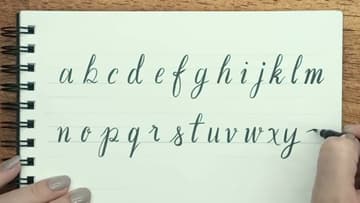
3. Rule Guidelines and Write the Alphabet
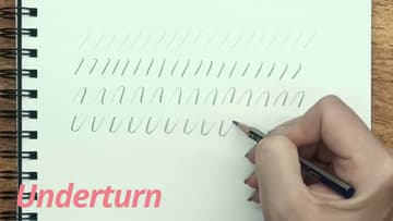
Rule four parallel guidelines across your page, equally spaced. The middle space is the x-height - it holds the body of every lowercase letter.
Tip: Grid paper or pre-printed lettering guidesheets save you the time of ruling lines for every practice session.
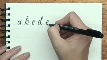
4. Add Flair with a Decorative Alphabet
Once the basic alphabet feels familiar, walk through it again and add decorative flourishes. Loop the entry stroke on the b and the d.
Tip: Save photos of styles you like from Pinterest or Instagram before you embellish your own alphabet. Copying specific letterforms is faster than inventing them.
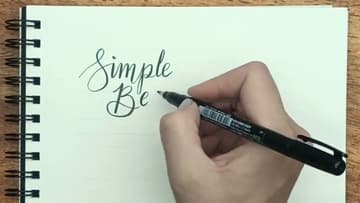
5. Link Letters into Words
Now combine letters into a short phrase. Pick something with letters you enjoy drawing - a few s, b, and e shapes if you have favorites.
Tip: If a word looks crammed, your letter spacing is too tight. Calligraphy letters need air around them.
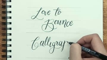
6. Try Bounce Lettering
Bounce lettering is the modern look you see on Pinterest quotes and Instagram posters. Instead of every letter sitting on the same straight baseline, move each letter up or down a little.
Tip: Don't bounce randomly. Pick a rhythm and stick to it - like up-down-up-down across the word, or dropping every third letter.
7. Simulate Calligraphy with a Fine Liner
If you don't own a brush pen yet, you can still get the calligraphy look with a regular fine liner. Write your word in cursive first using the same letter formations.
Tip: Only thicken the downstrokes. Upstrokes stay single-width.